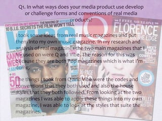
1. Q1. In what ways does your media product use develop
or challenge forms and conventions of real media
products?
I took some ideas from real music magazines and put
them into my own music magazine. In my research and
analysis of real magazines the two main magazines that I
focused on were Q and Vibe. The reason for this was
because they are both Pop magazines which is what I’m
doing.
The things I took from Q and Vibe were the codes and
conventions that they both used and also the house
styles that they both followed. From looking at the two
magazines I was able to apply these things into my own
magazine, I was able to look at the styles that suite the
magazines.
2. I love how the main focus is
the picture, its so powerful and it real
captures your attention even before you
look at the the rest of the front cover, I took
note of this and put it into my magazine by
only using one main picture on the front
cover.
The circle is another thing the
Q have used to draw people to
the magazine
Because it stands out to rest of
the front cover. I wanted to
incorporate this into my
magazine so I put the oval on
the front cover, I think it also
makes the front cover look a
little bit more exciting with out
being to ‘busy’.
The mast head Is very simple
and plain which I like, it think
that it makes the front cover
look very elegant.
with my masthead
even though its
not just one letter
I still think it looks
Elegant and simple, which was
the look I was going for.
3. With the contents pages I took
note of how they made the house colors
flow through the magazine, in my
magazine the house color is the pink stripes
that run through the magazine.
I liked the
way that Q set out
there numbering of
pages and also the
way that they’ve
delivered their
information. So I
tied this in with my
magazine, but
instead I used white
blocks to make it
stand out and it also
tied in with my front
cover.
With the
Pictures I wanted to
make my pictures
stand out as much as
possible so I looked at
the way that Q put a
border around there
pictures and took that
and used it in my
pictures both on the
contents page and the
double page spread.
4. I LOVE THIS! I
love the way they’ve taken a quote
form the interview and blown up
like this! I used this in my own
magazine because I think its so
clever and its also so powerful, I
love the way that it captures your
attention it makes you want to read
the rest of the interview, just
because of that one quote.
The picture is also very bold and it stands
Out well and its in keeping with the look of the page, her
clothes fitted the bold quotation, I like the way that it all
flows and gels together, I tried to incorporate this into my
own double page spread, I wanted the pictures to stand
out so I took two separate pictures of the band members
to break it up a bit.
5. One of the things that I took
from Vibe was the way that the
picture over lapped the
Masthead I really like the way
they’ve done this.
The one thing
that stood out to me was
the bold writing down to
side of the picture, and
also how it varies in
color. It really draws you
into read the different
articles.
I love the banner at the top
of the magazine it stands
out. I also think that it
breaks up the front cover a
little bit.
The thing I love about vibe is that it’s so simple yet its so powerful at the same
time, this is why I took so much inspiration form the magazines, I used some
elements in my magazine also. For instance I tied in the banner at the top but
instead I put it in my contents page, and I also used the bold writing down the
side to attract people’s attention.
6. The first thing that caught my eye about
Vibes contents page was how they’ve broken up
‘contents’ into three pieces and stacked them up on top of
each other, I loved this, however I just kept my ‘contents’
simple and plain as I thought I was more in keeping with
the style I was going for.
I like the way they have put the big V
Behind the main picture and the features.
Like the front cover they’ve only used
one picture, I wanted to incorporate this into my
own magazine but I ended up putting two pictures
in.
7. I like how
powerful vibe make there
double page spreads, unlike Q
they’ve used quite a few
pictures, but only one has
been blown up and been put
in color, I wanted to do this in
mine but I ran out of space.
I like the way that
the black and white
theme is broken up
by the blue writing
my double page
spread is very colorful
but I took it from vibe
to mix up the colors.