
Recommended
More Related Content
What's hot
What's hot (19)
Viewers also liked
Similar to Editing a Magazine Cover in Photoshop
Similar to Editing a Magazine Cover in Photoshop (20)
More from bethgricewyke
Recently uploaded
Recently uploaded (20)
Editing a Magazine Cover in Photoshop
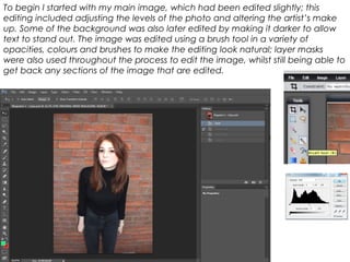
- 1. To begin I started with my main image, which had been edited slightly; this editing included adjusting the levels of the photo and altering the artist’s make up. Some of the background was also later edited by making it darker to allow text to stand out. The image was edited using a brush tool in a variety of opacities, colours and brushes to make the editing look natural; layer masks were also used throughout the process to edit the image, whilst still being able to get back any sections of the image that are edited.
- 2. I then added the masthead which I created in a variety of colours; my masthead was based around the ‘Q’ logo.
- 3. Next I added a skyline which included a feature story, I used two colours for the text to allow the text to stand out and made the most significant text the biggest; I made the background of the skyline black as this contrasts with the background of the main image, which also allows the text to stand out. I created the skyline by creating a box and then using the text tool.
- 4. I then added used the text tool to make the main feature story which is in red and white to contrast with the artist’s clothing, making the text clear to the reader.
- 5. I then added white and red shadowing behind the main feature story to allow the text to stand out more predominantly. This was done by duplicating the text layer.
- 6. I then added the plug using the shape and text tools, along with the select tool to give the background of the plug a slight texture; I chose to make the plug black, white and red as this ties in all the colours in the colour scheme.
- 7. I then started to add some of the feature stories; the feature stories include a combination of the colours in the colour scheme to allow different elements of the text to stand out. This was done using the text tool.
- 8. I then added the tagline under the masthead; I chose to create the tagline in black and white to allow it to stand out from the masthead, whilst still fitting with the colour scheme. This was done using the shape and text tools.
- 9. Next, I added an image and a feature story using the text tool, although the image had to be removed for copyright reasons - in my final magazine, I am going to aim to get another image to feature on the magazine.
- 10. I then used the text tool to add more feature stories with the combination of colours from the colour scheme, I also created the text in a variety of fonts and sizes to allow the most important information to stand out.
- 11. I then added the barcode, date, price and website – these are featured in the bottom right corner as this is conventional for magazines. To do this I used the text tool and the magic wand tool to edit out the background of the image, along with the shape tool to allow the numbers on the barcode to be visible after the background was edited out.
- 12. I then added white boxes to allow the feature stories and main feature story stand out more; I also edited the plug to make it stand out more. To do this, I used the shape tool, rectangular marquee tool and edited the text.