
Recommended
More Related Content
What's hot
Similar to Step by Step Contents Page
Similar to Step by Step Contents Page (20)
More from bethgricewyke
Recently uploaded
Recently uploaded (20)
Step by Step Contents Page
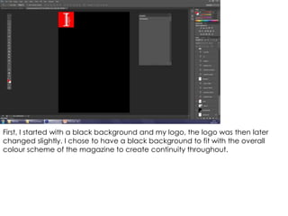
- 1. First, I started with a black background and my logo, the logo was then later changed slightly. I chose to have a black background to fit with the overall colour scheme of the magazine to create continuity throughout.
- 2. I then added the page title ‘CONTENTS’ - I chose to write the text in capital letters as this allowed it to stand out most effectively. I chose to create the text in white with a red shadow as this incorporates the colour scheme, whilst also allowing the text to stand out.
- 3. I then added the issue number which is featured in a speech bubble to allow it to stand out; both the speech bubble and text are featured in red and white to fit with the colour scheme, although I chose to create the speech bubble in white to allow the text in red to stand out more as it is the most significant feature out of the two. I also added the date, as both the issue number and date are conventions of contents pages; the date is featured in white with a red shadow to allow it to stand out.
- 4. I then added an image of Elisha (who is featured on the front cover) to show continuity throughout the magazine, which has been edited to appear more interesting to the reader. By making some of the image black and white, this is also fitting with the front cover which features a main image with black and white elements, also by making some of the image appear more red, this allows the image to fit with the colour scheme. To make it clear that the feature story relates to the one on the front cover, I have used the same feature story title ‘Elisha Holt’s Rise to Fame’, this also shows continuity throughout the magazine. The image also features a page number by the side of it which is a convention of contents pages.
- 5. I then added a box titled ‘Contact us’; this included social media such as Twitter, Facebook and Instagram, as well as the website for the magazine. I chose to do this as it is a vital convention of magazines.
- 6. Following this, I then began to add the feature stories which are the most significant features of a contents page, along with the page numbers – I decided to split the feature stories into four sections, the first being ‘This Month’; I chose to do this as music magazines regularly feature recent news, to keep them up-to-date, therefore by naming the title ‘This Month’ it is clear the magazine features up-to-date content.
- 7. The next section of feature stories is titled ‘2014’, I chose to do this as it the issue is from January 2015, so therefore magazines often do a ‘look back’ on music from the previous year.
- 8. I then created a section titled ‘Past and future’ – I created this group of feature stories as both past and upcoming music is vital in the music industry and music magazines.
- 9. The final section of feature stories is titled ‘Other’ – I decided to create it as often some feature stories do not fit into a certain category.
- 10. I then added a subscription advertisement as this is also a convention of magazines – subscriptions are often featured on contents pages as the large majority of readers see the contents page, which means the magazine are most likely to make money from it being featured on this page.
- 11. I then changed the sub-images and feature stories, I did this as the photographs are more suited to a music magazine as they were taken at Indie music gigs.
- 12. Next I resized the subscription box to allow more space for feature stories and images, this is because they are the most significant features on a contents page.
- 13. Following this, I then edited the main image further to allow it to stand out more – I made the image appear more red to allow it to fit with the colour scheme better.
- 14. Finally, I finished the ‘Contact Us’ section of the page and moved/ resized the feature stories so that the text is easier/ clearer to read, as well as making the page as a whole appear more finished.