
Recommended
More Related Content
What's hot
What's hot (17)
Viewers also liked
Viewers also liked (20)
Similar to Music Magazine Evaluation
Similar to Music Magazine Evaluation (20)
More from bdr628
More from bdr628 (20)
Recently uploaded
Recently uploaded (20)
Music Magazine Evaluation
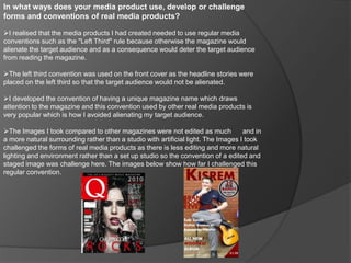
- 1. In what ways does your media product use, develop or challenge forms and conventions of real media products? I realised that the media products I had created needed to use regular media conventions such as the "Left Third" rule because otherwise the magazine would alienate the target audience and as a consequence would deter the target audience from reading the magazine. The left third convention was used on the front cover as the headline stories were placed on the left third so that the target audience would not be alienated. I developed the convention of having a unique magazine name which draws attention to the magazine and this convention used by other real media products is very popular which is how I avoided alienating my target audience. The Images I took compared to other magazines were not edited as much and in a more natural surrounding rather than a studio with artificial light. The Images I took challenged the forms of real media products as there is less editing and more natural lighting and environment rather than a set up studio so the convention of a edited and staged image was challenge here. The images below show how far I challenged this regular convention.
- 2. How does your media product represent particular social groups? My media product presents certain social groups in a variety of ways such as the main image on the front cover, it is very unusual which is obvious and compared to the "Q" magazine, it is very quirky. This quirkiness represents the fans of alternative/indie rock, not pop or rap fans because it is not their style so through the style the media product I created represent my target audience. The front cover has a "20 new band" sticker like feature on which represents the social group of youth as any OAP for example wouldn't want to know about a list of new bands because they already have their music tastes and artists. Furthermore, the social group of aspiring artists is also represented in the magazine because in the double page spread the featured artist is questioned on his experiences and how he got into the business. This is made clear through the title "Bran Rock Revealed".
- 3. What kind of media in institution might distribute your media product and why? IPC (International Publishing Company) is one of the UKs biggest distributors both online and paper copy of magazine's who sell more than over 350 million copies a year across both spectrum's. They split magazine titles into five groups: Connect (Women's Weeklies such as Look), Inspire (Leisure and Specialist), Ignite (Men's Lifestyle and Entertainment), Southbank (Women's Lifestyle and Home Interest) and TX (TV Titles). They would distribute my media product both online and on paper in stores because my magazine would fit into the Inspire group as the magazine is a specialist in a music genre. By distributing my magazine, IPC could attract more of an audience who would not usually attract such an audience and my media product could open up more doors for IPC. My magazine could expand their market and audience by selling my magazine so it would be very beneficial to them.
- 4. Who would be the audience for your media product? My target audience and general audience would be a social group built up of many difernet factors such as age and interest in the music genre, not the general population or appeal to a certain gender more than the other. The age of the audience would mostly be youth (16-40). 40 may not be classed as youth but the age does allow a certain number of people of that age to be interested in the media product. So the age would be youth and the rest of the audience would most probably be again interested in alternative/indie rock. In addition, the media product would get aspiring artists as well as such details are in the product. The overall audience would be a young person interested in the music genre and/or an aspiring audience. This however cannot account for random audiences viewing the media product as the magazine will not purely attract only the youthful and interested in alternative/indie rock as of course any magazine can attract anybody.
- 5. How did you attract/address your audience? My target audience are the fans of alternative/indie rock, further research showed that this genre of music has very few new artists becoming bigger in the industry as they are not as publicised as pop stars for example. Knowing this, with the sticker feature I claimed the magazine had found "20 new bands" who the reader might enjoy as they will all be alternative/indie rock who can provide new albums to the reader. It's not guaranteed that all 20 bands will be okay for them but at least a few of them will be good for each reader. This is how I attracted my target audience, through the use of knowing what they could want from the music industry, new and more artists, so the target audience was attracted through this.
- 6. What have you learnt about technologies from the process of constructing this product? I already knew about much of the technologies in the process of producing media texts due to my expertise in ICT which I have learnt through the year because of my ICT AS Level course. However, I have learnt some extra skills concerning Adobe Photoshop CC as when I created the double page spread, I created these grey boxes to hold the text but it didn't look professional. I remembered when I completed my research that other magazines such as "Q" faded their boxes which held their texts and I wondered how they did it. With research I figured out there is a opacity tool which creates this transparency. This is insight into how magazines produce their products with technology is insightful as I learnt skills like the opacity tool which shows me how magazines exactly create their products with such a professional appearance.
- 7. Looking back at your preliminary task, what do you feel you have learnt in the progression from it to the full product? I feel I have learnt so much since the preliminary task as for one I feel have created more of a professional looking magazine through the use of the preliminary task because my front cover for that was a single image of a student with the background changed to plain black. I learnt that an image should have natural background when taken rather than editing one in or majorly changing it. I applied this in the music magazine front cover which I found very useful and it helped create a better looking magazine. In addition, I learnt from my preliminary task when I used a silver bar with an orange/gold outline to hold my masthead but his only made the school magazine look unprofessional. From this I changed that ineffective style to the more traditional style of the masthead on the background image but edited to be around and behind the character on the front cover. I am thankful I learnt this as my final music magazine front cover looked more professional than my preliminary task did. When I took the image for my preliminary task I did not care much for how my model was positioned but I later learnt it was more important than I thought when I had trouble positioning text and formatting the front cover because of how bad my model was positioned. I learnt from my mistake by caring more for how my model was positioned in the photo which helped create a more aesthetic and professional front cover. As well I found on the front cover that the masthead should not overlap the main image as it ruins the professional look of the magazine. Knowing this I changed that so the masthead was edited by using masking in Adobe Photoshop CC which again helped create an even more professional look that could attract my target audience.