NO1 Top Black Magic Specialist In Lahore Black magic In Pakistan Kala Ilam Ex...
Research task 3c analysis of own magazine double page spread
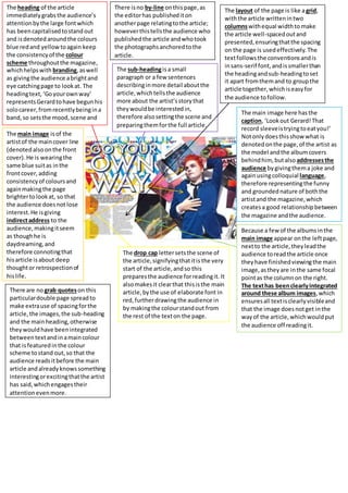
1. The heading of the article
immediatelygrabsthe audience’s
attentionbythe large fontwhich
has beencapitalisedtostandout
and isdenotedaroundthe colours
blue redand yellowtoagain keep
the consistencyof the colour
scheme throughoutthe magazine,
whichhelpswith branding,aswell
as givingthe audience abrightand
eye catchingpage to lookat. The
headingtext,‘Goyourownway’
representsGerardtohave begunhis
solocareer,fromrecentlybeingina
band,so setsthe mood,scene and
storyof the proceedingarticle.
The sub-headingisa small
paragraph or a few sentences
describinginmore detail aboutthe
article,whichtellsthe audience
more about the artist’sstorythat
theywouldbe interestedin,
therefore alsosettingthe scene and
preparingthemforthe full article.
There isno by-line onthispage,as
the editorhas publishediton
anotherpage relatingtothe article;
howeverthistellsthe audience who
publishedthe article andwhotook
the photographsanchoredtothe
article.
The layout of the page is like agrid,
withthe article writtenintwo
columnswithequal widthto make
the article well-spacedoutand
presented,ensuringthatthe spacing
on the page is usedeffectively.The
textfollowsthe conventionsandis
insans-serif font,andissmallerthan
the headingandsub-headingtoset
it apart fromthemand to groupthe
article together,whichiseasyfor
the audience tofollow.
The main image here hasthe
caption, ‘Lookout Gerard!That
record sleeveistryingtoeatyou!’
Notonlydoesthisshowwhat is
denotedonthe page,of the artist as
the model andthe albumcovers
behindhim, butalso addressesthe
audience bygivingthema joke and
againusingcolloquial language,
therefore representingthe funny
and groundednature of boththe
artistand the magazine,which
createsa good relationshipbetween
the magazine andthe audience.
The main image isof the
artistof the maincover line
(denotedalsoonthe front
cover).He is wearingthe
same blue suitas inthe
frontcover,adding
consistencyof coloursand
againmakingthe page
brightertolookat, so that
the audience doesnot lose
interest.He isgiving
indirectaddress to the
audience,makingitseem
as thoughhe is
daydreaming,and
therefore connotingthat
hisarticle isabout deep
thoughtor retrospectionof
hislife.
Because a few of the albumsinthe
main image appear onthe leftpage,
nextto the article,theyleadthe
audience toreadthe article once
theyhave finishedviewingthe main
image,astheyare inthe same focal
pointas the columnon the right.
The texthas beenclearlyintegrated
around these album images,which
ensuresall textisclearlyvisibleand
that the image doesnotget inthe
wayof the article,whichwouldput
the audience off readingit.
The drop cap lettersetsthe scene of
the article,signifyingthatitis the very
start of the article,andso this
preparesthe audience forreadingit. It
alsomakesit clearthat thisisthe main
article,bythe use of elaborate font in
red,furtherdrawingthe audience in
by makingthe colourstandout from
the rest of the texton the page.
There are no grab quoteson this
particulardouble page spreadto
make extrause of spacingforthe
article,the images,the sub-heading
and the mainheading,otherwise
theywouldhave beenintegrated
betweentextandinamaincolour
that isfeaturedinthe colour
scheme tostand out,so that the
audience readsitbefore the main
article andalreadyknowssomething
interestingorexcitingthatthe artist
has said,whichengagestheir
attentionevenmore.