The Liver & Gallbladder (Anatomy & Physiology).pptx
Research task 3b analysis of own magazine contents page
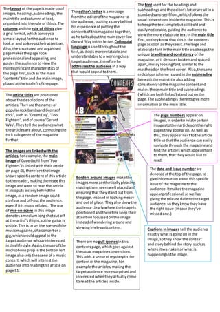
1. The layout of the page is made up of
images,headings,subheadings,the
maintitle andcolumnsof text,
organisedintothe rule of thirds.The
columnsand the rule of thirds give
a grid format,whichconveysa
simple layoutforthe audience to
lookat and so keepstheirattention.
Also, the structured andorganised
page makesthe page look
professionalandappealing,and
guidesthe audience toviewthe
mostsignificantcharacteristicsof
the page first,suchas the main
‘contents’title andthe mainimage,
placedat the top leftof the page.
The font usedfor the headingsand
subheadingsandthe editor’sletterare all ina
standardsans-serif font,whichfollowsthe
usual conventionsinsidethe magazine.Thisis
to keepthe textsimple butstill boldand
easilynoticeable,guidingthe audience to
view the more elaborate textinthe maintitle
first,sotheyknow that thisis the contents
page as soon as theysee it.The large and
elaborate fontinthe maintitle alsokeepsthe
unique brandingand consistencyof the
magazine,asit denotesbrokenandspaced
apart, messylookingfont,similarto the
mastheadonthe front cover. Also,the same
redcolour scheme isusedinthe subheading
beneaththe maintitle alsoadding
consistencytothe magazine contentand
makesthese maintitle andsubheadings
(whichare bothlinked) standoutonthe
page.The subheadingisthere togive more
informationof the maintitle.
The article titlesare positioned
above the descriptionsof the
articles.Theyare the namesof
popularrock bandsand (iconsof
rock’,such as ‘GreenDay’,‘Foo
Fighters’,andof course ‘Gerard
Way’.They tell the audience what
the articlesare about,connotingthe
rock sub-genre of the magazine
further.
The imagesare linkedwith the
articles,for example,the main
image of Dave Grohl from‘Foo
Fighters’islinkedwiththeirarticle
on page 48, therefore the image
showsspecificcontentof thisarticle
to the reader,makingthemsee this
image andwant to readthe article.
It alsoputs a storybehindthe
image,asa randomimage could
confuse andoff-putthe audience,
evenif itismusic related. The use
of mis-en-scene inthisimage
denotesamediumlongshotcut off
at the artist’sthighs,sothe guitaris
visible.Thisistosetthe scene of the
musicmagazine,of a concertor a
gig,whichwouldappeal tothe
target audience whoare interested
inthislifestyle.Again,the use of the
microphone propinthe bottomleft
image alsosetsthe scene of a music
concert,whichwill interestthe
audience intoreadingthisarticle on
page 51.
The editor’sletter isa message
fromthe editorof the magazine to
the audience,puttingastorybehind
hisexperience of puttingthe
contentsof thismagazine together,
as he talksabout the maincover line
Gerard Way inthisletter. Colloquial
language is usedthroughoutthe
text,as thisismore relatable and
understandabletoa workingclass
target audience;thereforehe
addressesthe audience ina way
that wouldappeal tothem.
The page numbers appearon
images,inorderto relate certain
imagestotheirarticlesonthe right
pagestheyappearon. Aswell as
this,theyappearnexttothe article
title sothat the audience caneasily
navigate throughthe magazine and
findthe articleswhichappeal most
to them, thattheywouldlike to
read.
The date and issue numberare
denotedatthe top of the page,to
give informationaboutthisspecific
issue of the magazine tothe
audience.Itmakesthe magazine
appearprofessional,aswell as
givingthe release date tothe target
audience,sotheyknowtheyhave
the right issue (incase they’ve
missedone.)
Borders around images make the
imagesmore aestheticallypleasing,
makingthemseemwell placedand
ensuringthattheystandout from
the page,insteadof lookingmessy
and outof place.Theyalsoshow the
audience clearlywhere the image is
positionedandtherefore keep their
attentionfocussedonthe image
insteadof wanderingaroundand
viewingirrelevantcontent. Captions inimages tell the audience
exactlywhatisgoingon inthe
image,sotheyknow the context
and storybehindthe story,suchas
where itwastakenor whatis
happeninginthe image.
There are no pull quotesinthis
contentspage,whichgoesagainst
the usual magazine conventions.
Thisadds a sense of mysterytothe
contentof the magazine,for
example the articles,makingthe
target audience more surprisedand
interestedwhenthey actuallycome
to readthe articlesinside.