
Recommended
More Related Content
What's hot
What's hot (18)
Viewers also liked
Similar to Research task 3d analysis of own magazine similarites between 3 parts
Similar to Research task 3d analysis of own magazine similarites between 3 parts (20)
Recently uploaded
Recently uploaded (20)
Research task 3d analysis of own magazine similarites between 3 parts
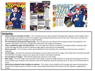
- 1. Similarities • Colour scheme of red yellow and blue – This is to keep the house style consistent throughout the magazine and the bright colours make the pages eye catching, as well as the magazine representing the bold loud nature of the music inside, due to the rock sub- genre, therefore giving them magazine a unique branding. • The main feature and story line of Gerard way – This is to show the main feature of the magazine which would appeal to the audience interested in rock music, so keeps them interested in the magazine throughout. • Titles in capitalised, larger and coloured font – This is to make them stand out instantly to the target audience, and know what content the page will show, as well as making the page appear more dynamic and appealing. • Text in sans serif – This is to keep a simple and standard font of text and follow the conventions of serif and sans serif text in magazines • Use of Images – This gives the audience something else to look at other than text on a page, which keeps them interested and adds to the format of the page, using up more space and so makes it look better presented. • Use of captions on images – These tell the target what is going on in the image. • Main image – The main image is the main focus of each page, so gives the target audience an image that would appeal to them to look at straight away, drawing in their attention more and making them want to read about them, as they are all anchored with an article. • Informal and colloquial mode of address to audience – This makes it more relatable to the younger age range and working class lifestyle of the target audience, therefore creates a good relationship between the audience and the magazine, engaging them further.