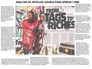
1. ANALYSIS OF ARTICLES- DOUBLE PAGE SPREAD 1 NME
Caption saying Dizzee which gives
kind of dedicates the whole double
Mise en scene created by page spread to Dizzee and it’s also,
graffiti wall background: this reasserting who it is, making it
links with the headline of tags constant so that the reader is fully
which is a phrase describing sure of who it is without having to
the graffiti. And also, it shows look back to the front cover.
that fame hasn’t changed who
he really is and that he’s still
the same person underneath.
Byline (credit for author and
And the clothes clearly
photographer). This is small and
represent the kind of
not too prominent on the page but
background he’s come from
it still there because it’s important
and the kind of music he
to credit the people involved with
produces.
the production.
Main heading/headline is really
big and prominent on the page, it
stands out and is big and bold to
Main image is of Dizzee Rascal catch the reader’s attention. The
standing next to the graffiti word ‘tag’ is a play on words with
emphasising that it’s the kind of ‘rags’ and is in relation to the
rebellious behaviour that he graffiti, highlighting the kind of
may have taken part in when background he has come from.
he was younger because of the
social class he has come from. Sub heading: this is further
The picture shows him looking emphasising the success Dizzee
away as if he’s was constantly Rascal has achieved and it’s like a
worrying if he was being mini introduction and is like the
spotted and was perhaps living start of the article.
in fear. The image is quite
colour and bright, thus catching
the eye of the reader and the 4 columns – notice text
colours emphasise his life and wraps around the image of
diversity and excitement in it. the radio. This is so that the
It’s obvious that he doesn’t go text doesn’t get in the way of
round ‘tagging’ anymore but the the images and shows that
image makes him seem more they are both of importance
full of character. so that they need their own
space on the page. This also
gives the article a sense of
structure and makes it easier
to read.
Copy (text) begins with A large letter Y
Second image used is a picture of bottle of alcohol and a stereo which is
Page number; NME title; Date = these aspects are small and using Drops Cap. This is so that it signals representative of the kind of lifestyle Dizzee Rascal has lived and has come from.
the start of the article and the reader is
in the corner of the page because it the greater context of the Background is quite plain but with different splodges of colour here and there
aware of where to start reading. Also, it’s
double page spread, it isn’t that important and while they are which emphasise that everything was straightforward and easy for Dizzee growing
effective because it takes a bit away from
necessary, it’s not intended to get in the way of more up and that he faced difficulties. This is shown by the splodges on the page which
important features such as the main image and main heading. the general boring look of text and gives it a aren’t quite perfect but look okay in the grand scheme of the double page spread.
bit more character and individuality.
2. Analysis of
written article
The article itself is basically about Dizzee
Rascal’s upbringing and how he has worked
his way to be what he is today and the
humble backgrounds he has come from.
The style of the article is relating the style of
the magazine. And in this case it gives off a
‘hip hop’ vibe relating to Dizzee Rascal’s style
of music and target audience.
It is written in 4 short columns each of approx
75-100 words so that it’s easier for the reader
to read. And because of it being aimed at
teenagers, they have tried not to include too
much text which wouldn’t interest this
particular target audience.
The main heading/headline is quite dramatic
and draws the reader in and makes them
want to read on.
3. ANALYSIS OF ARTICLES- DOUBLE
PAGE SPREAD 2
The text is in columns,
making it much more
The same colour easier to read the article
scheme of red, black and following the general
and white is effective layout and style of a
in that it makes the magazine article.
magazine look more There isn’t too much text
consistent, neat and on the page which is
structured. And also, effective because it
as a whole, making it focuses on the key
appear powerful. aspects and what the
general target audience
of teenagers would be
The use of a pull interested in.
quote is really
effective because it’s
bold and stands out
a lot by using the
consistent colour The use of several
scheme. And in this images on the double
case, it’s page spread makes it
emphasising about seem like the article is
their careers and the almost telling a story and
effort they’re putting is intending to grip the
in to be the best they reader in.
can be. The reader
is immediately drawn The images are all anchored by The subheading is effective
to this bit of quotes, making it clear who they all because it gives the reader
information because The images are all black and white to give off the effect are of and so that the reader is some insight into the
it’s bigger than the that the bands are almost considered as legendary, and able to become aware of who they interview and where it took
other text and is makes the images come across as sophisticated and all are the kind of image the band place, making the reader
much more eye striking. give off, perhaps in this case more aware of the situation.
catching. showing what they are like during Also, it draw them in wanting
work in the studios and on stage. them to read on.
4. Analysis of written article 2
• The article itself is basically about My Chemical
Romance and their ambitions and plans for the
future and how they intend to be the best they can
be, also giving the reader some more insight into
how hard they work.
• The style of the article is relating the style of the
magazine. And in this case it gives off a
‘rock/indie’ vibe with the type of music My
Chemical Romance produce and their target
audience.
• It is written in 4 short columns each of approx 75-
100 words so that it’s easier for the reader to
read. And because of it being aimed at 16-19 year
olds, they have tried not to include too much text
which wouldn’t interest this particular target
audience.
• The main heading/headline is quite dramatic and
draws the reader in and makes them want to read
on. The use of an exclamation mark portrays how
committed they are and the belief they have in
their own ability, portraying confidence and
because it’s a pull quote means that the reader
will trust the article more because it’s come from a
primary source.