CBO’s Recent Appeals for New Research on Health-Related Topics
Task 3 U2 double page spread analysis (THIRD ANALYSIS)
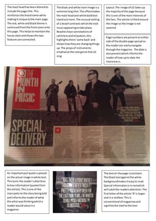
1. Layout: The image of U2 takes up
the majority of the page because
this is one of the main interests of
the fans. The article is fitted around
the image so the image is not
covered.
The mast head has been altered to
include the page title. This
reinforces the brand name while
making it unique to the main page.
The red, white and black theme is
continued from the front cover onto
this page. This helps to maintain the
house style and shows the two
features are connected.
The black and white main image is a
extreme long shot. The effect makes
the mast head and white bold text
stand out more. The unusual setting
of a beach contrasts which the rock
music appearing to take place.
Beaches have connotations of
calmness and relaxation, this
highlights there ‘come back’ and
shows how they are changing things
up. The props of instruments
emphasise the rock genre that U2
sing.
Page numbers are present on either
side of the double page spread so
the reader can easily navigate
through the magazine. The date is
also present which informs the
reader of how up to date the
interview is.
An important pull quote is placed
on the actual image in white text.
This turns the reader’s attention
to key information (quotes from
the artists). This is one of the
main parts to the story being told
and informs the reader of what
the artist was thinking which a
reader would value in a
magazine.
The text on the page is constant.
The black text against the white
background makes it easy to read.
Special information is in red which
will catch the readers attention. The
first letter of the article ‘R’ is larger
and in a red box. This is
conventional of magazines and
signifies the start to the text.