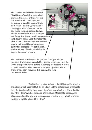
1. The CD itself has letters of the words
‘David Guetta’ and ‘One Love’ which
are both the names of the artist and
the album itself. The font of the
letters are in a graffiti form which is
both fun and attracting. He has also
cleverly got letters from each word
and mixed them up and used only a
few on the CD which makes it unique
and funky. The title of the album is One Love,
and cleverly he has used the hole in the
disk as the ‘O’ in One Love. The 2 colours
used are pink and black that contrast
eachother and looks a lot better than 2
similar colours. The disk also holds the
logo of therecord company.
The back cover is white with the pink and black graffiti font
on top of it which adds a good effect and is eye catching. Also the
white background makes it stand out among the rest and it makes
it modern and fun. They have also cleary distinguished which
tracks are on each individual disk byu dividing the 2
Columns of tracks.
The front cover has a picture of David Guetta, the artrist of
the album, which signifies that it’s his album and the picture has a retro feel to
it. In the top right of the front cover, there’s writing which says ‘David Guetta’
and ‘One – Love’ which is the name of the album. Most of the songs on the
album are related to love and consequences of falling in love which is why he
decided to call the album ‘One – Love’.