
Recommended
More Related Content
What's hot
Viewers also liked
Viewers also liked (15)
Similar to Screenshots
Similar to Screenshots (20)
More from asmediac14
More from asmediac14 (20)
Recently uploaded
Recently uploaded (20)
Screenshots
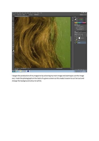
- 1. I beganthe productionof my magazine byselectingmymainimage andstartingto cut the image out,I took the photographonthe back of a greenscreenso thismade iteasiertocut herout and change the backgroundcolourto white.
- 2. I thenfeatheredthe image sothe cutout edgesdidn’tlookasblunt.Thiswill make the image look more realisticandfiton the newbackgroundbetter.
- 3. Thisis the final cutout of the mainimage formy frontcover.I addeda filteroverthe image tomake herlookmore realisticasthe original image hadagreenglow fromthe greenscreen.
- 4. I beganto lookforfontsfor my mastheadand I used www.dafont.com .Iusedthe section ‘distorted’asitconnotesthe genre of indie musicwhichismymaingenre andwill appeal tomy target audience.
- 5. Here I addeda white backgroundandmastheadtothe topof the page.
- 6. I addedthe barcode whichisa typical conventionof amagazine andmyslogan.
- 7. I startedto add coverlinesandaddedeffectstomake themstandoutmore againstthe background.
- 8. I addeda puff and othercoverlinesanda bannerat the bottomto add extradetails.Ialsoaddeda price and a maincoverline.
- 9. In thisscreenshotIstartedto searchfor fontsformy contentspage usingdafont.com.
- 10. I startedto add imagesandthe title forthe page.
- 11. I usedeffectstomake the backgroundhave more detail soit’snota plaincolourandtoo boring.This will attractthe targetaudience.
- 12. I addedeffectstothe images togive themborders.
- 14. I changedthe colourof the backgroundsto make itstand outon the page.
- 15. I decidedtochange the imagesshownonmy contentspage asI wantedto use one for mydouble page spread.
- 16. I beganto add subheadingstostartthe textonmy page.I alsoaddeda date andissue number.
- 17. Here I addedthe article namesandpage numbertoensure thatthe page doesitsjob.
- 18. I addedeffectstothe textandpuff to create a certainaesthetictoattract mytarget audience.
- 20. Here I completelychangedthe righthandside of mypage to addmore imagesandmake the layout more suitedforthe genre.
- 21. For my double page spread,firstIaddedthe backgroundimage andopeneditintoPhotoshopto make the space betweenthe peoplebigger,thisallowedme toaddmore textin-between.Ithen insertedmytextandaddedthe headline andbyline.Ialsoaddedmymastheadandcut around the imagesof the artistsand letthe textflow aroundthemsoit was clearand easyto read.