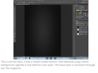
1. This is my first layer, it was a simple carbon texture I had obtained using a white
background, vignette it and add fine cross overs. This base layer is consistent through
out the magazine.
2. Here is my imported picture I am using for my front cover, this has had no editing to it
what so ever.
3. After cutting out the edges and colour changing the hat, I now have my basic photo to work
around, the colour of the hat fits to the colour scheme.
4. I then added my mast head and placed it over instead of behind the picture through prefered
choice. This also gave me a basic layout to work around.
5. I added a selling line, and a few graphics around the mast head in order to give it a bit of depth
and style, the eye behind the senda mast head was done through a photo taken of my own eye
6. From this point in began to add cover lines, issue numbers, dates and barcodes to see what
space I had left to fill. This included graphics such as shape layers, and of course an abundance
of text layers.
7. Finally I added a free bee, in which being a separate music album. This again was done by
photography and basic image effects. In also touched up everything and added tattoos through
preference. This was my final piece.