Salient Features of India constitution especially power and functions
Analysis of vibe+mayhem
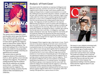
1. The costume which the celebrities are wearing in Q Magazine and
Billboard is very sexy, and theirs not much of it. This signs that the
magazine want to attract an older, more mature audience who
maybe are living at home, in student accommodation or in a small
flat, fulfilling the last step of their education, however, Q readers may
be more ‘wild’, therefore may not still be in education. Gaga is using
a dildo under her trousers which is symbolic signing that the media
thinks she is a man so she is confidently making fun of the media. I
think this may be because she is embarrassed of what they are
saying. The magazines are both very different in the way that
Billboard have put Rihanna in more of a pretty outfit and Gaga in a
very rock outfit. For Rihanna, the magazine is giving an symbolic sign
of her changing from this very sexy, rebel to this sexy but soft and
pretty lady, however, by showing the tattoo, a symbolic sign could be
that the bad side to her is still there. In Q Magazine, Lady Gaga’s
image is showing her iconic sign. She has stayed her usual wacky self.
The preferred reading of this would be that they look young and
appealing to the eye. The oppositional reading could be for Rihanna,
that she will never change from her original self, and for Lady Gaga,
they may say she looks vulgar.
The language of these magazines signs a big interest in music. There’s
only one or two pieces of gossip on the front covers and rest of the
content is purely about music. Although the two magazines content
is primarily the same, Q’s is more laid back and the effort goes on the
music, which is more rock pop which signifies that for that particular
magazine, they care more about music. The preferred reading for
this would be that it’s nice to see a different range music and the
emphasis on music because it frequently gets put in the background.
The oppositional reading to this would be that the magazine has no
exciting content so the purchaser doesn’t buy the magazine. This is
the opposite to Billboard, who put more emphasis on the gossip,
talking about how Rihanna is a ‘re-invented’ person. This signifies
that Rihanna’s gossip is more important that the music itself. The
preferred reading of this would be that the magazine is interesting
and people will buy it because they feel it will keep them
entertained, and the oppositional reading would be that they may as
well buy a gossip magazine where there is more gossip, rather than
reading a little gossip then a sparse amount of music.
Analysis of Front Cover
The layout is very celebrity orientated with
the mastheads behind the women. This
has a symbolic sign of media needing
celebrities to stay in business, so they
praise them and put them over anything.
The preferred reading of this is that the
audience wants to fully see celebrities and
know that they can also see the music
news, so don’t mind, however the
oppositional reading is that the audience
thinks that the magazine doesn't’t care
about the music.
The camera shot for Billboard is head
and shoulders which signs that Rihanna
feels confident with the camera up
close. The shot for Q Magazine is head
to knees which signifies the magazine
wants to show off her clothes. Both of
the magazines show confidence. The
preferred reading of this is that they are
being role models for shy young ladies.
The oppositional reading is that they are
egotistical and conceited.
The camera shots on both the
magazines photos of the celebrities is
front on, which signifies a more intimate
feeling to the magazine. The preferred
reading would be that the audience
feels like the celebrities are looking
strait at them , resulting in them
wanting to buy the magazine. The
oppositional reading would be that the
audience feels intimidated by the
celebrities.
2. The costume which the celebrities are wearing in Q
Magazine and Billboard is very sexy, and theirs not much of
it. This signs that the magazine want to attract an older,
more mature audience who maybe are living at home, in
student accommodation or in a small flat, fulfilling the last
step of their education, however, Q readers may be more
‘wild’, therefore may not still be in education. Gaga is using
a dildo under her trousers which is symbolic signing that the
media thinks she is a man so she is confidently making fun
of the media. I think this may be because she is
embarrassed of what they are saying. The magazines are
both very different in the way that Billboard have put
Rihanna in more of a pretty outfit and Gaga in a very rock
outfit. For Rihanna, the magazine is giving an symbolic sign
of her changing from this very sexy, rebel to this sexy but
soft and pretty lady, however, by showing the tattoo, a
symbolic sign could be that the bad side to her is still there.
In Q Magazine, Lady Gaga’s image is showing her iconic
sign. She has stayed her usual wacky self. The preferred
reading of this would be that they look young and appealing
to the eye. The oppositional reading could be for Rihanna,
that she will never change from her original self, and for
Lady Gaga, they may say she looks vulgar.
3. The language of these magazines signs a big interest in music. There’s
only one or two pieces of gossip on the front covers and rest of the
content is purely about music. Although the two magazines content is
primarily the same, Q’s is more laid back and the effort goes on the
music, which is more rock pop which signifies that for that particular
magazine, they care more about music. The preferred reading for this
would be that it’s nice to see a different range music and the emphasis
on music because it frequently gets put in the background. The
oppositional reading to this would be that the magazine has no exciting
content so the purchaser doesn’t buy the magazine. This is the opposite
to Billboard, who put more emphasis on the gossip, talking about how
Rihanna is a ‘re-invented’ person. This signifies that Rihanna’s gossip is
more important that the music itself. The preferred reading of this
would be that the magazine is interesting and people will buy it because
they feel it will keep them entertained, and the oppositional reading
would be that they may as well buy a gossip magazine where there is
more gossip, rather than reading a little gossip then a sparse amount of
music.
4. The camera shot for Billboard is head and shoulders which signs that
Rihanna feels confident with the camera up close. The shot for Q
Magazine is head to knees which signifies the magazine wants to show
off her clothes. Both of the magazines show confidence. The preferred
reading of this is that they are being role models for shy young ladies.
The oppositional reading is that they are egotistical and conceited.
The camera shots on both the magazines photos of the celebrities is
front on, which signifies a more intimate feeling to the magazine. The
preferred reading would be that the audience feels like the celebrities
are looking strait at them , resulting in them wanting to buy the
magazine. The oppositional reading would be that the audience feels
intimidated by the celebrities.
5. The layout is very
celebrity orientated
with the mastheads
behind the women.
This has a symbolic sign
of media needing
celebrities to stay in
business, so they praise
them and put them
over anything. The
preferred reading of
this is that the
audience wants to fully
see celebrities and
know that they can also
see the music news, so
don’t mind, however
the oppositional
reading is that the
audience thinks that
the magazine doesn't’t
care about the music.
6. The costume, which the models and celebrities in this issue of Mayhem
Magazine and Vibe Magazine are wearing, signifies a very provocative
nature by the length of the costume being short. This applies to Vibe
magazine more, as she is wearing stiletto heels which signs her legs look
longer, and stilettos signify that sexual nature. In Vibe, the lady is also
wearing tight fitting clothes, whereas in Mayhem, even though Rita’s legs
are out, She is in what looks like a baggy jacket and converse high tops.
This is iconic because she portrays herself as quite laid back, cool and sexy
woman. The preferred reading of the costume being seductive would be so
the audience look up to their styles and want to see more of their beauty.
The oppositional reading could be that the costume is too revealing and
the models look vain, revealing too much skin.
The expression of the models’ faces and the gestures they are holding are
quite relaxed but still posed. Rita, in Mayhem is holding a more so relaxed
pose, however, the camera shot is angled so the audience can view most of
her outside leg and thigh. This is iconic because Rita’s character is very
sexy. She is pouting in the shot, which is also an iconic sign, for the same
reason. The fact that the camera angle is pointing down at Rita is a
symbolic sign because the magazine may be trying to make Rita look more
laid back and more approachable than she may be. The position which the
girl on is in emphasizes her legs as they cover most of the contents page.
The camera angle on Vibe magazine has an indexical sign of the
imagination of the lady lying next to a partner on a bed, giving the
audience the intensity of her looking at you strait in your eyes and lying
next to you. The preferred reading of this would be that the girls want to
be like them, so they look at their positions and facial features and try to
replicate them because they look up to these woman as role models. The
oppositional reading could be that the girls look silly and too sexual for
their liking so don’t buy the magazine.
The colour scheme of both the magazines is fairly dark and mysterious with
dark and light tones. This has an iconic sign because both the women are
portrayed as very sexy beings and dark lights symbolically could represent
an intimate space, such as a bedroom or a dark ally in Mayhem’s case. The
preferred reading would be that the audience seems closer to the girls and
share intimacy with them, which makes them want to read the article. The
oppositional reading is that the reader thinks it is too dark on the magazine
and the audience thinks it looks dull so they end up not wanting to read
the article.
The typography in both
the magazines is san serif
for the headline. This
signs as being informal,
meaning the audience
feels comfortable reading
it when they first glance at
the page. The fact that it’s
in a very large font grabs
the audiences attention.
The preferred reading of
this would be that the
audience knows that the
article is not going to be
very confusing and hard-
reading. The oppositional
reading would be that the
audience thinks the article
is going to not be worth
reading because it is so
informal and they think
there will be no useful
information in there.
Analysis of Contents Page
7. The typography in both the magazines is san serif for the headline.
This signs as being informal, meaning the audience feels comfortable
reading it when they first glance at the page. The fact that it’s in a
very large font grabs the audiences attention. The preferred reading
of this would be that the audience knows that the article is not going
to be very confusing and hard-reading. The oppositional reading
would be that the audience thinks the article is going to not be
worth reading because it is so informal and they think there will be
no useful information in there.
8. The costume, which the models and celebrities
in this issue of Mayhem Magazine and Vibe
Magazine are wearing, signifies a very
provocative nature by the length of the costume
being short. This applies to Vibe magazine
more, as she is wearing stiletto heels which
signs her legs look longer, and stilettos signify
that sexual nature. In Vibe, the lady is also
wearing tight fitting clothes, whereas in
Mayhem, even though Rita’s legs are out, She is
in what looks like a baggy jacket and converse
high tops. This is iconic because she portrays
herself as quite laid back, cool and sexy woman.
The preferred reading of the costume being
seductive would be so the audience look up to
their styles and want to see more of their
beauty. The oppositional reading could be that
the costume is too revealing and the models
look vain, revealing too much skin.
9. The expression of the models’ faces and the gestures they are holding
are quite relaxed but still posed. Rita, in Mayhem is holding a more so
relaxed pose, however, the camera shot is angled so the audience can
view most of her outside leg and thigh. This is iconic because Rita’s
character is very sexy. She is pouting in the shot, which is also an
iconic sign, for the same reason. The fact that the camera angle is
pointing down at Rita is a symbolic sign because the magazine may be
trying to make Rita look more laid back and more approachable than
she may be. The position which the girl on is in emphasizes her legs as
they cover most of the contents page. The camera angle on Vibe
magazine has an indexical sign of the imagination of the lady lying
next to a partner on a bed, giving the audience the intensity of her
looking at you strait in your eyes and lying next to you. The preferred
reading of this would be that the girls want to be like them, so they
look at their positions and facial features and try to replicate them
because they look up to these woman as role models. The
oppositional reading could be that the girls look silly and too sexual
for their liking so don’t buy the magazine.
10. The colour scheme of both the
magazines is fairly dark and
mysterious with dark and light tones.
This has an iconic sign because both
the women are portrayed as very
sexy beings and dark lights
symbolically could represent an
intimate space, such as a bedroom or
a dark ally in Mayhem’s case. The
preferred reading would be that the
audience seems closer to the girls
and share intimacy with them, which
makes them want to read the article.
The oppositional reading is that the
reader thinks it is too dark on the
magazine and the audience thinks it
looks dull so they end up not wanting
to read the article.
11. The colour scheme in Q Magazine’s contents page is full of
bright reds and whites, which looks very fresh. This signs
that the magazine is clear to read and signifies a mature
feel and that the magazine is open to all types of music.
The preferred reading of this would be that the audience
is happy that they can read everything clearly and that
they can read about all different music types. The
oppositional reading would be that the audience thinks
the magazine looks boring and they may think that the
magazine is wasting valuable space in the magazine for all
different types of music, rather than just one.
V Magazine’s contents page is much more simplistic with
only one image, which is a woman holding a heart to a
rapper to sign that this man does have a heart, people just
don’t see it often. A symbolic sign would be that women are
in control of his heart, as it assumingly is a lady holding his
heart.