
Recommended
More Related Content
What's hot
What's hot (19)
Similar to Digipak Analysis - Rita Ora
Similar to Digipak Analysis - Rita Ora (20)
More from amykirbyy
More from amykirbyy (20)
Recently uploaded
Recently uploaded (20)
Digipak Analysis - Rita Ora
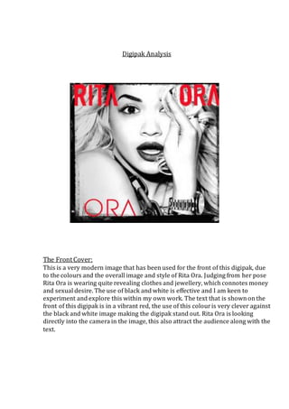
- 1. Digipak Analysis The Front Cover: This is a very modern image that has been used for the front of this digipak, due to the colours and the overall image and style of Rita Ora. Judging from her pose Rita Ora is wearing quite revealing clothes and jewellery, which connotes money and sexual desire. The use of black and white is effective and I am keen to experiment and explore this within my own work. The text that is shown on the front of this digipak is in a vibrant red, the use of this colour is very clever against the black and white image making the digipak stand out. Rita Ora is looking directly into the camera in the image, this also attract the audience along with the text.
- 2. The Disk: This disk is not very interesting however the blood red that is used on the central part of the disk does attract your attention. This blood red colour is the same colour that is used on the front cover text. This blood red could represent a few things such as the passion and determination that Rita Ora puts into her music, but also how once the audience have listened to Rita’s music they become infected by her songs. Along the left hand side of the disk it shows the institution that Rita Ora is labelled by such as ‘Roc Nation’. Roc Nation is an American entertainment company founded by Jay-Z.
- 3. The Back Cover: The record label, image and production credits written on the back of the digipak also match the colour scheme that is carried throughout. This image however is different to the image on the front cover, and shows slightly more ‘bling’. this image is cleverly used and could suggest, because she is blowing a kiss, in order to see the image you have to pick the digipak up and therefore its Rita Ora’s way of saying thank you for listening and looking. Rita Ora is wearing sun glasses in this image which shows a clear picture of what she is looking at, this could suggest that as the audience we can see where Rita is heading with her music further in the future.