TỔNG ÔN TẬP THI VÀO LỚP 10 MÔN TIẾNG ANH NĂM HỌC 2023 - 2024 CÓ ĐÁP ÁN (NGỮ Â...
Audience feedback Summary
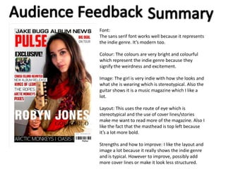
1. Font:
The sans serif font works well because it represents
the indie genre. It’s modern too.
Colour: The colours are very bright and colourful
which represent the indie genre because they
signify the weirdness and excitement.
Image: The girl is very indie with how she looks and
what she is wearing which is stereotypical. Also the
guitar shows it is a music magazine which I like a
lot.
Layout: This uses the route of eye which is
stereotypical and the use of cover lines/stories
make me want to read more of the magazine. Also I
like the fact that the masthead is top left because
it’s a lot more bold.
Strengths and how to improve: I like the layout and
image a lot because it really shows the indie genre
and is typical. However to improve, possibly add
more cover lines or make it look less structured.
2. Font: The font of the contents page is keeping to the
house style. It is sans serif and bold which looks a lot
more appealing and suits the target audience.
Colour: There is a consistent colour scheme which
makes it look better and you have used indie colours
which represent the genre. The black and white
makes it a lot more masculine which is good.
Image: There are different bands/artists used which
is good. The people look very indie with their
clothes and the props used. The use of pictures
makes me want to read further.
Layout: I like the column on the right side of the
page. The list of contents makes the page seem a lot
more full of information. The subscription offer is
also stereotypical and makes it a typical magazine.
Strengths and how to improve: I like the right
column a lot and the heading with the date as it is
stereotypical for a contents page. To improve, I think
the cover stories need to look more professional.
3. Font: The font is quite bold and exciting. It is sans serif, the pull quote font looks good because
it’s very different to the others and stands out which is what is useful in a magazine.
Colour: The colour scheme is good because it is masculine and keeps representing the genre.
Image: The image on the left is good because it stands out and looks good with the shadow. It
represents indie by the style of the image.
Layout: The article on the right is stereotypical with the image on the left. Also the pull quotes
are signify how cluttered and different it is. Also the structure of the heading and title looks
good because its all going down into the main article.
Strengths and how to improve: I like the image and the use of pull quotes is good. However I
think you should change the article and maybe add more colour to make it look appealing.