House style and design elements in a music magazine article
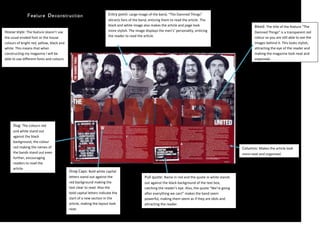
1. House style: The feature doesn’t use the usual eroded font or the house colours of bright red, yellow, black and white. This means that when constructing my magazine I will be able to use different fonts and colours.Bleed: The title of the feature “The Damned Things” is a transparent red colour so you are still able to see the images behind it. This looks stylish, attracting the eye of the reader and making the magazine look neat and organised.Columns: Makes the article look more neat and organisedDrop Caps: Bold white capital letters stand out against the red background making the text clear to read. Also the bold capital letters indicate the start of a new section in the article, making the layout look neat.Pull quote: Name in red and the quote in white stands out against the black background of the text box, catching the reader’s eye. Also, the quote “We’re going after everything we can!” makes the band seem powerful, making them seem as if they are idols and attracting the reader.Slug: The colours red and white stand out against the black background, the colour red making the names of the bands stand out even further, encouraging readers to read the article.Entry point: Large image of the band, “The Damned Things” attracts fans of the band, enticing them to read the article. The black and white image also makes the article and page look more stylish. The image displays the men’s’ personality, enticing the reader to read the article.41998908566151447800857250<br />