2. WWW’s and EBI’s
• WWW:
- The message was clear and was easy to understand.
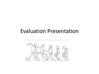
- The animation was based on the actual charity (Teenage Cancer
Trust) and didn’t go off the topic.
- None of the animation was copy right it was all done first hand in a
classroom.
• EBI:
- We needed to add some colour to the animation so it can be easier
to understand and it’ll look more professional.
- Correct some of the spelling mistakes and edit them back into the
animation.
- Put in a voice over into the animation we can talk about the charity
as well as showing it in the animation.
3. Outcome of the animation
• The overall outcome of the animation was
really good. We didn’t think we would get that
much feedback regarding how good/ bad it
was but it was really good. We know as a
group we could've tried harder in the
animation to make it more professional. We
feel we should’ve added some colour to the
animation which would’ve added a bit more
of an affect. But overall we thought the
outcome of the animation was brilliant.
4. The editing and effects
• The outcome of the editing and effects overall
was really good.
- Editing: the editing that was put into the
animation was really good as we had to delete a
few parts of the animation to make it, to what it
is now.
- Effects: The effects that were added into the
animation such as the music was spot on it
related to the animation and its was calm and
relaxed which patients of the teenage cancer
trust want to feel.
5. Audience
Q: Did you think the message was clear?
A: Yes I thought the message was clear. Thought it should
what the teenage cancer trust do and what they’re trying
to put across.
Q: What would you do to improve the animation?
A: I would add some colour to the animation to make it
look more professional, and also some spelling mistakes.
Q: Do you think the animation was put well together?
A: I think overall the animation was well put together
with a bit more editing I would see it being an advert
representing the teenage cancer trust.