2. “The ways in which my product challenge the conventions of real
media products”.
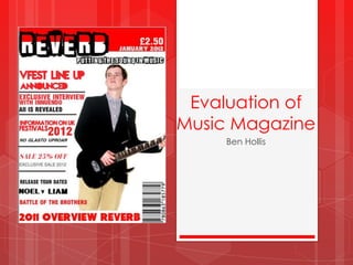
I feel that I have challenged the forms and conventions of real media
products, in this case music magazines, very well considering the
limited software which was available. Throughout the production of my
magazine I looked at various professionally produced magazines
which I researched and incorporated some of the conventions such as
layouts and font styles into my magazine.
I used a popular magazine layout with cover lines on the left which
slightly overlap the central image, which I think makes it look realistic
and informative but not too cluttered. The reason for this layout was
because it follows the conventions of other magazines on the market
but doesn‟t look too compact and hard to read. I feel that I have
followed the “Route of the eye” Concept fairly well which entices my
target audience to look at all of the aspects of the front cover at first
look.
3. - Layout Evaluation
The “route of the eye”
concept is shown on my
own magazine and „Q‟
magazine. Both
Magazines show the
concept as the reader of
the magazine will firstly
recognise the company
who produced the
magazine in my case
„Reverb‟. The eyes of the
reader will then follow
down and across to the
central/main image that
the producer has used on
the front cover. The reader would then look in more
depth at the cover lines and articles which are
incorporated in the magazine on the left hand side of
the page. Finally, before turning the page they will
look at the bottom of the page for any further cover
lines, pull quotes or article titles.
I feel the layout and concept I have used complies
with professional; magazines as shown here.
4. -Font Styles
I tried to use a variety of font styles within my magazine as from my research I
noticed that the cover lines on the front cover of magazines showed a wide
range of font styles. I also used bold and casual font styles for my cover lines
as this related to the Indie rock genre very well.
This is an example of one of my bold cover
line fonts which clearly stands out really well
and looks like a professional magazine font that
would be used. I also used a variety of font colours so it made the magazine
look more appealing to the eye.
I tried to develop the title font title to make it look how the music it is related to
sounds. I made the title font look „rough‟ yet „bold‟ like the sound of indie
rock music. I also made it look cracked as if the distorted music has cracked
the title
5. Colours and Mode of Address
The colour scheme I used for the my magazine was clearly Red/White/Black.
The colour of Red was used as the dominant colour to contrast with the white
and make titles and cover lines stand out. I thought the colour scheme was
appropriate as it was favoured by my focus group and I also thought it was
relevant to the Indie-rock genre. I also took into consideration of what the
colours symbolised for example the Red symbolises aggro and Envy which
relates to the style of music the genre is related to.
I feel that the language I used didn‟t necessarily address my audience. To
improve I could have used some slang language to address the teenage
audience like some abbreviations that are often used.
6. Images
I used a selection of images that I took for myself using a high quality
camera. The images I used in the magazine showed a variety of shot types
which I think work quite well and are pretty effective.
This shot which I used for my
main image on my front cover is
taken at a slightly low angle, this
gives the effect of authority on
the artist and makes him look
like a musical icon. I took the
image on a white background
and changed the contrast to Noah and the whale
erase the rest of the
background. This was effective
because the background was
irrelevant and considering the
background colour of the
magazine is white I knew it
would stand out well. I chose
the costume for this image
which consists of chino trousers
and a smart suit jacket which is
iconic to indie rock artists.