2. After I decided which image I was going to use for the
double page spread I edited it to make the aesthetics
more professional.
3. I set up my columns
Headline and first paragraph of article on the 1st page and the
second and third paragraph of the article on the 2nd page
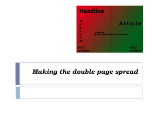
4. I decided to make the headline big, bold and aligned in the top left corner of
the page in colour black so it stands out, I didn’t use a subhead because I
also made it part of the headline.
I used a drop cap in capital letters in colour white contrasting with the
background image however I did not use a end dot instead I ended the
article with a rating for the mixtape review, which acted as my end dot.
I have a gutter
I incorporated my pull out quote into my article using quotation marks “ ” but
I didn’t make it stand out
My page numbers are in white and they noticeable
And I decided to break the codes and conventions of music magazines
double page spreads so Instead of placing the 2nd part of the article in 2
columns I placed it as a normal paragraphs.