Call Girls Chirag Delhi Delhi WhatsApp Number 9711199171
Love Cinema Magazine Analysis
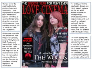
1. The text above the The font I used for the
masthead typically masthead is Georgia size
contains important 156. It is easily readable
information. I have and the red, which
highlighted the ‘biggest denotes violence and
year’ in red as this blood (perhaps
signifies something of foreshadowing for the
significant importance, magazine’s contents and
attracting consumers appeals to my target
to the magazine. I have audience). It grabs
used RepriseStamp size attention through the
30 font as it is clear traffic light theory. The
and easy to read. title is bold, and isn’t too
obstructed by the image.
I have taken inspiration
and conventions from
magazines such as Q, The title is larger (Sathu
Empire, Vanity Fair and size 30) than the content
NME. This content features. Signifiers such
feature box is similar to as ‘essential’ entice
one found on a NME consumers to know what
cover but it applies for it is. ‘Preview’ signifies
film magazines too. A something that is new
mistake I made on my and up to date, a typical
first attempt was that convention of magazines
my content features and a major selling point.
was too cluttered, so
the box successfully
segregates the
information.
2. I have cut around the
image and placed it
over the background. I
I have used a target/gun
have done this so that
symbol by the content
the background of
features as it denotes
trees can be edited so
violence and war, which
that it looked darker,
features in the movies
therefore suiting the
listed beside it. This
genre of the film, and
appeals to my sixteen to
the figures can be
twenty five year old
separately edited so
target market.
not to hinder the
darkened effect of the
trees. I have lightened
the figures slightly as This follows on the
their faces weren’t natural eye flow of the
clear when they were reader, signifying that
dark. it is the main content
feature. ‘On set’ refers
The OhTheHorror font to firsthand, exclusive
used for this contents information that would
feature is appeal to the audience.
conventionally “You’re sure of a big
associated with horror surprise” refers to a
films. The red denotes line in the trailer, so
blood and violence, readers can make that
again foreshadowing assosiation.
the content of the
films. I have used an
image for another film
to promote it.
3. The subjects are
wearing dark clothes,
fitting the genre of the
film and the magazine.
The band shirts and
leather jackets represent
a youth and music
subculture, appealing to
the market of young
people, who are my
target audience.
I have used the same
font, Requiem, for my
In order to make my cover as I used on the
cover look more movie poster and trailer.
authentic and I have done this so that
professional I have the font would become
included a bar code, associated with the
date and issue movie and aid
number. This conforms promotion.
to typical magazine
conventions.