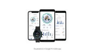
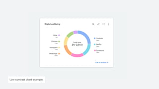
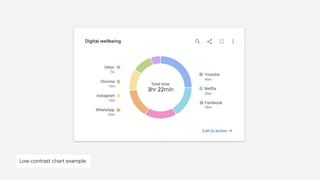
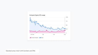
Lessons Learned
From Our Accessibility-First
Approach to Data Visualization
@KentTheHuth #DataAccessibility
Kent E Eisenhuth, Datavis Lead, Google
UXDX America 2023
THE CHALLENGE
Chart accessibility is difficult
Visualization of worldwide COVID-19 cases
Visualizations in Google Fit mobile app.
Visualization of a query plan in Google Cloud
Topic source: Dr. Steven Franconeri
Raspberries on a bush
Topic source: Dr. Steven Franconeri
2D representation of raspberries
Gestalt patterns
Visualization of worldwide COVID-19 cases
Visualization of worldwide COVID-19 cases: central field loss simulation
Visualization of worldwide COVID-19 cases: peripheral field loss simulation
Visualization of worldwide COVID-19 cases: blindness simulation
WHY IT MATTERS
In the United States:
4M+ people in America use assistive technology.
41M people have a disability.
World-wide
≈300M people have a color vision deficiency.
Sources: Census.gov; StackExchange.com; Colorblindawareness.org
Accessibility icon
@KentTheHuth #DataAccessibility
LESSON LEARNED
Data Accessibility is difficult.
@KentTheHuth #DataAccessibility
1
How might accessibility standards
empower better visual design?
USEFUL, GLANCEABLE,
YET ACCESSIBLE
Part 1
Low contrast chart example
Low contrast chart example: protanopia
Low contrast chart example: grayscale
WCAG2.1 COMPLIANT PALETTE
Image source: Google Cloud: Using the Logs Explorer View A visualization of cloud logs over an hour
A visualization of cloud logs over an hour
Image source: Google Cloud: Using the Logs Explorer View
LESSON LEARNED
A combination fills and borders enables
you to focus on what matters.
@KentTheHuth #DataAccessibility
Low contrast chart example
Chart with improved color contrast
Pie chart with textures as an encoding
CHALLENGE
How might we make charts accessible
while minimizing chartjunk?
@KentTheHuth #DataAccessibility
Donut chart with proper color contrast.
Donut chart with in-line labels
Stacked area chart with borders and fills
Stacked area chart with directed focus
Small multiples as an accessible alternative
Status icons in tables
Finding inspiration in nature: A murmuration of starlings
Visualizing weather impacting a satellite network
Halftone printing
Accessible heatmaps
Left & Right: Guggenheim Museum, New York City
Animation to improve comprehension
LESSON LEARNED
Consider accessibility first to get to the
best possible design.
@KentTheHuth #DataAccessibility
Heatlane visualization
Topic source: Dr. Steven Franconeri
Raspberries on a bush
2
USEFUL DATA
EXPERIENCES WITH
ASSISTIVE
TECHNOLOGY
Part 2
How might we create a useful
multisensory experience?
Build a diverse team and work with
people who use assistive technology
@KentTheHuth #DataAccessibility
LESSON LEARNED
How might we structure the chart so it’s
easy to navigate with a keyboard?
@KentTheHuth #DataAccessibility
CHALLENGE
Visualization of LinkedIn connections
Source: LinkedIn (graph tool has been deprecated)
HIERARCHICAL NAVIGATION
Network Group Individual
Visualization of LinkedIn connections
Source: LinkedIn (graph tool has been deprecated)
FLATTENED NAVIGATION
Individual Individual Individual
Network
Visualization of LinkedIn connections
Source: LinkedIn (graph tool has been deprecated)
Consider using alternative keys,
shortcuts and other methods for
helping people quickly find answers to
questions they’re asking of the data.
@KentTheHuth #DataAccessibility
LESSON LEARNED
How might we use text to prioritize data
exploration and surface insights?
@KentTheHuth #DataAccessibility
CHALLENGE
Visualization of worldwide COVID-19 cases: blindness simulation
Map showing cholera cases in London in 1854
Source: Google Search: ‘GOOG’
Chart displaying Google Stock performance
Source: Battling Infectious Diseases in the 20th Century: The Impact of Vaccines, WSJ
Visualizing the effects of the measles vaccine.
How might we create a useful
screen reader experience?
@KentTheHuth #DataAccessibility
CHALLENGE
Always orient people
within the dataset. Indicate
where they are, where they
came from and where they
can go next.
LESSON LEARNED
@KentTheHuth #DataAccessibility
Sankey diagram on assistive technology
Providing an accessible
way to view the data in a
table or spreadsheet can
be a valid option.
Test it!
Data table of status and signals
@KentTheHuth #DataAccessibility
LESSON LEARNED
How might we leverage other senses
when representing data?
@KentTheHuth #DataAccessibility
CHALLENGE
Photo of elevator lobby Source: Forms + Surfaces
Data sonification can be part of the
chart’s core experience.
@KentTheHuth #DataAccessibility
LESSON LEARNED
3
MAKING IT HAPPEN
Part 3
How might we prioritize and execute
this work?
$1T market for consumers
with disabilities (2017).
THE BUSINESS CASE
Source: Jean-Baptiste, Build for Everyone
@KentTheHuth #DataAccessibility
Charts, graphs and visualizations
will block accessibility audits.
@KentTheHuth #DataAccessibility
LESSON LEARNED
Data Accessibility Working Group website
go/data-accessibility
WHAT WE’RE DOING
Learn Collect Share
Maximizing community
engagement requires a
balance of activities.
● Guest presentations
● Design reviews
● Brainstorming time
● Contribution time
go/data-accessibility
LESSON LEARNED
Keyboard navigation on a Sankey diagram
Data Accessibility Working Group website
TOP TIPS FOR CREATING ACCESSIBLE VISUALIZATIONS
● Facilitate comparisons
● Be a helpful guide
● Focus on what matters
● Provide structure
● Embrace flexibility
● Exceed expectation
material.io/blog
Illustration of top chart a11y tips.
A NOTE ABOUT PROCESS
Sketches and photos from a design workshop
Drawing Product Ideas
Fast and Easy UX Drawing for Anyone
● Foreword by Manuel Lima
● Find it on Amazon
● Find it on Wiley.com
discount: DPI20
#DataAccessibility
#DrawingProductIdeas
Drawing Product Ideas book
A PARTING THOUGHT
THANK YOU
@KentTheHuth #DataAccessibility
ACKNOWLEDGEMENTS
● Andrew Carter
● Chris Mitchell
● Danny Farra
● Gerrit de Vries
● Guy Kohen
● Gerard Rocha
● Ian Hill
● James Wexler
● Jane Chang
● Jen Kozenski Devins
● Jennifer Yuchi
● Jesse Zackery
● Jess Klos
● Jialin Yun
● Julián Gonzalez
● Kai Chang
● Lisa Kaggen
● Mags Sousa
● Manuel Lima
● Martin Wattenberg
● Nicholas Cottrell
● Olga Prilepova
● Peter Vachon
● Rebecca Plotnick
● Robinson Eaton
● Saurabh Kumar
● Sierra Seeborn
● Shuo Yang
● Tom Hoddes
● Travis Alber
● Tyler Williamson
● Young Choi
@KentTheHuth #DataAccessibility
THANK YOU
Kent Eisenhuth
Staff UX Designer, Google
● Twitter: @KentTheHuth
● linkedin.com/in/kenteisenhuth
● kent.eisenhuth@gmail.com
#DataAccessibility
#DrawingProductIdeas
● Data Accessibility is difficult.
● Charts, graphs and visualizations will block accessibility audits.
● Build a diverse team and work with people who use assistive technology.
● Apply a combination of fills and borders to focus on what matters.
● Consider accessibility first to get to the best possible design.
● Consider using other keys, shortcuts and alternative methods for helping
people quickly find answers to questions they’re asking of the data.
● Consider providing an accessible way to view the data in
a table or spreadsheet.
● Data sonification can be part of the chart’s core experience.
● Designing for accessibility can benefit everyone.
@KentTheHuth #DataAccessibility
LESSONS LEARNED

Lessons Learned From Our Accessibility-First Approach to Data Visualization