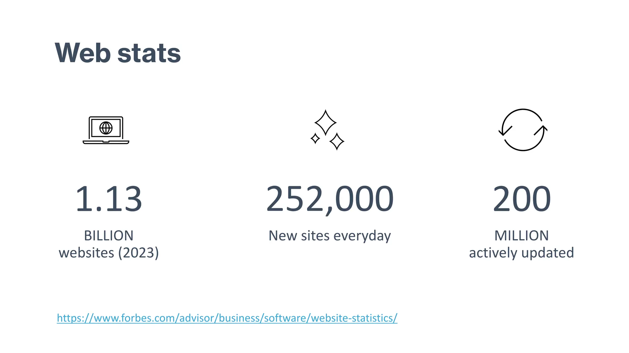
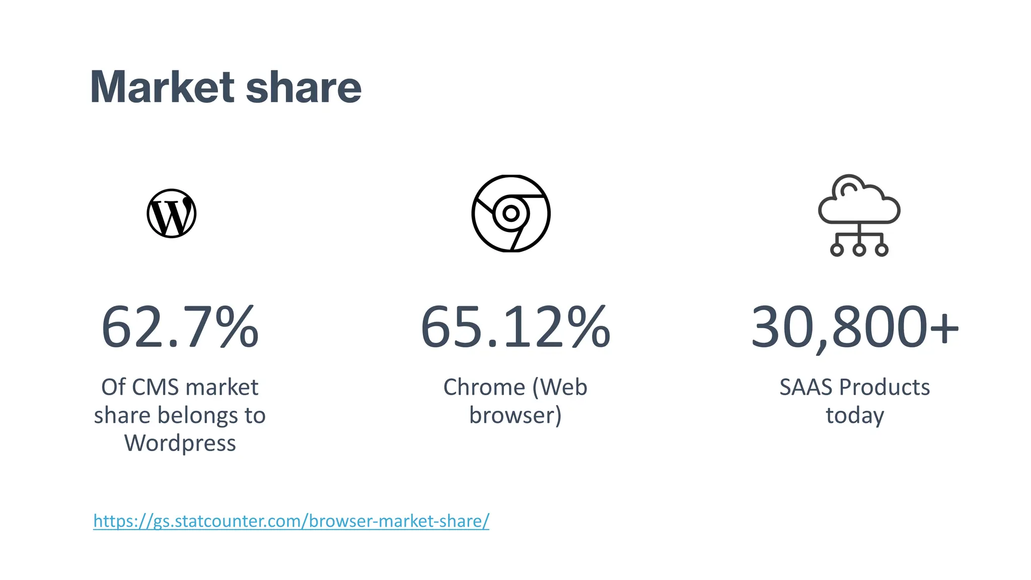
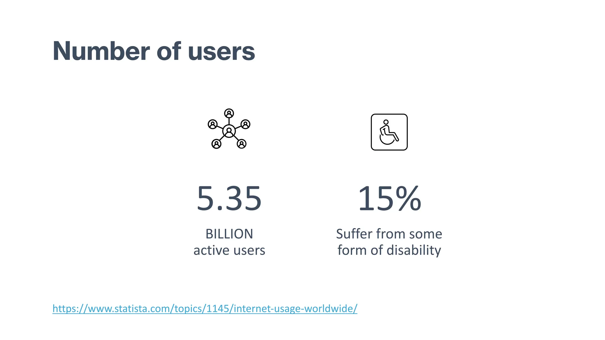
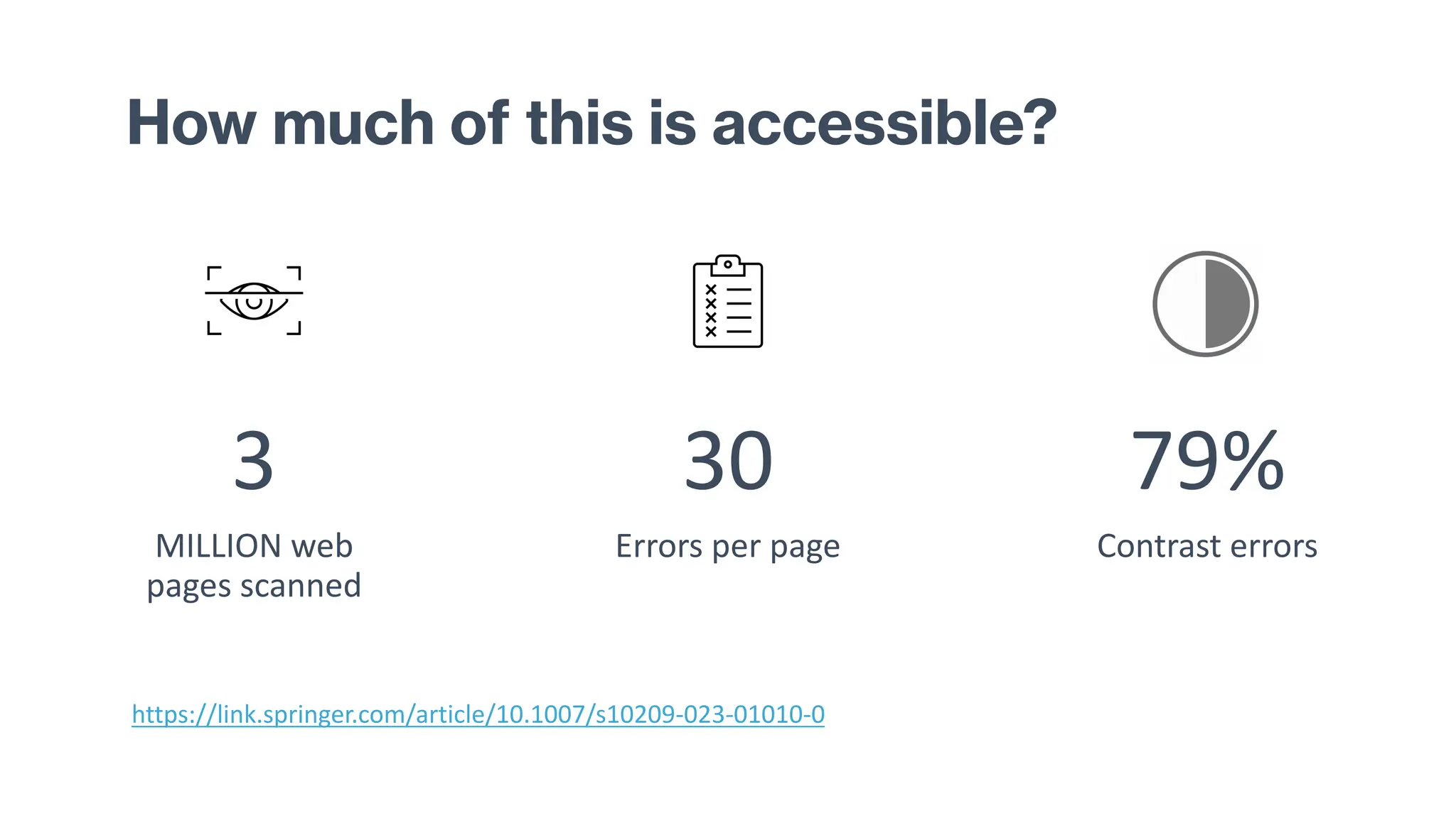
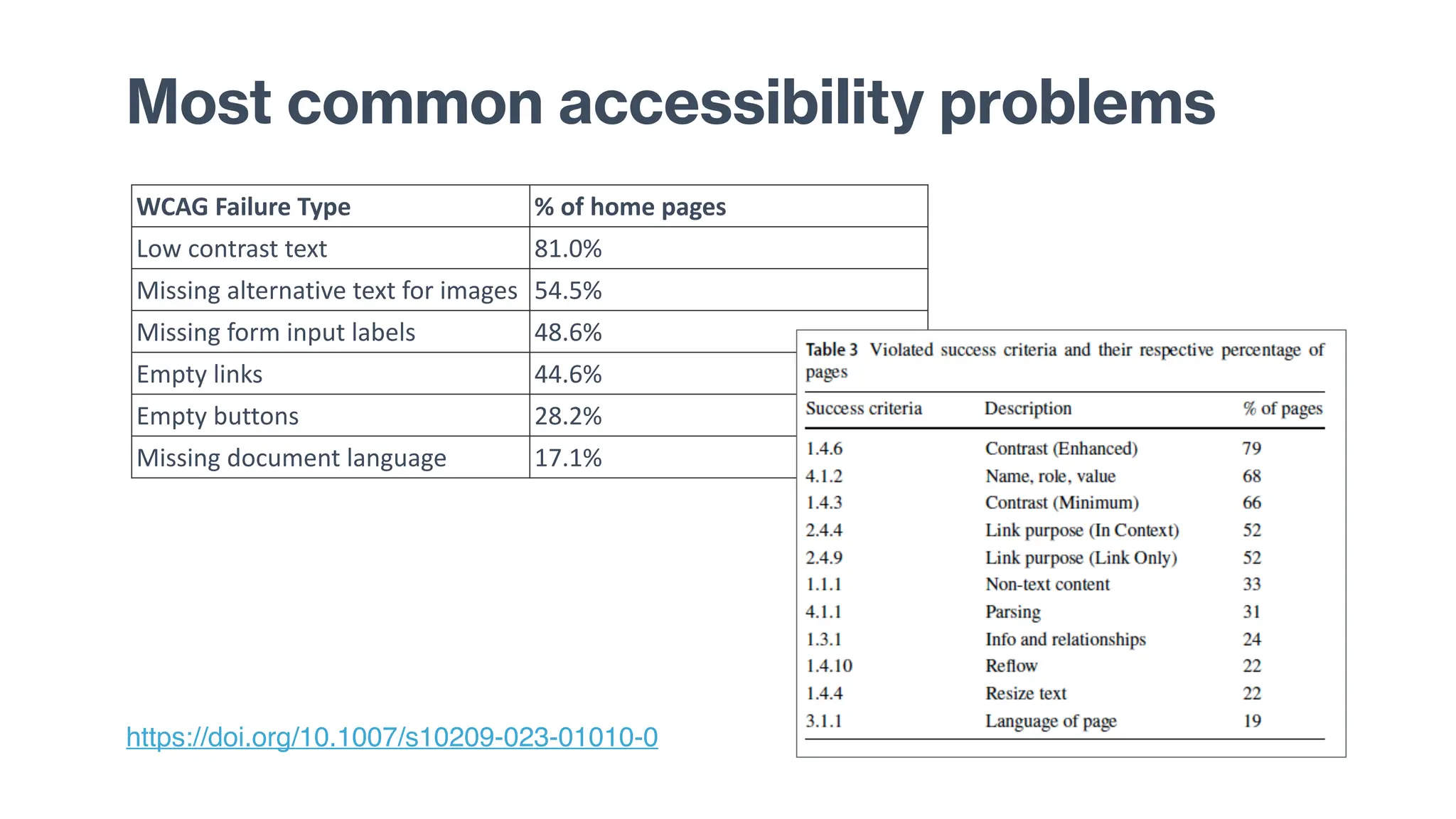
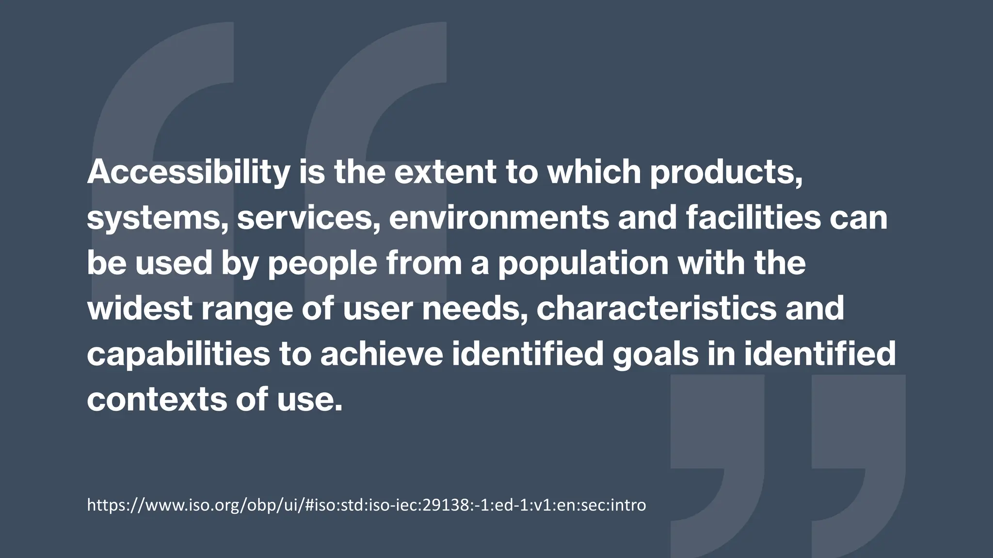
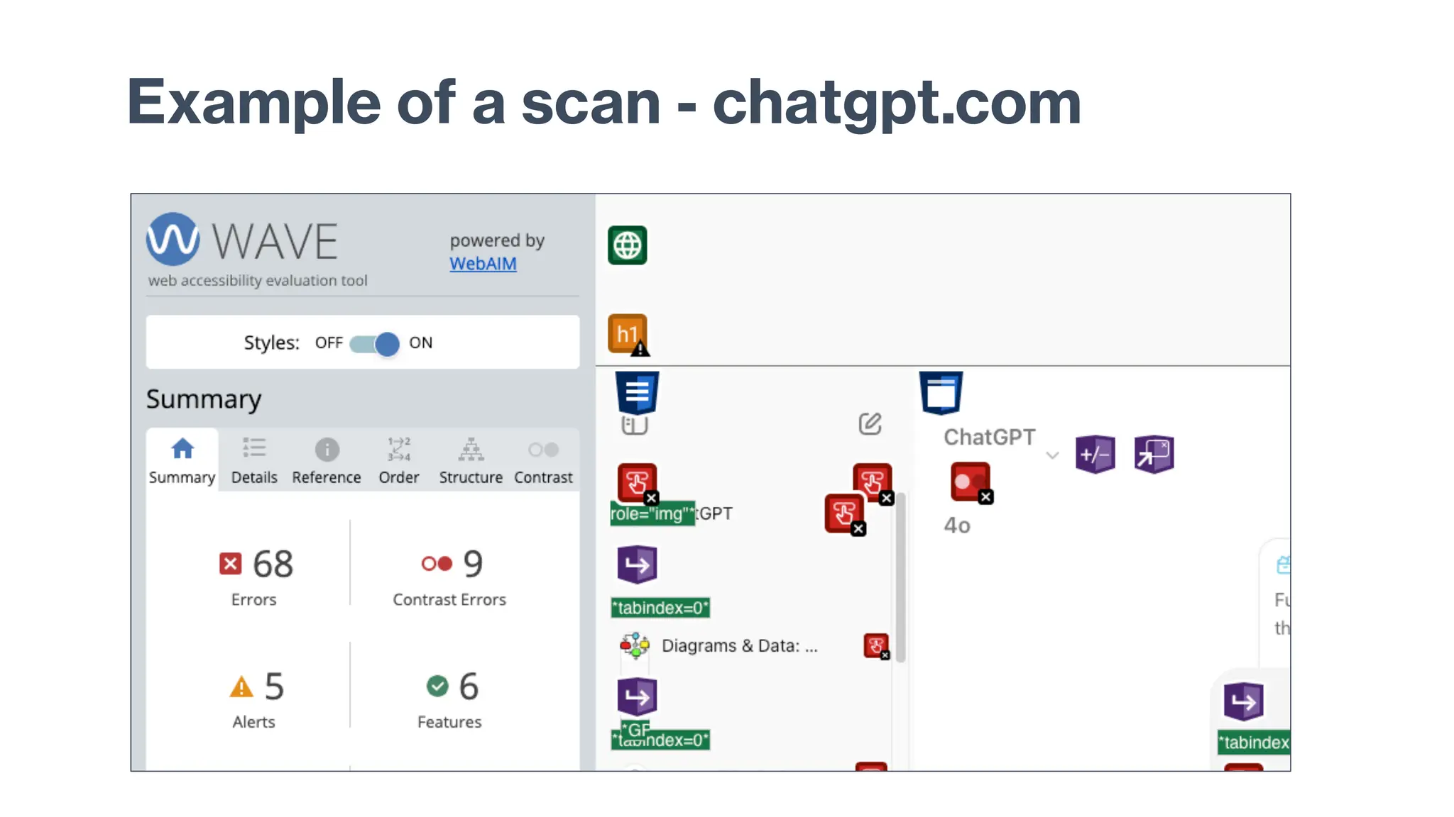
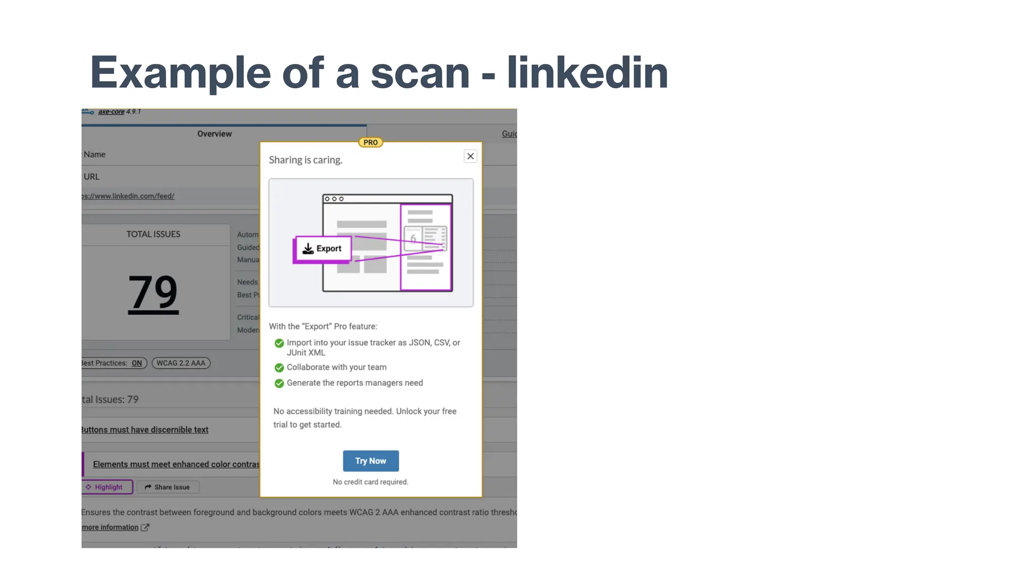
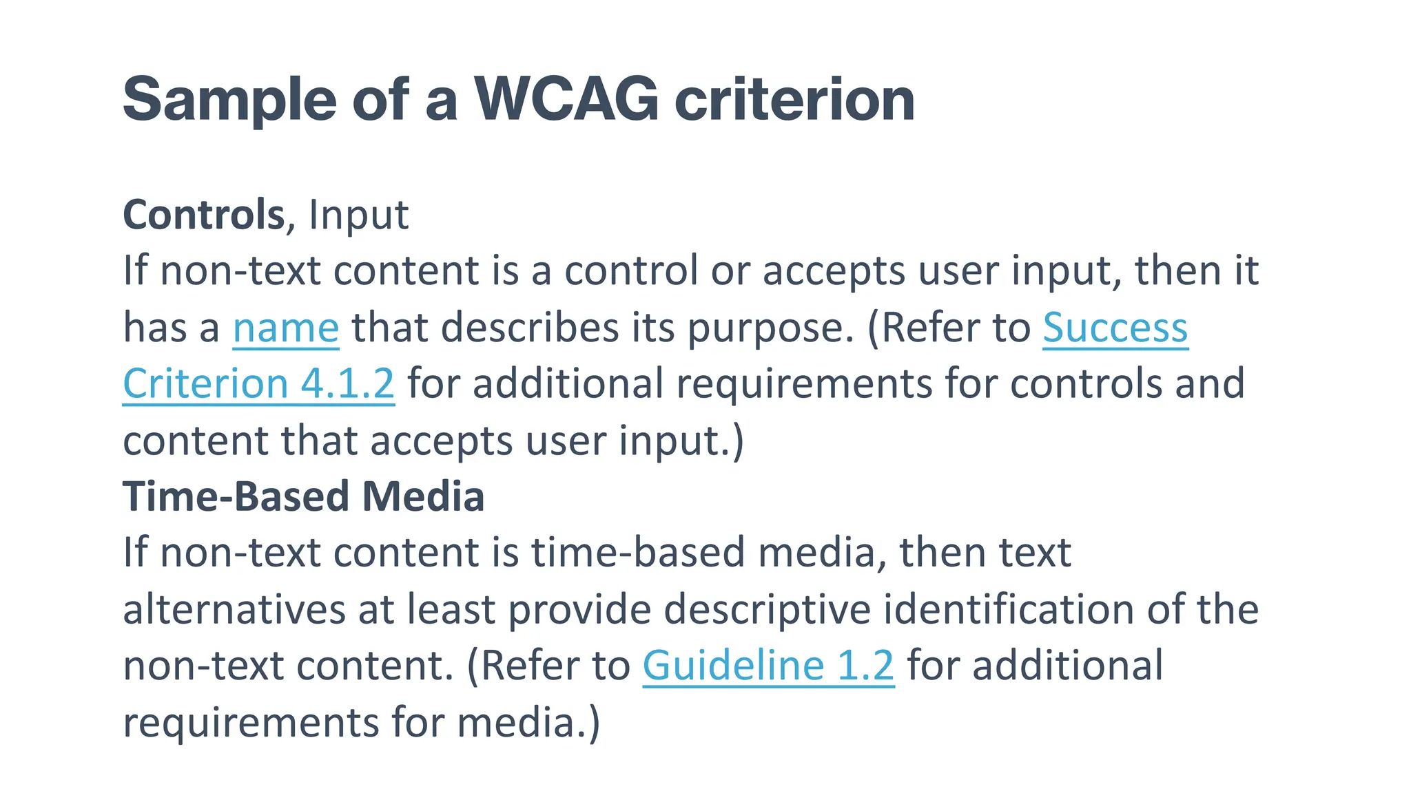
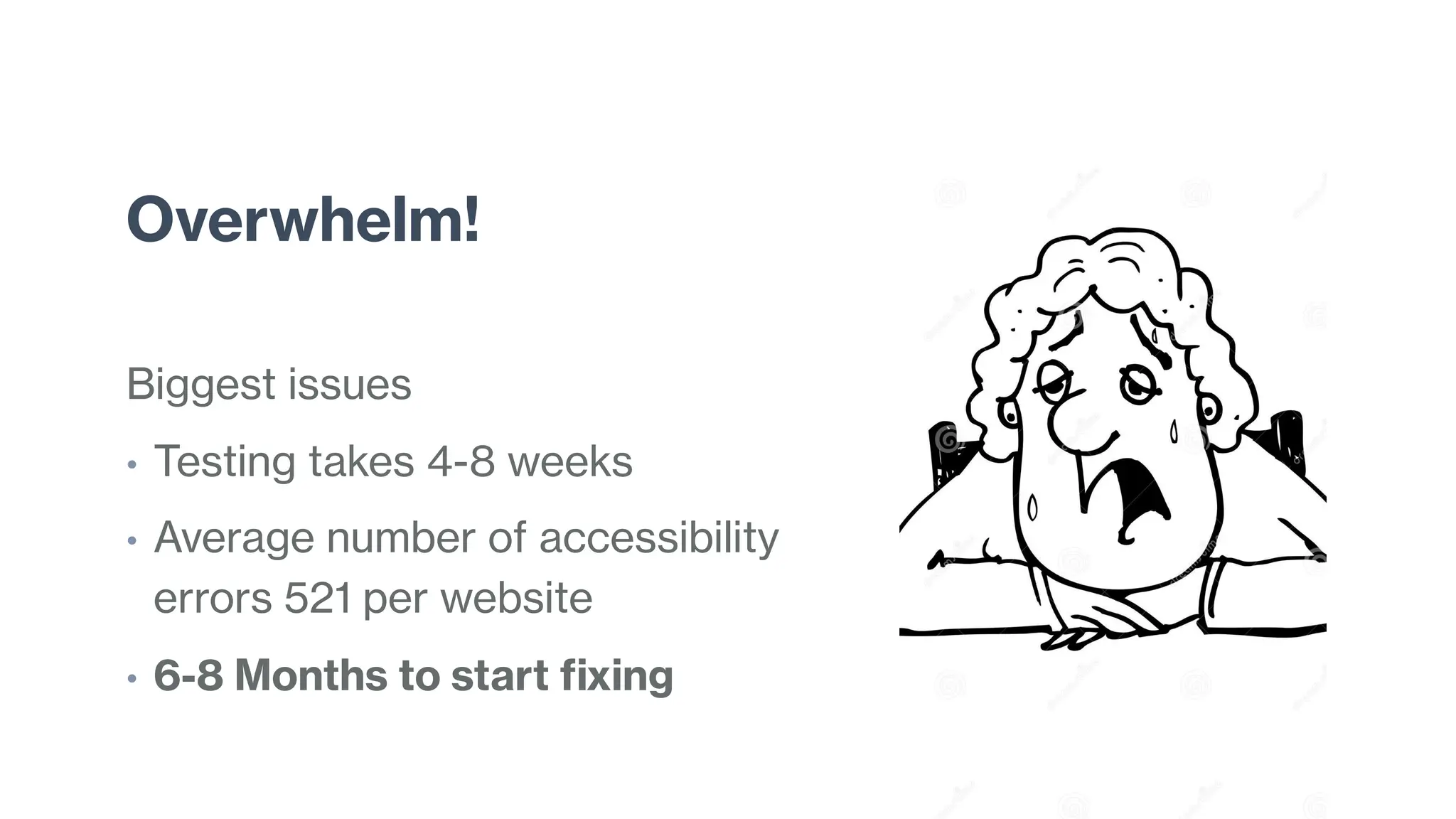
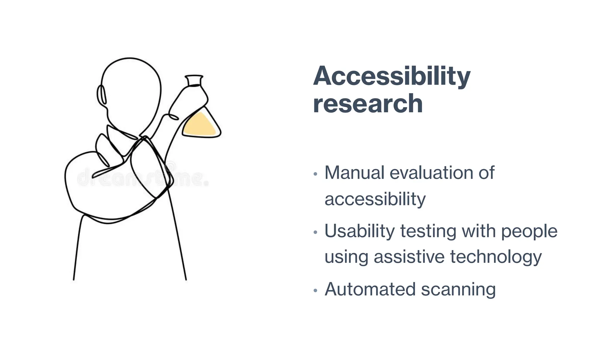
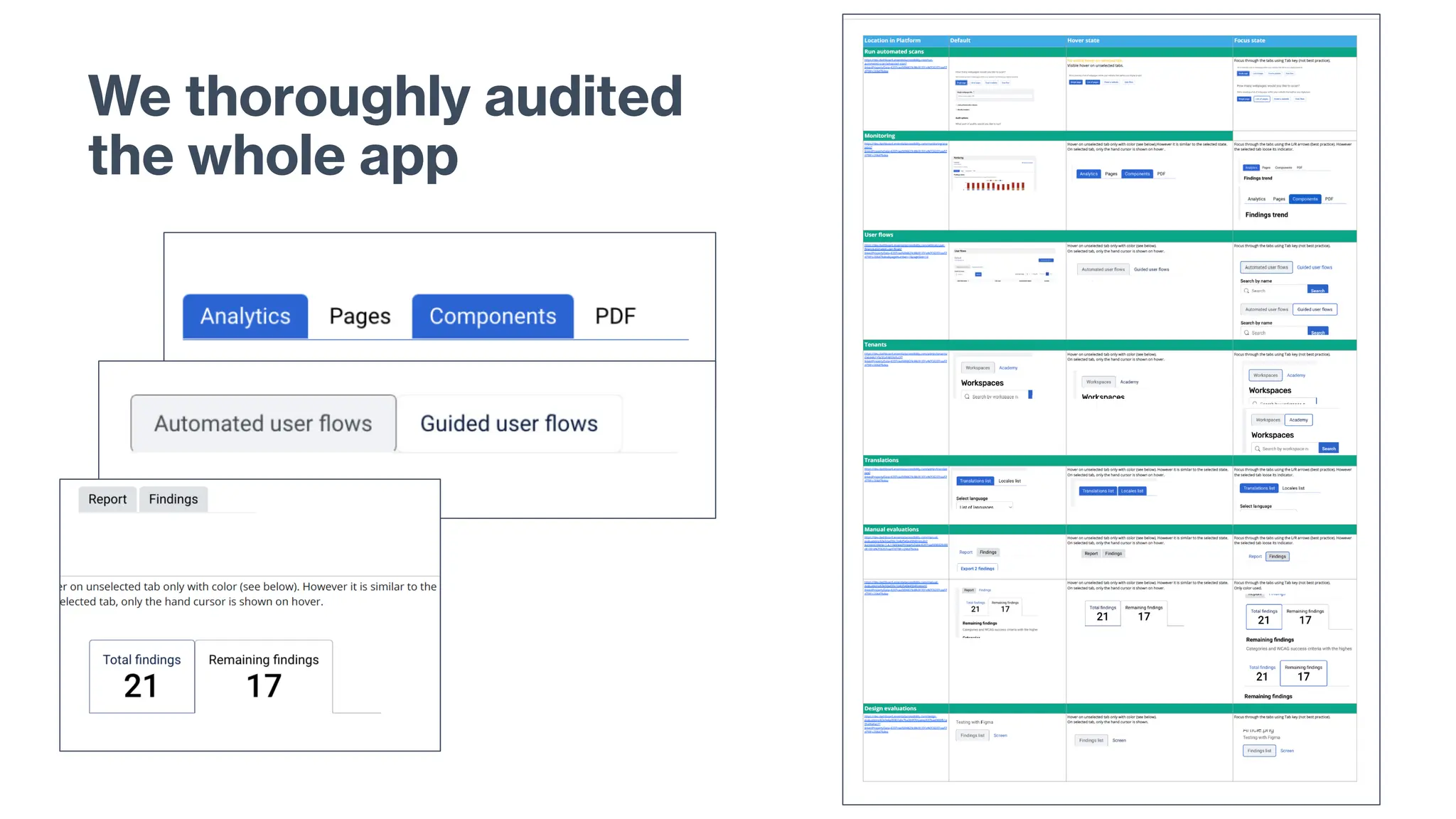
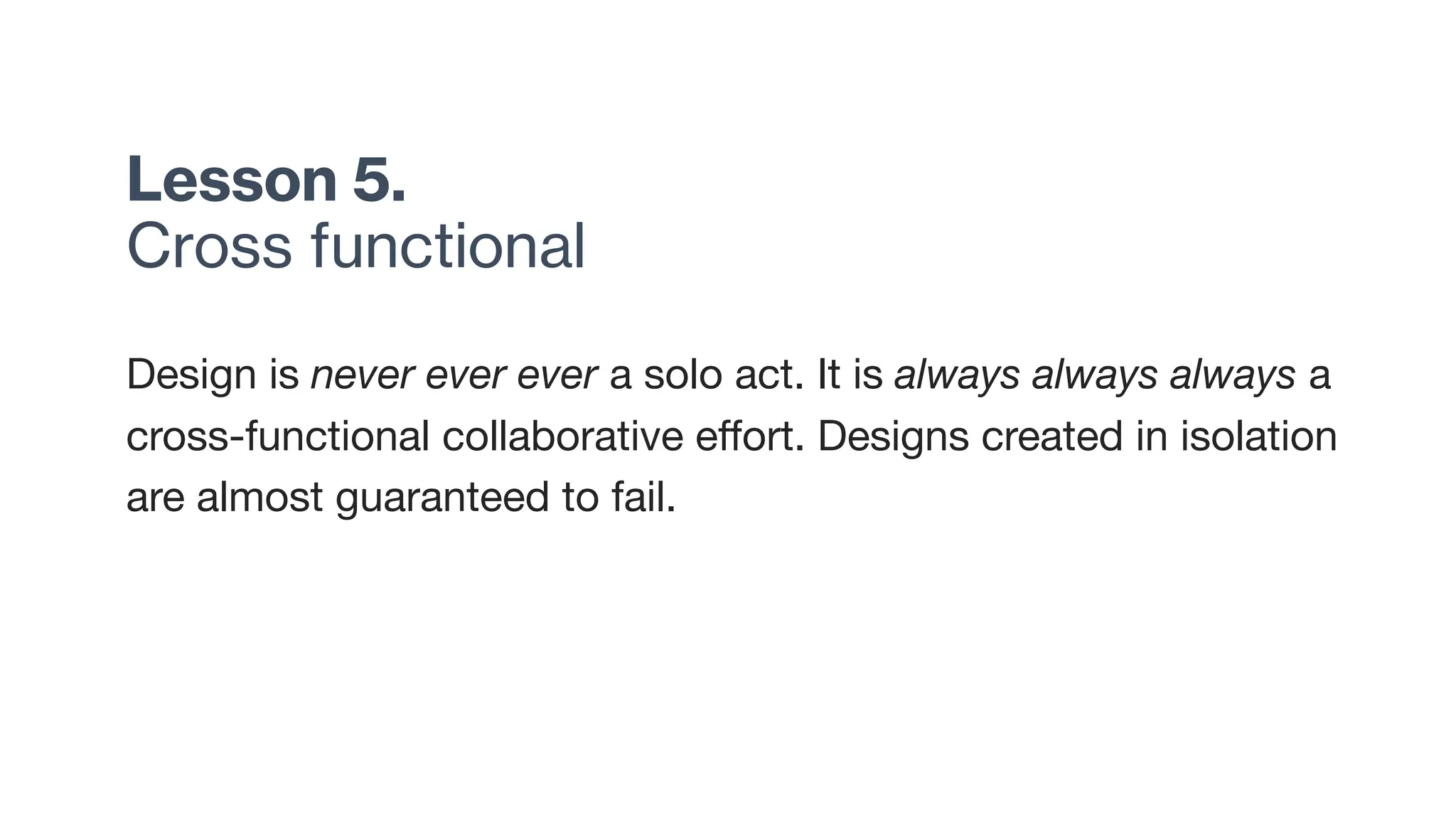
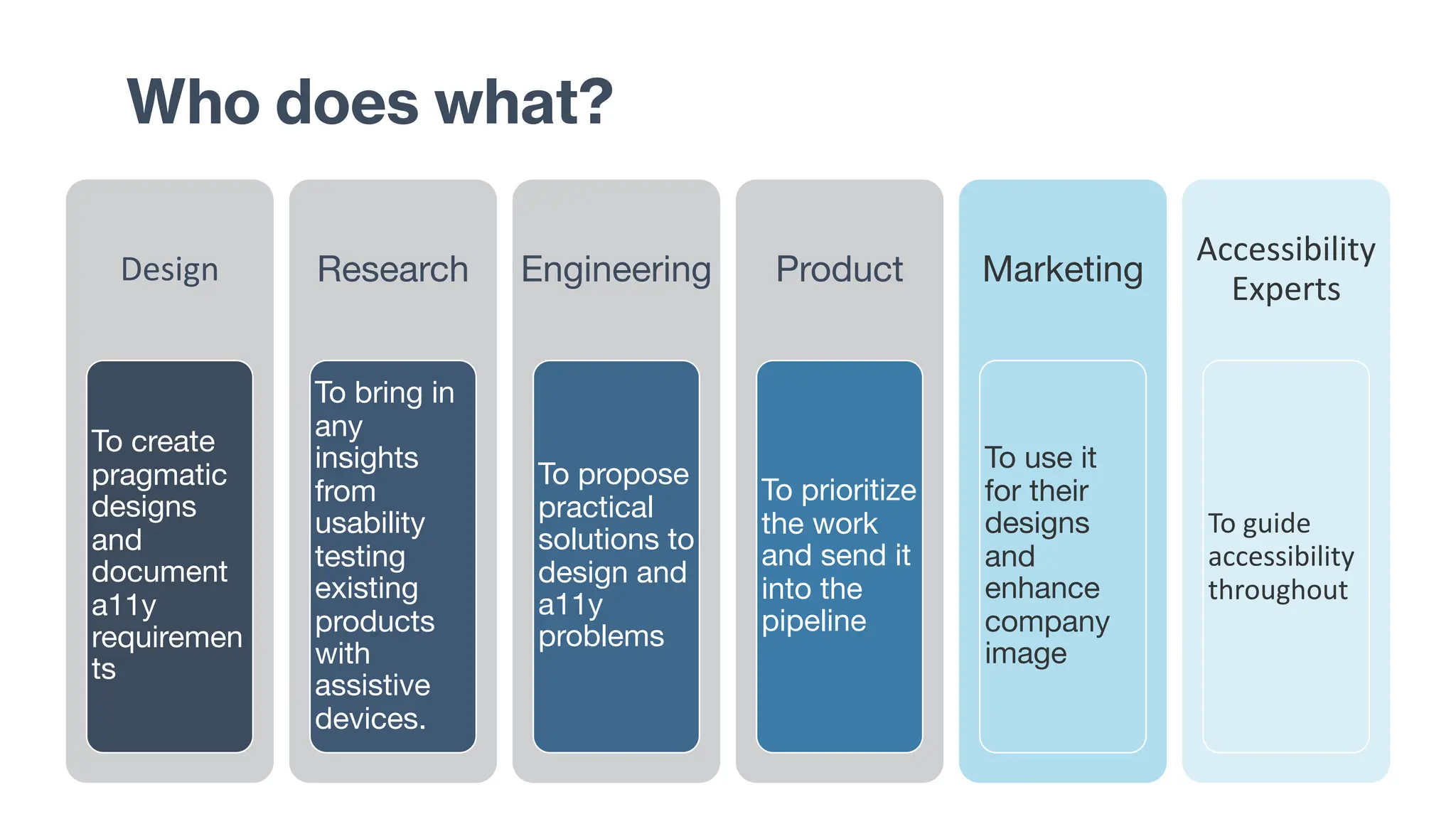
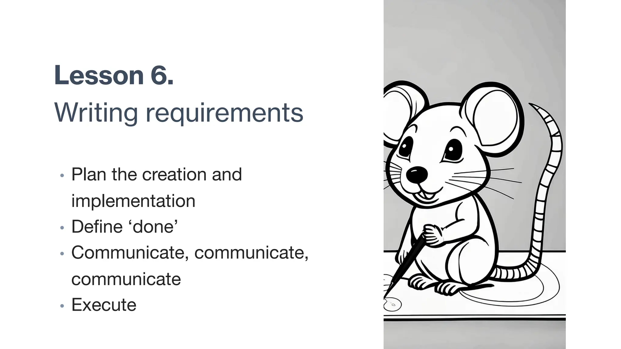
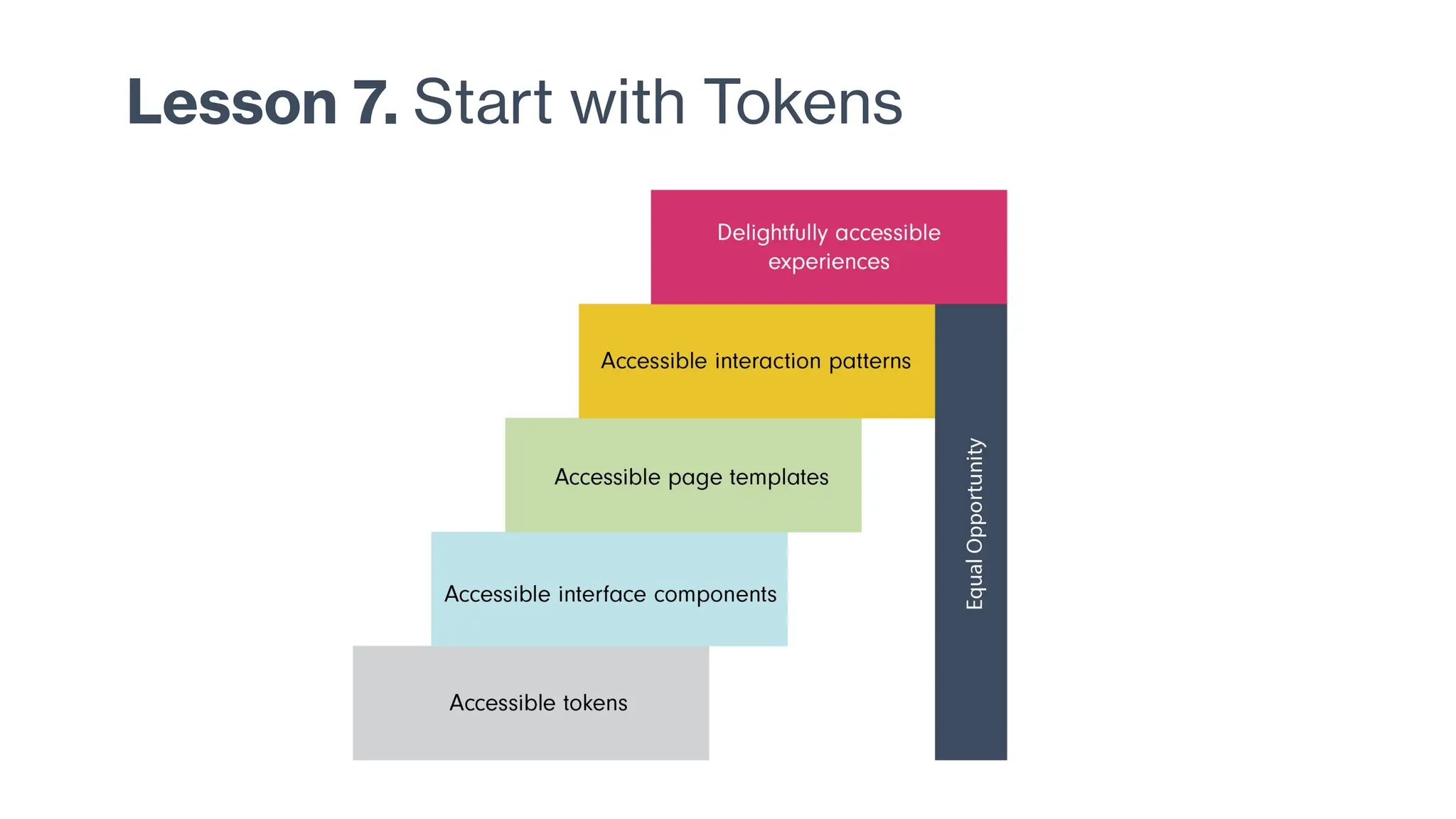
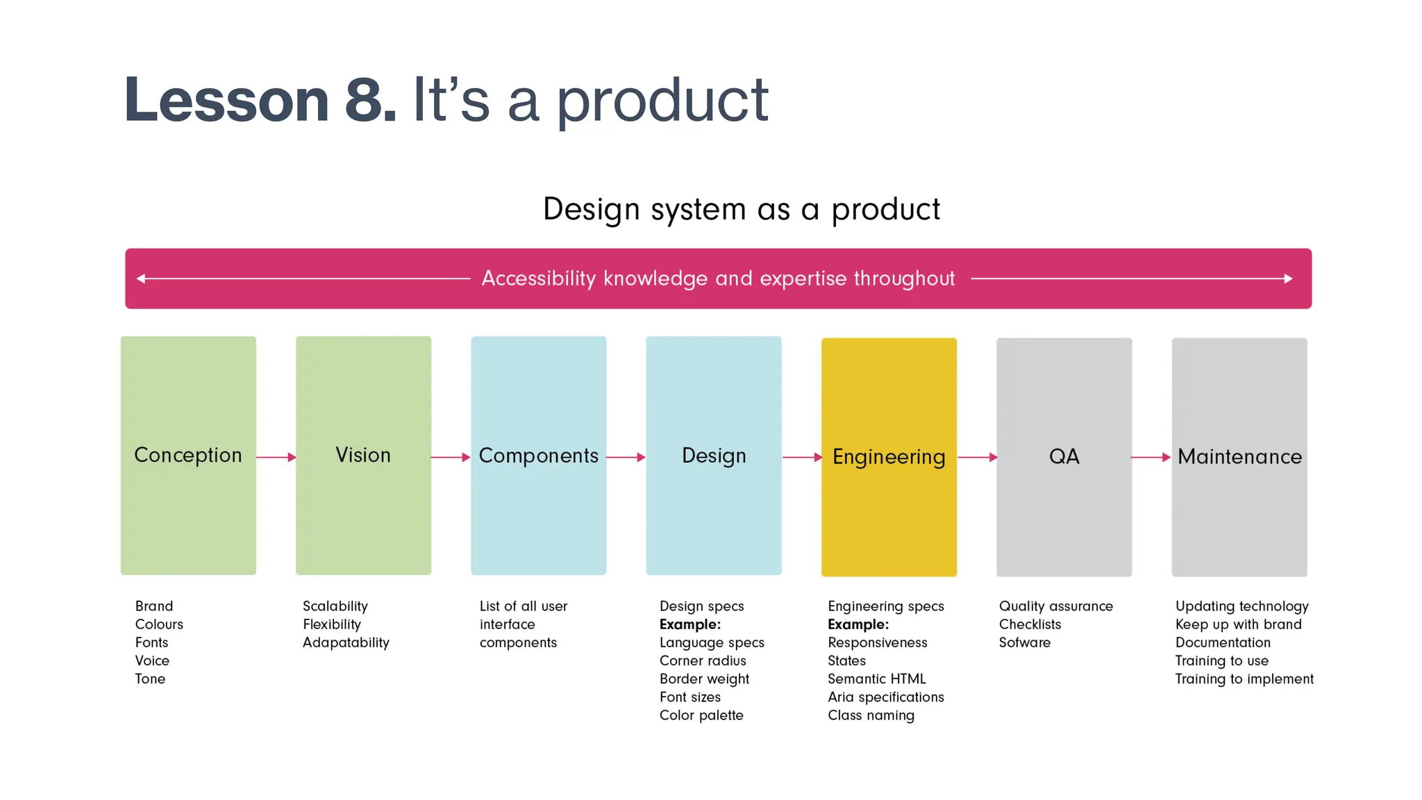
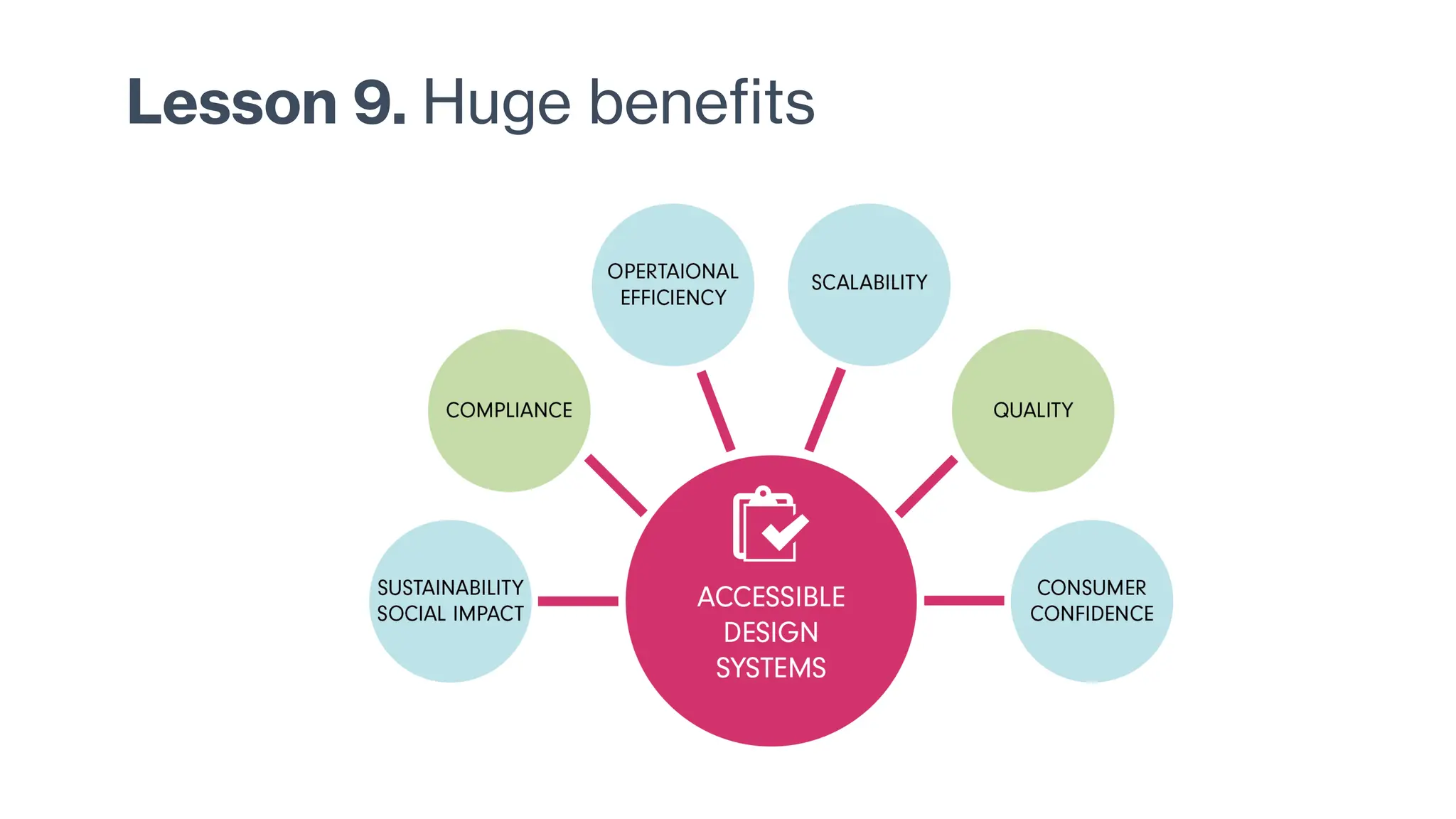
Baking Accessibility into Design
Lessons from Crafting an Accessible Design System
Agenda
• If you give a mouse a
cookie…
• Stats at scale
• Are we insane?
• Cookie crumbs
(lessons learned)
1999
WCAG 1.0 was published in 1999
How much of this is accessible?
1
MILLION websites
scanned
95.9%
Home pages failed
WCAG AA
81%
Low contrast errors
https://webaim.org/projects/million/
Web stats
1.13
BILLION
websites (2023)
252,000
New sites everyday
200
MILLION
actively updated
https://www.forbes.com/advisor/business/software/website-statistics/
Market share
62.7%
Of CMS market
share belongs to
Wordpress
65.12%
Chrome (Web
browser)
30,800+
SAAS Products
today
https://gs.statcounter.com/browser-market-share/
Number of users
5.35
BILLION
active users
15%
Suffer from some
form of disability
https://www.statista.com/topics/1145/internet-usage-worldwide/
How much of this is accessible?
3
MILLION web
pages scanned
30
Errors per page
79%
Contrast errors
https://link.springer.com/article/10.1007/s10209-023-01010-0
Most common accessibility problems
WCAG Failure Type % of home pages
Low contrast text 81.0%
Missing alternative text for images 54.5%
Missing form input labels 48.6%
Empty links 44.6%
Empty buttons 28.2%
Missing document language 17.1%
https://doi.org/10.1007/s10209-023-01010-0
Accessibility is the extent to which products,
systems, services, environments and facilities can
be used by people from a population with the
widest range of user needs, characteristics and
capabilities to achieve identified goals in identified
contexts of use.
https://www.iso.org/obp/ui/#iso:std:iso-iec:29138:-1:ed-1:v1:en:sec:intro
What do we do?
Example of a scan - chatgpt.com
Example of a scan - linkedin
Sample of a WCAG criterion
Controls, Input
If non-text content is a control or accepts user input, then it
has a name that describes its purpose. (Refer to Success
Criterion 4.1.2 for additional requirements for controls and
content that accepts user input.)
Time-Based Media
If non-text content is time-based media, then text
alternatives at least provide descriptive identification of the
non-text content. (Refer to Guideline 1.2 for additional
requirements for media.)
How do you feel?
Overwhelm!
Biggest issues
• Testing takes 4-8 weeks
• Average number of accessibility
errors 521 per website
• 6-8 Months to start fixing
Insanity is doing the same thing over and over again and
expecting different results.
~ Albert Einstein
The real problem
• Strong advocacy is increasingly stigmatized. Accessibility
complaints are often portrayed as greedy or unfair.
• Businesses seem to ignore the problem, either out of
indifference, or a vague sense of helplessness.
Training
Time
Cost
Is there a better way?
Perhaps…
Accessible Design Systems
One solution to address the problem of scale
• Address accessibility issues at component level
• Reduce errors at scale
If you give a
mouse a cookie….
• A story of an accessible
design system
Research data
showed the
following
• Inconsistency in components
• Poor usability
• Poor accessibility
• Low adoption
• Menu bursting at seams
If you give the
design team a
task to redesign
the menu…
They are going to want to
look at the information
architecture
If they look at the
information
architecture…
• They are going to find
• Redundancies
• Incoherent arrangement
• Inconsistent taxonomy
If they look at
bad IA…
They are going to want to
make it better.
This is where our story begins
It all started with menu redesign
Navigation
Nonsense
Revealed
• Some things that were in the
menu really belonged as a
functionality on a page
• Some things that were non-
discoverable on the page
really belonged in the menu.
If the design team
starts brainstorming
They are going to ideate for
a whole new design
Accessibility
research
• Manual evaluation of
accessibility
• Usability testing with people
using assistive technology
• Automated scanning
Lesson 1.
Understand the
technology
• Current UI Frameworks /
technologies
• Most used UI components
• Current state of UI components
We thoroughly audited
the whole app
Most popular
frameworks
• React - This was ours
• Angular
• Ember
• Vue
High-level understanding of React
Built-in Accessibility: React has some built-in tools and best practices that encourage
accessibility. For example, React provides warnings in the development mode if certain
accessibility practices are not followed.
• JSX: Encourages the use of accessible HTML elements and attributes.
• React ARIA: React supports the use of ARIA (Accessible Rich Internet
Applications) roles and properties.
Developer Responsibility: Developers need to actively implement and test for
accessibility. This includes:
• Using semantic HTML and ARIA roles.
• Managing keyboard navigation and focus states.
• Ensuring that interactive elements are accessible.
• Using tools like eslint-plugin-jsx-a11y to enforce accessibility rules in React code.
Lesson 2.
Create Project
Plan
• Analyze the audit
• Find most used components
• Make a list
• Create arbitrary timelines for
• Design
• Accessibility requirements
• Development
• Testing
When you start
creating a
project plan
You will soon realize that you
need a governance
framework.
Lesson 3.
Governance
model of the
design system
• Centralized
• Federated
• Hybrid
• Community
When you start
thinking about
the governance
You will naturally need to
think about the actual
physical management of it.
Lesson 4.
Front-end
architecture
• Where is it going to live?
• When is it going to be
maintained and updated?
• How many products in your
portfolio?
• Versioning
Lesson 5.
Cross functional
Design is never ever ever a solo act. It is always always always a
cross-functional collaborative effort. Designs created in isolation
are almost guaranteed to fail.
Design
To create
pragmatic
designs
and
document
a11y
requiremen
ts
Research
To bring in
any
insights
from
usability
testing
existing
products
with
assistive
devices.
Engineering
To propose
practical
solutions to
design and
a11y
problems
Product
To prioritize
the work
and send it
into the
pipeline
Marketing
To use it
for their
designs
and
enhance
company
image
Accessibility
Experts
To guide
accessibility
throughout
Who does what?
Lesson 6.
Writing requirements
• Plan the creation and
implementation
• Define ‘done’
• Communicate, communicate,
communicate
• Execute
Lesson 7. Start with Tokens
Input controls
Navigational Components
Informational Components
Containers
Types of UI components
Design Phase
1.Contrast and Visibility
1.Ensure the button has a high contrast ratio with the background (minimum
4.5:1 for normal text, 3:1 for large text).
2.Use distinguishable colors for the button text and background.
2.Size and Click Area
1.Make the button large enough to be easily clickable (minimum of 44x44
pixels).
2.Ensure there is adequate spacing around the button to prevent accidental
clicks.
3.Label and Instructions
1.Use clear and descriptive text for the button label (e.g., “Submit,” “Learn
More”).
2.Avoid using generic labels like “Click Here.”
4.Focus Indicator
1.Design a visible focus indicator (e.g., outline or border) for when the button is
tabbed to or clicked on.
5. Zoom /Mobile view
Development Phase
1.Semantic HTML
1.Use the correct HTML element (<button>, <input type="button">, or <a> with
role="button") for the button.
2.Ensure the button is focusable using tabindex if necessary.
2.ARIA Attributes
1.Use ARIA roles and properties appropriately (e.g., aria-label, aria-pressed for
toggle buttons).
3.Keyboard Accessibility
1.Ensure the button is fully operable via keyboard (using Enter and Space keys).
2.Verify the focus order is logical and intuitive.
4.State Indication
1.Default State
2. Hover State
3. Focus State
4. Active State
5. Disabled State (ensure it is correctly indicated)
6. Visited State (for Links Acting as Buttons)
7. Pressed State (for Toggle Buttons)
5.Screen Reader Compatibility
1.Test the button with screen readers to ensure it conveys the correct
information.
2.Include accessible names and descriptions where necessary.
Example of Button
Lesson 8. It’s a product
Lesson 9. Huge benefits
What was the effort?
90%
components
2 Qs
time taken
13%
of total
development effort
IBM Carbon
Adobe
Spectrum
Salesforce
Lightning
Examples of accessible design systems
What if?
62.7%
WordPress market share
65.12
Chrome (Web browser)
30,800+
SAAS
Stay in touch!
Swapnali Thakar
https://www.linkedin.com/in/swapnalithakar/
Accredited UX Professional #010304001, CPACC
Thank you!
Have a purposeful day ahead!
References
https://www.forbes.com/home-improvement/internet/internet-statistics/
https://www.statista.com/topics/1145/internet-usage-worldwide/#topicOverview
https://www.ibm.com/topics/saas
Q and A

UXPA 2024- Baking Accessibility into Design.pdf

  • 1.
    Baking Accessibility intoDesign Lessons from Crafting an Accessible Design System
  • 2.
    Agenda • If yougive a mouse a cookie… • Stats at scale • Are we insane? • Cookie crumbs (lessons learned)
  • 3.
    1999 WCAG 1.0 waspublished in 1999
  • 4.
    How much ofthis is accessible? 1 MILLION websites scanned 95.9% Home pages failed WCAG AA 81% Low contrast errors https://webaim.org/projects/million/
  • 5.
    Web stats 1.13 BILLION websites (2023) 252,000 Newsites everyday 200 MILLION actively updated https://www.forbes.com/advisor/business/software/website-statistics/
  • 6.
    Market share 62.7% Of CMSmarket share belongs to Wordpress 65.12% Chrome (Web browser) 30,800+ SAAS Products today https://gs.statcounter.com/browser-market-share/
  • 7.
    Number of users 5.35 BILLION activeusers 15% Suffer from some form of disability https://www.statista.com/topics/1145/internet-usage-worldwide/
  • 8.
    How much ofthis is accessible? 3 MILLION web pages scanned 30 Errors per page 79% Contrast errors https://link.springer.com/article/10.1007/s10209-023-01010-0
  • 9.
    Most common accessibilityproblems WCAG Failure Type % of home pages Low contrast text 81.0% Missing alternative text for images 54.5% Missing form input labels 48.6% Empty links 44.6% Empty buttons 28.2% Missing document language 17.1% https://doi.org/10.1007/s10209-023-01010-0
  • 10.
    Accessibility is theextent to which products, systems, services, environments and facilities can be used by people from a population with the widest range of user needs, characteristics and capabilities to achieve identified goals in identified contexts of use. https://www.iso.org/obp/ui/#iso:std:iso-iec:29138:-1:ed-1:v1:en:sec:intro
  • 11.
  • 12.
    Example of ascan - chatgpt.com
  • 13.
    Example of ascan - linkedin
  • 14.
    Example of ascan - linkedin
  • 15.
    Sample of aWCAG criterion Controls, Input If non-text content is a control or accepts user input, then it has a name that describes its purpose. (Refer to Success Criterion 4.1.2 for additional requirements for controls and content that accepts user input.) Time-Based Media If non-text content is time-based media, then text alternatives at least provide descriptive identification of the non-text content. (Refer to Guideline 1.2 for additional requirements for media.)
  • 16.
  • 17.
    Overwhelm! Biggest issues • Testingtakes 4-8 weeks • Average number of accessibility errors 521 per website • 6-8 Months to start fixing
  • 18.
    Insanity is doingthe same thing over and over again and expecting different results. ~ Albert Einstein
  • 19.
    The real problem •Strong advocacy is increasingly stigmatized. Accessibility complaints are often portrayed as greedy or unfair. • Businesses seem to ignore the problem, either out of indifference, or a vague sense of helplessness. Training Time Cost
  • 20.
    Is there abetter way? Perhaps…
  • 21.
    Accessible Design Systems Onesolution to address the problem of scale • Address accessibility issues at component level • Reduce errors at scale
  • 22.
    If you givea mouse a cookie…. • A story of an accessible design system
  • 23.
    Research data showed the following •Inconsistency in components • Poor usability • Poor accessibility • Low adoption • Menu bursting at seams
  • 24.
    If you givethe design team a task to redesign the menu… They are going to want to look at the information architecture
  • 25.
    If they lookat the information architecture… • They are going to find • Redundancies • Incoherent arrangement • Inconsistent taxonomy
  • 26.
    If they lookat bad IA… They are going to want to make it better.
  • 27.
    This is whereour story begins It all started with menu redesign
  • 28.
    Navigation Nonsense Revealed • Some thingsthat were in the menu really belonged as a functionality on a page • Some things that were non- discoverable on the page really belonged in the menu.
  • 29.
    If the designteam starts brainstorming They are going to ideate for a whole new design
  • 30.
    Accessibility research • Manual evaluationof accessibility • Usability testing with people using assistive technology • Automated scanning
  • 31.
    Lesson 1. Understand the technology •Current UI Frameworks / technologies • Most used UI components • Current state of UI components
  • 32.
  • 33.
    Most popular frameworks • React- This was ours • Angular • Ember • Vue
  • 34.
    High-level understanding ofReact Built-in Accessibility: React has some built-in tools and best practices that encourage accessibility. For example, React provides warnings in the development mode if certain accessibility practices are not followed. • JSX: Encourages the use of accessible HTML elements and attributes. • React ARIA: React supports the use of ARIA (Accessible Rich Internet Applications) roles and properties. Developer Responsibility: Developers need to actively implement and test for accessibility. This includes: • Using semantic HTML and ARIA roles. • Managing keyboard navigation and focus states. • Ensuring that interactive elements are accessible. • Using tools like eslint-plugin-jsx-a11y to enforce accessibility rules in React code.
  • 35.
    Lesson 2. Create Project Plan •Analyze the audit • Find most used components • Make a list • Create arbitrary timelines for • Design • Accessibility requirements • Development • Testing
  • 36.
    When you start creatinga project plan You will soon realize that you need a governance framework.
  • 37.
    Lesson 3. Governance model ofthe design system • Centralized • Federated • Hybrid • Community
  • 38.
    When you start thinkingabout the governance You will naturally need to think about the actual physical management of it.
  • 39.
    Lesson 4. Front-end architecture • Whereis it going to live? • When is it going to be maintained and updated? • How many products in your portfolio? • Versioning
  • 40.
    Lesson 5. Cross functional Designis never ever ever a solo act. It is always always always a cross-functional collaborative effort. Designs created in isolation are almost guaranteed to fail.
  • 41.
    Design To create pragmatic designs and document a11y requiremen ts Research To bringin any insights from usability testing existing products with assistive devices. Engineering To propose practical solutions to design and a11y problems Product To prioritize the work and send it into the pipeline Marketing To use it for their designs and enhance company image Accessibility Experts To guide accessibility throughout Who does what?
  • 42.
    Lesson 6. Writing requirements •Plan the creation and implementation • Define ‘done’ • Communicate, communicate, communicate • Execute
  • 43.
    Lesson 7. Startwith Tokens
  • 44.
    Input controls Navigational Components InformationalComponents Containers Types of UI components
  • 45.
    Design Phase 1.Contrast andVisibility 1.Ensure the button has a high contrast ratio with the background (minimum 4.5:1 for normal text, 3:1 for large text). 2.Use distinguishable colors for the button text and background. 2.Size and Click Area 1.Make the button large enough to be easily clickable (minimum of 44x44 pixels). 2.Ensure there is adequate spacing around the button to prevent accidental clicks. 3.Label and Instructions 1.Use clear and descriptive text for the button label (e.g., “Submit,” “Learn More”). 2.Avoid using generic labels like “Click Here.” 4.Focus Indicator 1.Design a visible focus indicator (e.g., outline or border) for when the button is tabbed to or clicked on. 5. Zoom /Mobile view Development Phase 1.Semantic HTML 1.Use the correct HTML element (<button>, <input type="button">, or <a> with role="button") for the button. 2.Ensure the button is focusable using tabindex if necessary. 2.ARIA Attributes 1.Use ARIA roles and properties appropriately (e.g., aria-label, aria-pressed for toggle buttons). 3.Keyboard Accessibility 1.Ensure the button is fully operable via keyboard (using Enter and Space keys). 2.Verify the focus order is logical and intuitive. 4.State Indication 1.Default State 2. Hover State 3. Focus State 4. Active State 5. Disabled State (ensure it is correctly indicated) 6. Visited State (for Links Acting as Buttons) 7. Pressed State (for Toggle Buttons) 5.Screen Reader Compatibility 1.Test the button with screen readers to ensure it conveys the correct information. 2.Include accessible names and descriptions where necessary. Example of Button
  • 46.
  • 47.
  • 48.
    What was theeffort? 90% components 2 Qs time taken 13% of total development effort
  • 49.
  • 50.
    What if? 62.7% WordPress marketshare 65.12 Chrome (Web browser) 30,800+ SAAS
  • 51.
    Stay in touch! SwapnaliThakar https://www.linkedin.com/in/swapnalithakar/ Accredited UX Professional #010304001, CPACC
  • 52.
    Thank you! Have apurposeful day ahead!
  • 53.
  • 54.