
Recommended
More Related Content
What's hot
What's hot (20)
Similar to Vibe magazine cover annotation on 50 Cent's expression and style
Similar to Vibe magazine cover annotation on 50 Cent's expression and style (20)
More from TriciaBrown354
More from TriciaBrown354 (20)
Vibe magazine cover annotation on 50 Cent's expression and style
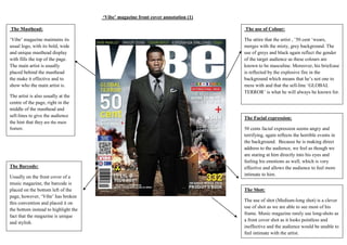
- 1. ‘Vibe’ magazine front cover annotation (1) The Masthead: The use of Colour: ‘Vibe’ magazine maintains its usual logo, with its bold, wide and unique masthead display with fills the top of the page. The main artist is usually placed behind the masthead the make it effective and to show who the main artist is. The attire that the artist , ’50 cent ‘wears, merges with the misty, grey background. The use of greys and black again reflect the gender of the target audience as these colours are known to be masculine. Moreover, his briefcase is reflected by the explosive fire in the background which means that he’s not one to mess with and that the sell-line ‘GLOBAL TERROR’ is what he will always be known for. The artist is also usually at the centre of the page, right in the middle of the masthead and sell-lines to give the audience the hint that they are the main feature. The Barcode: Usually on the front cover of a music magazine, the barcode is placed on the bottom left of the page, however, ‘Vibe’ has broken this convention and placed it on the bottom instead to highlight the fact that the magazine is unique and stylish. The Facial expression: 50 cents facial expression seems angry and terrifying, again reflects the horrible events in the background. Because he is making direct address to the audience, we feel as though we are staring at him directly into his eyes and feeling his emotions as well, which is very effective and allows the audience to feel more intimate to him. The Shot: The use of shot (Medium-long shot) is a clever use of shot as we are able to see most of his frame. Music magazine rarely use long-shots as a front cover shot as it looks pointless and ineffective and the audience would be unable to feel intimate with the artist.