Download to read offline
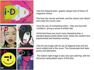

The document discusses magazine cover designs for i-D magazine that use bold graphic elements and vibrant colors. The covers have a stripped down, graphic design look with chunky lines and colors that make them pop. Contrasting colors are used loudly and confidently to give a sense of artistic flair and creativity compared to standard glossy photo covers. The designs have a homemade, punk rock feel that pushes the covers towards experimental graphic design.


