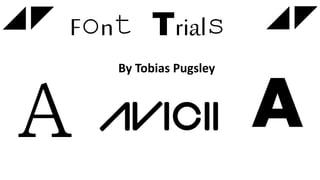
2. Serif and San
Serif
A A
Serif Sans Serif
Has the small flicks
(serifs) at the edges of
the letterform.
Used in formal and
professional situations.
Does not have serifs. The
letterforms are simple
and clean.
Used in informal, friendly
situations.
(Avicii’s Favoured and most used type of font)
3. Applying to
AviciiWhen researching Avicii, it is clear to see
that the only font style he uses is Sans Serif.
This may be because the letterforms are
simple and clean but also very eye catching.
As you can see, the edges of the letters in
this logo tend to be sharper. This logo
appeared on more recent releases like Wake
Me Up and True, the debut album released
in 2013. This logo is also used on the Avicii
official website currently.
4. Experimenting with Sans
Serif
Font 1: Font 2: Font 3:
AVICII AVICII
This first font used is very similar to the
ones used for the names of two of
Avicii’s most successful hits album
covers. The font may have been used
several times as it is clearly very eye
catching and would have helped in the
grossing of both albums. This font is very
stereotypical for the electronic dance
music genre.
The second font I am testing follows
the idea of the official logo being
rather basic but clear and eye
catching. This font test has no sharp
edges but is instead bold and full
which I believe will help it stand out
on any type of main image used on
the front cover.
The third and final font for my
experimentations is the ‘Tahoma’ font.
Whilst it is a san serif font, it doesn’t
exactly fit into the genre of ‘EDM’. I decided
to use this specific font due to the idea it
isn’t what Avicii would normally go for and
use. I felt as if I should see what it'd be like
using a font that wouldn’t stereotypically fit
into the EDM genre to see if I could find a
font that isn’t used but could still work. This
is the closest I came to and believe it
doesn’t fit in the way I would want it too.
5. What I have learnt from my
experiments…
From my experiments, I have learnt that ‘San Serif’ is the main font
type Avicii uses, only certain fonts in ‘San Serif’ fit into the genre
and finally only the outline of the font is coloured and the inside of
the font is the background colour/s.
These three factors I’ve learnt will help me when it comes to
creating my final piece. This is because I will have officially included
the main stereotypes and codes and conventions Avicii uses. This
will therefore make the Masthead and other titles used eye
catching as the Avicii font is recognisable world wide.