2. Genre and Target Audience.
My music magazine is targeted towards young teenagers aged around 12-16 years of
age. It consists of promoting new and current pop artists and is often used in
mainstream campaigns such as adverts, parties and is even used as inspiration for
clothing styles.
The pop genre tends to be full of life and is surrounded by high levels of creativity in
terms of the actual music itself and the videos which accompany it. As my target
audience is generally young teens, they are known to look for the latest trends, gossip
and seek social stimulation; which is what my music magazine provides, as well as the
genre itself.
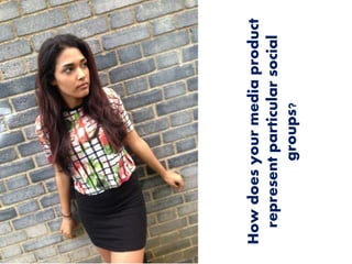
3. Mise en Scene and Images.
By selecting the outfits my ‘artist’ wore on the cover page shows how my music magazine
projects the latest trends in fashion and helps to encourage young teens to read it.
However it also represents my target audience as it includes the type of clothes they look
for which is skirts, blouses, jeans, dyed hair and many other aspects. The social group I aim
for are often known for seeking inspiration from celebrities and magazines as they believe
that this will help them develop socially in life.
The kind of styles achieved here further support the type of urban aura my social group
comes from. This is because many of the clothes can be brought from local clothing brands
and often high-street stores, therefore suggests a middle class as they clothes are
affordable and neither too expensive. The use of the brick wall with some graffiti on it in my
cover image further shows an urbanised area instead of a higher class scene. This helps my
target audience relate to the setting seen in the image and creates a personal attachment
to the magazine.
Another key aspect of the image used is the fact that I included a race other than someone
who may be Caucasian. This is because it challenges the stereotypical association of white
people and pop and enables me to branch out and appeal to all kinds of ethnic groups.
4. Language.
The use of language included in my magazine addresses young teens as it rejects any
explicit content and overly formal language, however does not embrace slang terms as
such as they are still quite young.
In modern society young teenagers are known to use informal texts and short
sentences which are visible on my double page, as the answers are simplified to keep
the attention of the young audience. On the other hand slang is not something which
is encouraged in young people hence why I had rarely included it throughout my
magazine.
5. Colour schemes
The colour schemes used throughout my music magazine tends to be white, pink and
very little black for the texts. This is because the colour pink is often included in many
aspects of young teenagers lives, majorly females. It represents the idea of being
youthful, girly and fashionable which is one of the reasons why there was so much
involvement within my magazine.
The reasons for not including much black in my magazine is due to the fact that it is
often linked to punk rock and ‘screamo’ music when excessively used. This is not the
image I am trying to perceive and would seem as though I am directing my magazine
towards ‘emo/scene’ type of people rather than people who listen to pop.
6. Future Improvements
Even though I have paid a lot of attention in regards to adjusting my magazine in order
to appeal to a particular social group, I feel as though I could have made more
improvements to make it more professional. For example:
• Including thumbnails directed to social networks within my spreads. This is
because they are increasingly making an impact on young teenagers lives; whether
it is updating statuses or posting pictures of their days- it is seen as a necessity in
modern society. Therefore by applying this in my magazine I would be able to
create a personal connection to my target audience which is the younger
generations (12-16 years) and would be representing how our current generation
uses social media in everyday life.