
Recommended
More Related Content
What's hot
What's hot (16)
Viewers also liked
Similar to Poster construction example1
Similar to Poster construction example1 (19)
Recently uploaded
Recently uploaded (20)
Poster construction example1
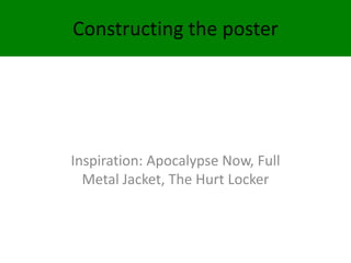
- 1. Constructing the poster Inspiration: Apocalypse Now, Full Metal Jacket, The Hurt Locker
- 2. LAYER 1 An A4 sized image was placed and transformed into Photoshop
- 3. LAYER 2 The layer was duplicated and a red shade was selected. A thin paintbrush was used to add red to the iris of each eye. Selecting a paint bucket tool and magic selection tool parts of the background were coloured red and a green posterise effect was added to the helmet.
- 4. LAYER 3 Text: Selecting an appropriate font I typed the title and set it to 60. positioning it on the helmet so the “War is hell” read as the tagline. Red was added to parts of the 2 Vs of survival which is repeated in all merchandise for the film – the red implies danger and repeats other parts of the image.
- 5. LAYER 4 A promotional announcement was then included. The same font as before was chosen and reduced in size and positioned at top of poster. This mentioned it was a short film.
- 6. LAYER 5 Blurb was added to the bottom of the poster to sell the film and offer further narrative and genre information. The same font was chosen and the size was reduced.
- 7. LAYER 6 The font was difficult to read and I did not want to use other colours for the font so I added a rectangle and used the paint bucket tool to fill it in green I reduced the opacity to 60%.