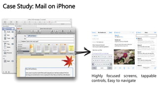
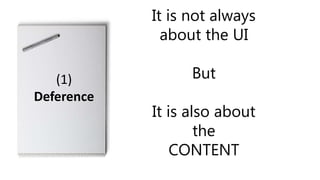
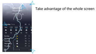
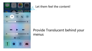
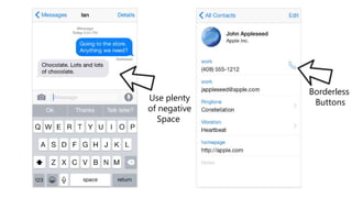
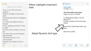
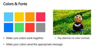
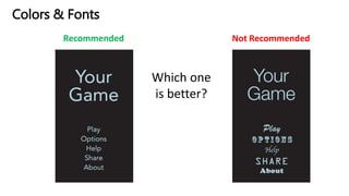
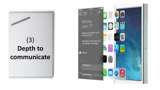
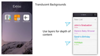
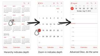
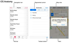
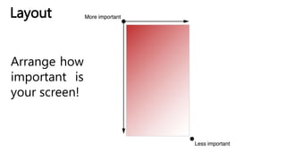
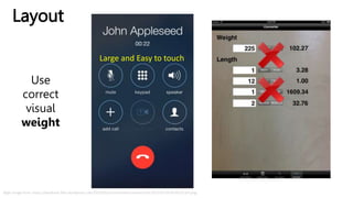
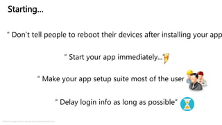
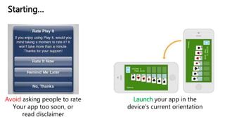
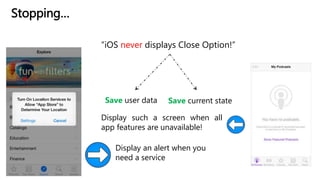
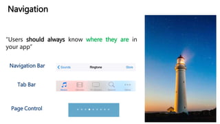
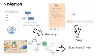
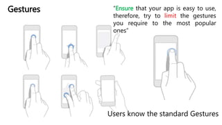
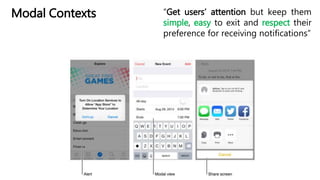
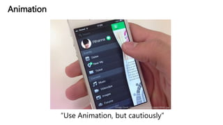
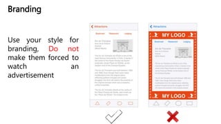
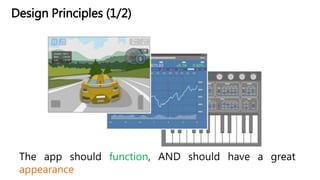
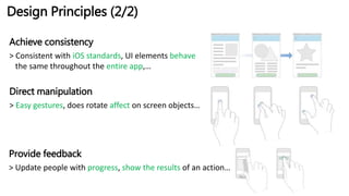
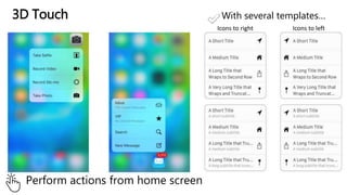
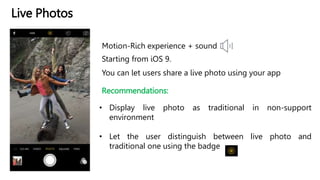
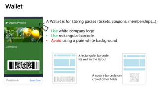
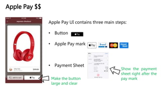
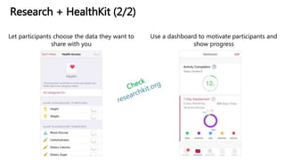
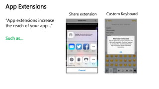
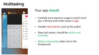
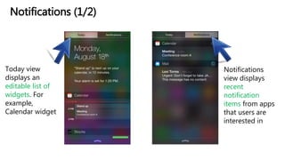
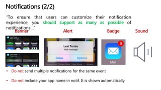
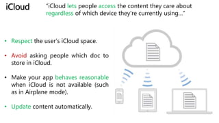
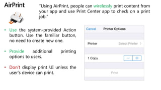
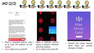
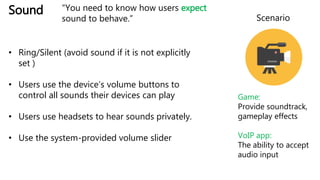
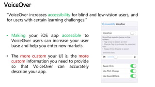
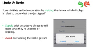
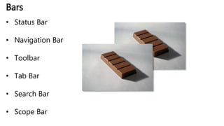
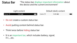
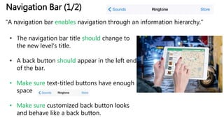
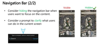
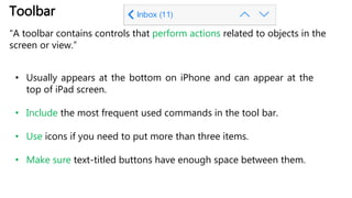
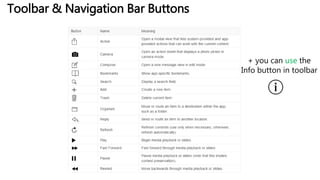
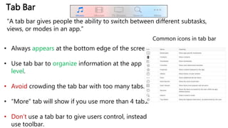
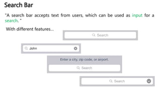
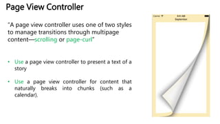
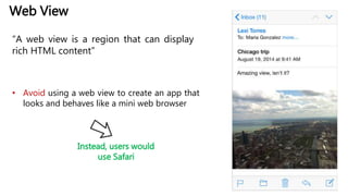
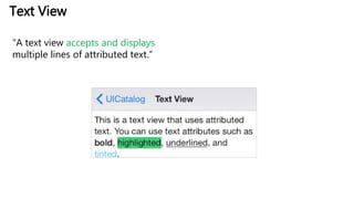
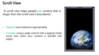
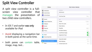
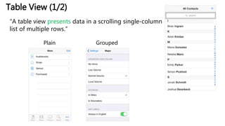
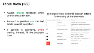
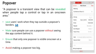
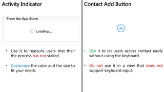
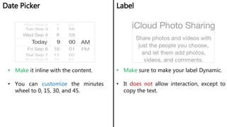
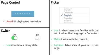
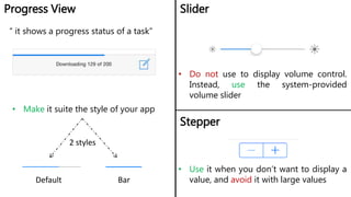
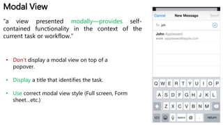
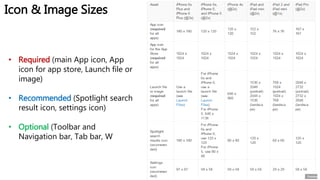
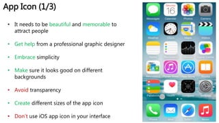
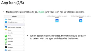
iOS Human Interface Guidelines
For iOS-Platforms
Mohammad Khalil
Presentation & Content are based on:
https://developer.apple.com/library/ios/documentation/User
Experience/Conceptual/MobileHIG/index.html
* All images are CC0 from pixabay or shareable from source
Usability
And
The Ease
Of use
http://www.smartinsights.com/mobile-marketing/mobile-marketing-
analytics/mobile-marketing-statistics/Mobile Future
In 2015
From Desktop to iOS
Case Study: Mail on iPhone
Highly focused screens, tappable
controls, Easy to navigate
Designing iOS
• Deference
• Clarity
• Depth
It is not always
about the UI
But
It is also about
the
CONTENT
(1)
Deference
Take advantage of the whole screen
Focus on the content and let the UI
Plays a supporting role.
Shadows, Bezels, Colors, Animation
Provide Translucent behind your
menus
Let them feel the content!
(2)
Clarity
Borderless
ButtonsUse plenty
of negative
Space
COLORS & Fonts
Image from: http://is5.mzstatic.com/image/thumb/Purple/v4/d5/9f/cd/d59fcd47-
f271-a2a1-1ed8-839bc645a463/source/1024x1024sr.jpg
Yellow, highlights important
state
Adopt Dynamic font type
Colors & Fonts
• Make sure colors work together
• Make your colors send the appropriate message
• Pay attention to color contrast
Colors & Fonts
Recommended Not Recommended
Which one
is better?
(3)
Depth to
communicate
Translucent Backgrounds
Use layers for depth of
content
Hierarchy indicates depth Zoom-in indicates depth Advanced Desc. do the same
iOS Anatomy
iOS Anatomy
Layout
iOS automatically
changes the layout
when the size class
changes
Layout
iPad
iPhone 6s
Other iPhones
Recommended Not Recommended
Which one
is better?
Layout
Layout
Arrange how
important is
your screen!
Layout
Right image from: https://wodtools.files.wordpress.com/2013/02/ios-simulator-screen-shot-2013-02-06-8-08-27-pm.png
Use
correct
visual
weight
Large and Easy to touch
Starting
& Stopping
“ Don’t tell people to reboot their devices after installing your app
Starting…
“ Start your app immediately...”
“ Make your app setup suite most of the users...”
“ Delay login info as long as possible”
Center Image from: www.computerworld.com
Avoid asking people to rate
Your app too soon, or
read disclaimer
Launch your app in the
device’s current orientation
Starting…
Stopping…
“iOS never displays Close Option!”
Save user data Save current state
Display an alert when you
need a service
Display such a screen when all
app features are unavailable!
Navigation
“Users should always know where they are in
your app”
Page Control
Navigation Bar
Tab Bar
Navigation
Experience Driven
Flat
(Tabs)
Hierarchy
Interactivity,
Animation &
Branding
Users know the standard Gestures
Gestures “Ensure that your app is easy to use,
therefore, try to limit the gestures
you require to the most popular
ones”
Modal Contexts “Get users’ attention but keep them
simple, easy to exit and respect their
preference for receiving notifications”
Image from: http://i.stack.imgur.com/rRNvL.jpg
Animation
“Use Animation, but cautiously”
Branding
Use your style for
branding, Do not
make them forced to
watch an
advertisement
Correct Wording in your App
http://i1.mirror.co.uk/incoming/article4521525.ece/ALTERNATES/s615/TEASER-This-road-sign-does-not-look-rihgt.jpg
• Watch out for Spelling & Grammar
• CAPITALS
• Use a friendly tone
• Understandable Description
Design Strategies
• Design Principles
• From Concept to
Product
Design Principles (1/2)
The app should function, AND should have a great
appearance
Design Principles (2/2)
Achieve consistency
> Consistent with iOS standards, UI elements behave
the same throughout the entire app,…
Direct manipulation
> Easy gestures, does rotate affect on screen objects…
Provide feedback
> Update people with progress, show the results of an action…
From Concept to Product (1/3)
1) Squeeze your brain and capture
all the tasks.
2) Determine who your users are.
3) Determine their needs.
4) Filter and set your app features.
From Concept to Product (2/3)
Get the job done correctly
beautiful custom
UI is a hindrance.
Let users predict what your
elements do
“Think twice before redesigning a standard
control”
From Concept to Product (3/3)
Test, test and test…
iOS Technologies
3D Touch
Perform actions from home screen
With several templates…
Icons to right Icons to left
Live Photos
Motion-Rich experience + sound
Starting from iOS 9.
Recommendations:
• Display live photo as traditional in non-support
environment
• Let the user distinguish between live photo and
traditional one using the badge
You can let users share a live photo using your app
Wallet
A Wallet is for storing passes (tickets, coupons, memberships…)
• Use white company logo
• Use rectangular barcode
• Avoid using a plain white background
A rectangular barcode
fits well in the layout
A square barcode can
crowd other fields
Apple Pay $$
Apple Pay UI contains three main steps:
• Button
• Apple Pay mark
• Payment Sheet
Make the button
large and clear
Show the payment
sheet right after the
pay mark
Research + HealthKit (1/2)
Research + HealthKit (2/2)
Let participants choose the data they want to
share with you
Use a dashboard to motivate participants and
show progress
App Extensions
“App extensions increase
the reach of your app…”
Such as…
Share extension Custom Keyboard
HomeKit
“HomeKit makes it easy to
use home automation
apps on people iOS
devices…”
• Make it easy to add new accessories
• Give users different ways to find
accessories
• Use friendly language to make your
app easy to use
Bottom Image from: https://www.appfutura.com/blog/wp-content/uploads/2015/04/homekit-3.png
Multitasking
Your app should:
• Carefully tune resource usage to avoid much
cpu, memory and screen space usage
• Handle interruptions such as the audio!
• Stop and restart, should be quickly and
smoothly
• Behave responsibly when not in the
foreground
Notifications (1/2)
Today view
displays an
editable list of
widgets. For
example,
Calendar widget
Notifications
view displays
recent
notification
items from apps
that users are
interested in
Notifications (2/2)
“To ensure that users can customize their notification
experience, you should support as many as possible of
notifications…”
Banner Alert SoundBadge
• Do not send multiple notifications for the same event
• Do not include your app name in notif. It is shown automatically
Social Media
• Enable signups, but avoid
asking for signing in
• Share experience, results
iCloud “iCloud lets people access the content they care about
regardless of which device they’re currently using…”
• Respect the user’s iCloud space.
• Avoid asking people which doc to
store in iCloud.
• Make your app behaves reasonable
when iCloud is not available (such
as in Airplane mode).
• Update content automatically.
In-App Purchase
“In-App Purchase lets people buy digital products within your app, in a
store that you design.”
• Upgrade a basic version to premium
version
• Renew subscription
• Purchase virtual items like a weapon in a
game
 Use simple description
 Don’t alter the confirmation alert
(use the default one)
AirPrint “Using AirPrint, people can wirelessly print content from
your app and use Print Center app to check on a print
job.”
• Use the system-provided Action
button. Use the familiar button,
no need to create new one.
• Provide additional printing
options to users.
• Don’t display print UI unless the
user’s device can print.
iAD (1/2) “ ... you can allow advertisements to display within your
application and you can receive revenue when users see or
interact with them”
Image from: http://d1vqbpto5tbbz0.cloudfront.net/blog/wp-
content/uploads/2015/09/08115830/Screen-Shot-2015-09-08-at-11.58.04-AM.png
Standard banner
Full screen bannerMedium banner
iAD (2/2)
• Place a standard banner view
at or near the bottom of the
screen.
• Don’t allow it to scroll off
• Place a medium banner
where it doesn’t interfere
with the content.
• Don’t allow it to scroll off
• Present full screen banner
when there are context
change or breaks.
Accessing User Data
“It allow apps to access the data people store in Contacts, Calendar,
Reminders, GPS…etc.”
Make the
statement
clear, and
understand
why they’re
being asked
Ask for
permission at
startup if your
app can’t
perform it on it’s
own
Sound
• Ring/Silent (avoid sound if it is not explicitly
set )
• Users use the device’s volume buttons to
control all sounds their devices can play
• Users use headsets to hear sounds privately.
• Use the system-provided volume slider
Scenario
Game:
Provide soundtrack,
gameplay effects
VoIP app:
The ability to accept
audio input
“You need to know how users expect
sound to behave.”
VoiceOver
“VoiceOver increases accessibility for blind and low-vision users, and
for users with certain learning challenges.”
• Making your iOS app accessible to
VoiceOver users can increase your user
base and help you enter new markets.
• The more custom your UI is, the more
custom information you need to provide
so that VoiceOver can accurately
describe your app.
http://ndl.mgccw.com/mu3/app/20141015/00/1413314384022/ss/3_small.png
Routing
• Focus on the route
• Provide information for every
step of a route
• Enrich map with additional info
• Respect user’s transit options
• Use push notification
Undo & Redo
“Users initiate an Undo operation by shaking the device, which displays
an alert to undo what they just typed”
• Supply brief descriptive phrase to tell
users what they’re undoing or
redoing.
• Avoid overloading the shake gesture
UI Elements
UI Elements
UI Elements
Bars
• Status Bar
• Navigation Bar
• Toolbar
• Tab Bar
• Search Bar
• Scope Bar
Status Bar
Default (dark) contentLight content
• Do not create a custom status bar.
• Avoid putting content behind status bar.
• Think twice before hiding status bar
• It is an important bar, which includes battery, signal,
H+,…etc.
“The status bar displays important information about
the device and the current environment”
Navigation Bar (1/2)
“A navigation bar enables navigation through an information hierarchy.”
• The navigation bar title should change to
the new level’s title.
• A back button should appear in the left end
of the bar.
• Make sure text-titled buttons have enough
space
• Make sure customized back button looks
and behave like a back button.
Navigation Bar (2/2)
• Consider hiding the navigation bar when
users want to focus on the content.
• Consider a prompt to clarify what users
can do in the current screen
Visible Hidden
Toolbar
“A toolbar contains controls that perform actions related to objects in the
screen or view.”
• Usually appears at the bottom on iPhone and can appear at the
top of iPad screen.
• Include the most frequent used commands in the tool bar.
• Use icons if you need to put more than three items.
• Make sure text-titled buttons have enough space between them.
Toolbar & Navigation Bar Buttons
+ you can use the
Info button in toolbar
Tab Bar
“A tab bar gives people the ability to switch between different subtasks,
views, or modes in an app.”
• Always appears at the bottom edge of the screen.
• Use tab bar to organize information at the app
level.
• Avoid crowding the tab bar with too many tabs.
• “More” tab will show if you use more than 4 tabs.
• Don’t use a tab bar to give users control, instead
use toolbar.
Common icons in tab bar
Search Bar
“A search bar accepts text from users, which can be used as input for a
search. ”
With different features…
Scope Bar
Only available with a search bar…
• it’s even better to improve search results so that users don’t need to
scope their search
Content Views
• Activity
• Collection View
• Map View
• Page View
Controller
• Web View
• Text View
• Scroll View
• Split View
Controller
• Table View
• Popover
Activity
“ An activity represents a system-provided or custom
service ”
• Each activity is represented by an icon and a title
• Use black & white with appropriate alpha
transparency
• Make a brief title
• Give users access to a custom service
Collection View
“A collection view manages an ordered collection
of items and presents them in a customizable
layout.”
• Display set of items
• Make it easy for people to select an item (use
44x44 image size)
• Don’t choose collection view when table view is
a better choice.
Map View
“A map view presents geographical data and
supports most of the functionality provided by
the built-in Maps app.”
• In general, let user interact with the map
• Use the standard pin colors:
 Use red for a destination point
 Use green for a starting point
 Use purple for a user-specified point
Page View Controller
“A page view controller uses one of two styles
to manage transitions through multipage
content—scrolling or page-curl”
• Use a page view controller to present a text of a
story
• Use a page view controller for content that
naturally breaks into chunks (such as a
calendar).
Web View
“A web view is a region that can display
rich HTML content”
• Avoid using a web view to create an app that
looks and behaves like a mini web browser
Instead, users would
use Safari
Text View
“A text view accepts and displays
multiple lines of attributed text.”
Scroll View
“A scroll view helps people see content that is
larger than the scroll view’s boundaries”
• Support zoom behavior appropriately
• Consider using a page control with a paging-mode
scroll view when your content is divided into
pages.
Split View Controller
A split view controller is a full-
screen view controller that
manages the presentation of
two child view controllers.
• In iOS 7 and earlier was only
available for iPad
• Avoid displaying a navigation bar
in both panes at the same time.
• both panes can contain table,
image, map, text…
Table View (1/2)
“A table view presents data in a scrolling single-column
list of multiple rows.”
Plain Grouped
• Always provide feedback when
users select a list item.
• As much as possible, use brief text
labels to avoid truncation.
• If content is extensive, avoid
waiting, Instead, fill the onscreen
rows
Table View (2/2)
some table view elements that can extend
functionality of the table view
Popover
“A popover is a transient view that can be revealed
when people tap a control or tap in an onscreen
area.”
• save users’ work when they tap outside a popover’s
borders.
• Make sure people can use a popover without seeing
the app content behind it.
• Ensure that only one popover is visible onscreen at a
time.
• Avoid making a popover too big.
Controls
&
Temporary Views
Activity Indicator Contact Add Button
• Use it to reassure users that their
the process has not stalled.
• Customize the color and the size to
fit your needs.
• Use it to let users access contact easily
without using the keyboard.
• Do not use it in a view that does not
support keyboard input.
Date Picker Label
• Make it inline with the content.
• You can customize the minutes
wheel to 0, 15, 30, and 45.
• Make sure to make your label Dynamic.
• It does not allow interaction, except to
copy the text.
Page Control Picker
• Avoid displaying too many dots
• Use it when users are familiar with the
set of values like Language or Countries.
• Make it inline with the content.
• Consider Table View if your set is too
large.
Switch
On Off
• Use it to show a binary state
Progress View Slider
• Make it suite the style of your app
• Do not use to display volume control.
Instead, use the system-provided
volume slider
2 styles
Default Bar
Stepper
• Use it when you don’t want to display a
value, and avoid it with large values
“ it shows a progress status of a task”
Segmented Control System Button
• Can contain images or text.
• Make sure each segment is easy to
tab
• Avoid mixing text and images in a
single segmented control.
• Has no border, and can contain icon.
• Use it as a verb phrase
• Avoid creating a long title and use
CAPITALS.
• You can add background to a system
button too
“It is a linear set of segments, each of
which functions as a button…”
Text Field
“A text field accepts a single line of user input”
• Display the Clear button in the right end of a text field when
appropriate.
• Display a hint in the text field if it helps users understand its
purpose.
• Specify a keyboard type like Numbers to enter phone
numbers or letters for text.
Alert
If an alert does this:
Provides information related to the
standard functioning of an app
Design an eye-catching way to display
the information
Updates users on tasks that are
progressing normally
Use a progress view or activity indicator
Do this instead:
• Avoid creating unnecessary alerts
• Avoid “you, me, my, your”.
• Use Capitalization appropriately
• Use two-button Alert
• Avoid lengthening alert text
Action Sheet
“An action sheet displays a set of choices related to a task the user
initiates.”
• Use red for the button that perform destructive
actions like Delete.
• Include cancel button in compact environment.
• Avoid making users scroll,
therefore limit number of
options in the action sheet.
Modal View
“a view presented modally—provides self-
contained functionality in the context of the
current task or workflow.”
• Don’t display a modal view on top of a
popover.
• Display a title that identifies the task.
• Use correct modal view style (Full screen, Form
sheet…etc.)
Icon and Image Design
Icon & Image Sizes
• Required (main App icon, App
icon for app store, Launch file or
image)
• Recommended (Spotlight search
result icon, settings icon)
• Optional (Toolbar and
Navigation bar, Tab bar, W
App Icon (1/3)
• It needs to be beautiful and memorable to
attract people
• Get help from a professional graphic designer
• Embrace simplicity
• Make sure it looks good on different
backgrounds
• Avoid transparency
• Create different sizes of the app icon
• Don’t use iOS app icon in your interface
App Icon (2/3)
• Mask is done automatically, so, make sure your icon has 90-degrees corners.
• When designing smaller sizes, they still should be easy
to detect with the eyes and describe theirselves.
AppIcon(3/3)
•SomeExamples
Image from http://www.designbolts.com/wp-content/uploads/2015/09/Free-iOS-9-Style-Social-Media-Icons-Set.jpg
Launch Files/Images
“A launch file (or image) provides a simple placeholder image that iOS
displays when your app starts up”
• Design a plain launch image that improves the user
experience.
• Should not be about/branding image
• For Retina iPhone 6 Plus:
1242 x 2208 (@3x) for portrait
2208 x 1242 (@3x) for landscape
• For Retina iPhone 6:
750 x 1334 (@2x) for portrait
1334 x 750 (@2x) for landscape
https://s-media-cache-ak0.pinimg.com/236x/bc/f3/6e/bcf36ebbd98c56635cf129bd5fa3f36b.jpg
Template Icons
• Use standard icons.
• If you redesign yours, make two versions.
• They should be simple and understandable.
Now, it is your turn
Mohammad Khalil
http://mohdkhalil.wordpress.com
@TuMohdKhalil
mohammad.khalil@tugraz.at
Slides Available:
http://bit.do/ios_guidelines

iOS Human Interface Guidelines (HCI)

  • 1.
    iOS Human InterfaceGuidelines For iOS-Platforms Mohammad Khalil Presentation & Content are based on: https://developer.apple.com/library/ios/documentation/User Experience/Conceptual/MobileHIG/index.html * All images are CC0 from pixabay or shareable from source
  • 2.
  • 3.
  • 4.
  • 5.
    Case Study: Mailon iPhone Highly focused screens, tappable controls, Easy to navigate
  • 6.
  • 7.
    It is notalways about the UI But It is also about the CONTENT (1) Deference
  • 8.
    Take advantage ofthe whole screen
  • 9.
    Focus on thecontent and let the UI Plays a supporting role. Shadows, Bezels, Colors, Animation
  • 10.
    Provide Translucent behindyour menus Let them feel the content!
  • 11.
  • 12.
  • 13.
    COLORS & Fonts Imagefrom: http://is5.mzstatic.com/image/thumb/Purple/v4/d5/9f/cd/d59fcd47- f271-a2a1-1ed8-839bc645a463/source/1024x1024sr.jpg
  • 14.
  • 15.
    Colors & Fonts •Make sure colors work together • Make your colors send the appropriate message • Pay attention to color contrast
  • 16.
    Colors & Fonts RecommendedNot Recommended Which one is better?
  • 17.
  • 18.
  • 19.
    Hierarchy indicates depthZoom-in indicates depth Advanced Desc. do the same
  • 20.
  • 21.
  • 22.
  • 23.
    iOS automatically changes thelayout when the size class changes Layout iPad iPhone 6s Other iPhones
  • 24.
    Recommended Not Recommended Whichone is better? Layout
  • 25.
  • 26.
    Layout Right image from:https://wodtools.files.wordpress.com/2013/02/ios-simulator-screen-shot-2013-02-06-8-08-27-pm.png Use correct visual weight Large and Easy to touch
  • 27.
  • 28.
    “ Don’t tellpeople to reboot their devices after installing your app Starting… “ Start your app immediately...” “ Make your app setup suite most of the users...” “ Delay login info as long as possible” Center Image from: www.computerworld.com
  • 29.
    Avoid asking peopleto rate Your app too soon, or read disclaimer Launch your app in the device’s current orientation Starting…
  • 30.
    Stopping… “iOS never displaysClose Option!” Save user data Save current state Display an alert when you need a service Display such a screen when all app features are unavailable!
  • 31.
    Navigation “Users should alwaysknow where they are in your app” Page Control Navigation Bar Tab Bar
  • 32.
  • 33.
  • 34.
    Users know thestandard Gestures Gestures “Ensure that your app is easy to use, therefore, try to limit the gestures you require to the most popular ones”
  • 35.
    Modal Contexts “Getusers’ attention but keep them simple, easy to exit and respect their preference for receiving notifications”
  • 36.
  • 37.
    Branding Use your stylefor branding, Do not make them forced to watch an advertisement
  • 38.
    Correct Wording inyour App http://i1.mirror.co.uk/incoming/article4521525.ece/ALTERNATES/s615/TEASER-This-road-sign-does-not-look-rihgt.jpg • Watch out for Spelling & Grammar • CAPITALS • Use a friendly tone • Understandable Description
  • 39.
    Design Strategies • DesignPrinciples • From Concept to Product
  • 40.
    Design Principles (1/2) Theapp should function, AND should have a great appearance
  • 41.
    Design Principles (2/2) Achieveconsistency > Consistent with iOS standards, UI elements behave the same throughout the entire app,… Direct manipulation > Easy gestures, does rotate affect on screen objects… Provide feedback > Update people with progress, show the results of an action…
  • 42.
    From Concept toProduct (1/3) 1) Squeeze your brain and capture all the tasks. 2) Determine who your users are. 3) Determine their needs. 4) Filter and set your app features.
  • 43.
    From Concept toProduct (2/3) Get the job done correctly beautiful custom UI is a hindrance. Let users predict what your elements do “Think twice before redesigning a standard control”
  • 44.
    From Concept toProduct (3/3) Test, test and test…
  • 45.
  • 46.
    3D Touch Perform actionsfrom home screen With several templates… Icons to right Icons to left
  • 47.
    Live Photos Motion-Rich experience+ sound Starting from iOS 9. Recommendations: • Display live photo as traditional in non-support environment • Let the user distinguish between live photo and traditional one using the badge You can let users share a live photo using your app
  • 48.
    Wallet A Wallet isfor storing passes (tickets, coupons, memberships…) • Use white company logo • Use rectangular barcode • Avoid using a plain white background A rectangular barcode fits well in the layout A square barcode can crowd other fields
  • 49.
    Apple Pay $$ ApplePay UI contains three main steps: • Button • Apple Pay mark • Payment Sheet Make the button large and clear Show the payment sheet right after the pay mark
  • 50.
  • 51.
    Research + HealthKit(2/2) Let participants choose the data they want to share with you Use a dashboard to motivate participants and show progress
  • 52.
    App Extensions “App extensionsincrease the reach of your app…” Such as… Share extension Custom Keyboard
  • 53.
    HomeKit “HomeKit makes iteasy to use home automation apps on people iOS devices…” • Make it easy to add new accessories • Give users different ways to find accessories • Use friendly language to make your app easy to use Bottom Image from: https://www.appfutura.com/blog/wp-content/uploads/2015/04/homekit-3.png
  • 54.
    Multitasking Your app should: •Carefully tune resource usage to avoid much cpu, memory and screen space usage • Handle interruptions such as the audio! • Stop and restart, should be quickly and smoothly • Behave responsibly when not in the foreground
  • 55.
    Notifications (1/2) Today view displaysan editable list of widgets. For example, Calendar widget Notifications view displays recent notification items from apps that users are interested in
  • 56.
    Notifications (2/2) “To ensurethat users can customize their notification experience, you should support as many as possible of notifications…” Banner Alert SoundBadge • Do not send multiple notifications for the same event • Do not include your app name in notif. It is shown automatically
  • 57.
    Social Media • Enablesignups, but avoid asking for signing in • Share experience, results
  • 58.
    iCloud “iCloud letspeople access the content they care about regardless of which device they’re currently using…” • Respect the user’s iCloud space. • Avoid asking people which doc to store in iCloud. • Make your app behaves reasonable when iCloud is not available (such as in Airplane mode). • Update content automatically.
  • 59.
    In-App Purchase “In-App Purchaselets people buy digital products within your app, in a store that you design.” • Upgrade a basic version to premium version • Renew subscription • Purchase virtual items like a weapon in a game  Use simple description  Don’t alter the confirmation alert (use the default one)
  • 60.
    AirPrint “Using AirPrint,people can wirelessly print content from your app and use Print Center app to check on a print job.” • Use the system-provided Action button. Use the familiar button, no need to create new one. • Provide additional printing options to users. • Don’t display print UI unless the user’s device can print.
  • 61.
    iAD (1/2) “... you can allow advertisements to display within your application and you can receive revenue when users see or interact with them” Image from: http://d1vqbpto5tbbz0.cloudfront.net/blog/wp- content/uploads/2015/09/08115830/Screen-Shot-2015-09-08-at-11.58.04-AM.png Standard banner Full screen bannerMedium banner
  • 62.
    iAD (2/2) • Placea standard banner view at or near the bottom of the screen. • Don’t allow it to scroll off • Place a medium banner where it doesn’t interfere with the content. • Don’t allow it to scroll off • Present full screen banner when there are context change or breaks.
  • 63.
    Accessing User Data “Itallow apps to access the data people store in Contacts, Calendar, Reminders, GPS…etc.” Make the statement clear, and understand why they’re being asked Ask for permission at startup if your app can’t perform it on it’s own
  • 64.
    Sound • Ring/Silent (avoidsound if it is not explicitly set ) • Users use the device’s volume buttons to control all sounds their devices can play • Users use headsets to hear sounds privately. • Use the system-provided volume slider Scenario Game: Provide soundtrack, gameplay effects VoIP app: The ability to accept audio input “You need to know how users expect sound to behave.”
  • 65.
    VoiceOver “VoiceOver increases accessibilityfor blind and low-vision users, and for users with certain learning challenges.” • Making your iOS app accessible to VoiceOver users can increase your user base and help you enter new markets. • The more custom your UI is, the more custom information you need to provide so that VoiceOver can accurately describe your app.
  • 66.
    http://ndl.mgccw.com/mu3/app/20141015/00/1413314384022/ss/3_small.png Routing • Focus onthe route • Provide information for every step of a route • Enrich map with additional info • Respect user’s transit options • Use push notification
  • 67.
    Undo & Redo “Usersinitiate an Undo operation by shaking the device, which displays an alert to undo what they just typed” • Supply brief descriptive phrase to tell users what they’re undoing or redoing. • Avoid overloading the shake gesture
  • 68.
  • 69.
    Bars • Status Bar •Navigation Bar • Toolbar • Tab Bar • Search Bar • Scope Bar
  • 70.
    Status Bar Default (dark)contentLight content • Do not create a custom status bar. • Avoid putting content behind status bar. • Think twice before hiding status bar • It is an important bar, which includes battery, signal, H+,…etc. “The status bar displays important information about the device and the current environment”
  • 71.
    Navigation Bar (1/2) “Anavigation bar enables navigation through an information hierarchy.” • The navigation bar title should change to the new level’s title. • A back button should appear in the left end of the bar. • Make sure text-titled buttons have enough space • Make sure customized back button looks and behave like a back button.
  • 72.
    Navigation Bar (2/2) •Consider hiding the navigation bar when users want to focus on the content. • Consider a prompt to clarify what users can do in the current screen Visible Hidden
  • 73.
    Toolbar “A toolbar containscontrols that perform actions related to objects in the screen or view.” • Usually appears at the bottom on iPhone and can appear at the top of iPad screen. • Include the most frequent used commands in the tool bar. • Use icons if you need to put more than three items. • Make sure text-titled buttons have enough space between them.
  • 74.
    Toolbar & NavigationBar Buttons + you can use the Info button in toolbar
  • 75.
    Tab Bar “A tabbar gives people the ability to switch between different subtasks, views, or modes in an app.” • Always appears at the bottom edge of the screen. • Use tab bar to organize information at the app level. • Avoid crowding the tab bar with too many tabs. • “More” tab will show if you use more than 4 tabs. • Don’t use a tab bar to give users control, instead use toolbar. Common icons in tab bar
  • 76.
    Search Bar “A searchbar accepts text from users, which can be used as input for a search. ” With different features…
  • 77.
    Scope Bar Only availablewith a search bar… • it’s even better to improve search results so that users don’t need to scope their search
  • 78.
    Content Views • Activity •Collection View • Map View • Page View Controller • Web View • Text View • Scroll View • Split View Controller • Table View • Popover
  • 79.
    Activity “ An activityrepresents a system-provided or custom service ” • Each activity is represented by an icon and a title • Use black & white with appropriate alpha transparency • Make a brief title • Give users access to a custom service
  • 80.
    Collection View “A collectionview manages an ordered collection of items and presents them in a customizable layout.” • Display set of items • Make it easy for people to select an item (use 44x44 image size) • Don’t choose collection view when table view is a better choice.
  • 81.
    Map View “A mapview presents geographical data and supports most of the functionality provided by the built-in Maps app.” • In general, let user interact with the map • Use the standard pin colors:  Use red for a destination point  Use green for a starting point  Use purple for a user-specified point
  • 82.
    Page View Controller “Apage view controller uses one of two styles to manage transitions through multipage content—scrolling or page-curl” • Use a page view controller to present a text of a story • Use a page view controller for content that naturally breaks into chunks (such as a calendar).
  • 83.
    Web View “A webview is a region that can display rich HTML content” • Avoid using a web view to create an app that looks and behaves like a mini web browser Instead, users would use Safari
  • 84.
    Text View “A textview accepts and displays multiple lines of attributed text.”
  • 85.
    Scroll View “A scrollview helps people see content that is larger than the scroll view’s boundaries” • Support zoom behavior appropriately • Consider using a page control with a paging-mode scroll view when your content is divided into pages.
  • 86.
    Split View Controller Asplit view controller is a full- screen view controller that manages the presentation of two child view controllers. • In iOS 7 and earlier was only available for iPad • Avoid displaying a navigation bar in both panes at the same time. • both panes can contain table, image, map, text…
  • 87.
    Table View (1/2) “Atable view presents data in a scrolling single-column list of multiple rows.” Plain Grouped
  • 88.
    • Always providefeedback when users select a list item. • As much as possible, use brief text labels to avoid truncation. • If content is extensive, avoid waiting, Instead, fill the onscreen rows Table View (2/2) some table view elements that can extend functionality of the table view
  • 89.
    Popover “A popover isa transient view that can be revealed when people tap a control or tap in an onscreen area.” • save users’ work when they tap outside a popover’s borders. • Make sure people can use a popover without seeing the app content behind it. • Ensure that only one popover is visible onscreen at a time. • Avoid making a popover too big.
  • 90.
  • 91.
    Activity Indicator ContactAdd Button • Use it to reassure users that their the process has not stalled. • Customize the color and the size to fit your needs. • Use it to let users access contact easily without using the keyboard. • Do not use it in a view that does not support keyboard input.
  • 92.
    Date Picker Label •Make it inline with the content. • You can customize the minutes wheel to 0, 15, 30, and 45. • Make sure to make your label Dynamic. • It does not allow interaction, except to copy the text.
  • 93.
    Page Control Picker •Avoid displaying too many dots • Use it when users are familiar with the set of values like Language or Countries. • Make it inline with the content. • Consider Table View if your set is too large. Switch On Off • Use it to show a binary state
  • 94.
    Progress View Slider •Make it suite the style of your app • Do not use to display volume control. Instead, use the system-provided volume slider 2 styles Default Bar Stepper • Use it when you don’t want to display a value, and avoid it with large values “ it shows a progress status of a task”
  • 95.
    Segmented Control SystemButton • Can contain images or text. • Make sure each segment is easy to tab • Avoid mixing text and images in a single segmented control. • Has no border, and can contain icon. • Use it as a verb phrase • Avoid creating a long title and use CAPITALS. • You can add background to a system button too “It is a linear set of segments, each of which functions as a button…”
  • 96.
    Text Field “A textfield accepts a single line of user input” • Display the Clear button in the right end of a text field when appropriate. • Display a hint in the text field if it helps users understand its purpose. • Specify a keyboard type like Numbers to enter phone numbers or letters for text.
  • 97.
    Alert If an alertdoes this: Provides information related to the standard functioning of an app Design an eye-catching way to display the information Updates users on tasks that are progressing normally Use a progress view or activity indicator Do this instead: • Avoid creating unnecessary alerts • Avoid “you, me, my, your”. • Use Capitalization appropriately • Use two-button Alert • Avoid lengthening alert text
  • 98.
    Action Sheet “An actionsheet displays a set of choices related to a task the user initiates.” • Use red for the button that perform destructive actions like Delete. • Include cancel button in compact environment. • Avoid making users scroll, therefore limit number of options in the action sheet.
  • 99.
    Modal View “a viewpresented modally—provides self- contained functionality in the context of the current task or workflow.” • Don’t display a modal view on top of a popover. • Display a title that identifies the task. • Use correct modal view style (Full screen, Form sheet…etc.)
  • 100.
  • 101.
    Icon & ImageSizes • Required (main App icon, App icon for app store, Launch file or image) • Recommended (Spotlight search result icon, settings icon) • Optional (Toolbar and Navigation bar, Tab bar, W
  • 102.
    App Icon (1/3) •It needs to be beautiful and memorable to attract people • Get help from a professional graphic designer • Embrace simplicity • Make sure it looks good on different backgrounds • Avoid transparency • Create different sizes of the app icon • Don’t use iOS app icon in your interface
  • 103.
    App Icon (2/3) •Mask is done automatically, so, make sure your icon has 90-degrees corners. • When designing smaller sizes, they still should be easy to detect with the eyes and describe theirselves.
  • 104.
  • 105.
    Launch Files/Images “A launchfile (or image) provides a simple placeholder image that iOS displays when your app starts up” • Design a plain launch image that improves the user experience. • Should not be about/branding image • For Retina iPhone 6 Plus: 1242 x 2208 (@3x) for portrait 2208 x 1242 (@3x) for landscape • For Retina iPhone 6: 750 x 1334 (@2x) for portrait 1334 x 750 (@2x) for landscape https://s-media-cache-ak0.pinimg.com/236x/bc/f3/6e/bcf36ebbd98c56635cf129bd5fa3f36b.jpg
  • 106.
    Template Icons • Usestandard icons. • If you redesign yours, make two versions. • They should be simple and understandable.
  • 107.
    Now, it isyour turn
  • 108.