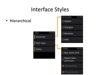
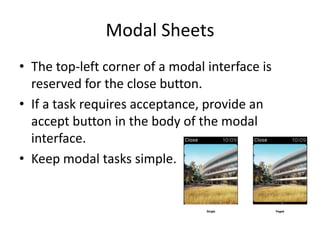
APPLE WATCH HUMAN INTERFACE
GUIDELINES
HappyMan
2014/12/16
Designing for Apple Watch
• Personal
個人化
• Holistic
整體性
• Lightweight
輕量級
App Anatomy
• Interface Styles
• User Interactions
Interface Styles
• Hierarchical
Interface Styles
• Page-based
User Interactions
• Action-based events
• Gestures
• Force Touch
• The Digital Crown
Gestures
• Vertical swipes - scroll the current screen.
• Horizontal swipes - display the previous or
next page in a page-based interface.
• Left edge swipes - navigate back to the parent
interface controller.
• Taps - indicate selection or interaction. Taps
are handled by the system and reported to
your WatchKit extension’s action methods.
Glances
Glances
• Template-based
• Not scrollable
• Associated with a single action
• Opetional
Glances
• Configure the Glance based on the user's
current context.
• Glances can deep link into their corresponding
app.
• Glances must provide useful content to the
user.
Notifications
• Short Look Notifications
• Custom Long Look Notifications
Short Look Notifications
• Keep titles short and focused.
Custom Long Look Notifications
• App content can underlap the sash or start
just below it.
Custom Long Look Notifications
• Long look notifications can display up to four
custom action buttons.
• The Dismiss button is always present.
• Configure the sash color to match your
branding.
Modal Sheets
• A modal sheet achieves by temporarily
preventing the user from interacting with the
rest of the app.
Modal Sheets
• In general, consider creating a modal context
only when:
– It is critical to get the user’s attention.
– A self-contained task must be completed—or
explicitly abandoned—to avoid leaving the user’s
data in an ambiguous state.
Modal Sheets
• The top-left corner of a modal interface is
reserved for the close button.
• If a task requires acceptance, provide an
accept button in the body of the modal
interface.
• Keep modal tasks simple.
Layout
• Layout Guidelines
• Screen Sizes
Layout Guidelines
• Limit the number of side-by-side controls in
your interface.
• Use the full width of the screen.
• Apps use relative positioning for items.
• Prefer the use of left alignment during layout.
• Make text buttons full width.
• Use the context menu to present secondary
actions.
Screen Sizes
• Provide image assets for different screen sizes
as needed.
Color and Typography
Color
• Use black for your app’s background color.
• Use your app’s key color for branding or status.
• Use high contrast colors for text.
• Avoid using color as the only way to show
interactivity.
• Be aware of color blindness.
• Color communicates, but not always in the way
you intend.
Typography
• Apps should always adopt Dynamic Type.
When you adopt Dynamic Type, you get:
– Automatic adjustments to letter spacing and line
height for every font size
– The ability to specify different text styles for
semantically distinct blocks of text, such as Body,
Footnote, or Headline
– Text that responds appropriately to changes the
user makes to text-size settings (including
accessibility text sizes)
Text Styles
• Use the built-in text
styles whenever
possible.
• Prefer the use of a
single font throughout
your app.
• When specifying system
font sizes manually, the
point size determines
the correct size to use.
Animations
• Create prerendered animations using a
sequence of static images.
• Programmatic playback controls are available
only for image and group objects.
Branding
• Incorporate a brand’s assets in a refined,
unobtrusive way.
• Resist the temptation to display your logo in
your app or Glance.
UI Elements
Labels
• A label displays static text.
Labels
• A label:
– Displays any amount of static text
– Does not allow direct user interaction
– Can be updated programmatically
– Can span multiple lines
• Make your labels legible.
• Use the built-in styles whenever possible.
Images
• An image object displays one image or an
animated sequence of images.
Images
• An image object:
– Has no appearance of its own; it only displays its
image
– Does not support user interactivity
– Provides programmatic controls for starting and
stopping animations
• Size images appropriately for each Apple
Watch display size.
• Create all image assets as @2x resources.
Groups
• Groups are an important tool for laying out
the content in your interface. Groups act as
containers for other objects. A group has no
default appearance of its own but can be
configured with a custom background color or
image. Groups also have attributes for
specifying position, size, margins, and other
layout-related properties.
Groups
• A group object:
– Can lay out items horizontally or vertically
– Contains one or more other interface elements
– Has attributes for specifying margins and spacing
among group elements
– Can display an image or solid color as a
background
– Has a configurable corner radius for its
background and content
Groups
• Nest groups inside other groups to create
sophisticated layouts.
• Size background images appropriately for each
Apple Watch display size.
Tables
• A table presents rows of data in a single
column. Use a table to present content that
can change dynamically.
Tables
• A table object:
– Supports multiple row types
– Is scrollable
– Can have a background color or image
Tables
• Use row types consistently.
• Avoid mixing rows with dramatically different
types of content.
• Limit the number of table rows displayed at
one time.
• Do not embed tables inside groups.
Buttons
• A button performs an app-specific action.
Buttons
• A button:
– Has a background that can be customized
– Has rounded corners
– Can contain a label or group object
• Create buttons that span the width of the screen
• Try to match button heights whenever possible.
• Buttons have a rounded corner to distinguish
them from other elements.
Switches
• A switch presents two mutually exclusive
choices or states.
Switches
• A switch:
– Indicates the binary state of an item
– Always includes a label
Sliders
• A slider lets users make adjustments to a value
throughout a range of discrete values. The
user changes the value by tapping the images
at either end of the slider bar.
Sliders
• A slider:
– Consists of a horizontal track with images at either
end for manipulating the slider value
– Can display the current value as a set of discrete steps
or as a continuous bar
– Always increments and decrements its value by a
predetermined amount
– Does not display its numerical value to the user
• Use custom images to make it obvious what the
slider does.
Maps
• Use maps to present a geographic location to
the user. Maps are static snapshots and not
interactive within your app. Tapping the map
takes the user to the Maps app.
Maps
• Configure the map region to be the smallest
area that encompasses the relevant locations.
• Do not create a map object whose size
exceeds the size of the available content area.
• Use annotations to highlight locations on the
map.
Dates and Timers
• Date and timer objects are specialized labels
that display time-related values on Apple
Watch.
Date Labels
• A date label:
– Displays the date, time, or a combination of the
two
– Can be configured to display the date and time
using a variety of formats, calendars, and time
zones
– Does not need to be updated by your WatchKit
extension
Timer Labels
• A timer label:
– Counts down to a specified time or counts up
from a specified time
– Can be configured to display its count value in a
variety of formats
– Does not need to be updated by your WatchKit
extension
Menus
• A Force Touch gesture
on the Retina display of
Apple Watch displays
the current screen’s
context menu, if any.
Menus store relevant
actions for the current
screen without taking
away space from your
interface.
Menus
• Menus display between one and four actions.
• Menu actions apply to the current screen.
• Each action must have an image and a label
string.
• Menus are optional.
Icon and Image Design
Icon and Image Sizes
Home Screen Icon
• For the best results, enlist the help of a professional
graphic designer.
• Use universal imagery that people will easily recognize.
• Embrace simplicity.
• Create an abstract interpretation of your app’s main
idea.
• Make your icon similar to the icon for your iOS app.
• Create different sizes of the home screen icon for both
Apple Watch display sizes.
Menu Images
Reference
• Apple Watch Human Interface Guidelines
https://developer.apple.com/library/prerelease/i
os/documentation/UserExperience/Conceptual/
WatchHumanInterfaceGuidelines/index.html
• Apple Watch Programming Guide
https://developer.apple.com/library/prerelease/i
os/documentation/General/Conceptual/WatchKit
ProgrammingGuide/index.html
• WatchKit - Apple Developer
https://developer.apple.com/watchkit/

Apple Watch Human Interface Guidelines

  • 1.
    APPLE WATCH HUMANINTERFACE GUIDELINES HappyMan 2014/12/16
  • 2.
    Designing for AppleWatch • Personal 個人化 • Holistic 整體性 • Lightweight 輕量級
  • 3.
    App Anatomy • InterfaceStyles • User Interactions
  • 4.
  • 5.
  • 6.
    User Interactions • Action-basedevents • Gestures • Force Touch • The Digital Crown
  • 7.
    Gestures • Vertical swipes- scroll the current screen. • Horizontal swipes - display the previous or next page in a page-based interface. • Left edge swipes - navigate back to the parent interface controller. • Taps - indicate selection or interaction. Taps are handled by the system and reported to your WatchKit extension’s action methods.
  • 8.
  • 9.
    Glances • Template-based • Notscrollable • Associated with a single action • Opetional
  • 10.
    Glances • Configure theGlance based on the user's current context. • Glances can deep link into their corresponding app. • Glances must provide useful content to the user.
  • 11.
    Notifications • Short LookNotifications • Custom Long Look Notifications
  • 12.
    Short Look Notifications •Keep titles short and focused.
  • 13.
    Custom Long LookNotifications
  • 14.
    Custom Long LookNotifications • App content can underlap the sash or start just below it.
  • 15.
    Custom Long LookNotifications • Long look notifications can display up to four custom action buttons. • The Dismiss button is always present. • Configure the sash color to match your branding.
  • 16.
    Modal Sheets • Amodal sheet achieves by temporarily preventing the user from interacting with the rest of the app.
  • 17.
    Modal Sheets • Ingeneral, consider creating a modal context only when: – It is critical to get the user’s attention. – A self-contained task must be completed—or explicitly abandoned—to avoid leaving the user’s data in an ambiguous state.
  • 18.
    Modal Sheets • Thetop-left corner of a modal interface is reserved for the close button. • If a task requires acceptance, provide an accept button in the body of the modal interface. • Keep modal tasks simple.
  • 19.
  • 20.
    Layout Guidelines • Limitthe number of side-by-side controls in your interface. • Use the full width of the screen. • Apps use relative positioning for items. • Prefer the use of left alignment during layout. • Make text buttons full width. • Use the context menu to present secondary actions.
  • 21.
    Screen Sizes • Provideimage assets for different screen sizes as needed.
  • 22.
  • 23.
    Color • Use blackfor your app’s background color. • Use your app’s key color for branding or status. • Use high contrast colors for text. • Avoid using color as the only way to show interactivity. • Be aware of color blindness. • Color communicates, but not always in the way you intend.
  • 24.
    Typography • Apps shouldalways adopt Dynamic Type. When you adopt Dynamic Type, you get: – Automatic adjustments to letter spacing and line height for every font size – The ability to specify different text styles for semantically distinct blocks of text, such as Body, Footnote, or Headline – Text that responds appropriately to changes the user makes to text-size settings (including accessibility text sizes)
  • 25.
    Text Styles • Usethe built-in text styles whenever possible. • Prefer the use of a single font throughout your app. • When specifying system font sizes manually, the point size determines the correct size to use.
  • 26.
    Animations • Create prerenderedanimations using a sequence of static images. • Programmatic playback controls are available only for image and group objects.
  • 27.
    Branding • Incorporate abrand’s assets in a refined, unobtrusive way. • Resist the temptation to display your logo in your app or Glance.
  • 28.
  • 29.
    Labels • A labeldisplays static text.
  • 30.
    Labels • A label: –Displays any amount of static text – Does not allow direct user interaction – Can be updated programmatically – Can span multiple lines • Make your labels legible. • Use the built-in styles whenever possible.
  • 31.
    Images • An imageobject displays one image or an animated sequence of images.
  • 32.
    Images • An imageobject: – Has no appearance of its own; it only displays its image – Does not support user interactivity – Provides programmatic controls for starting and stopping animations • Size images appropriately for each Apple Watch display size. • Create all image assets as @2x resources.
  • 33.
    Groups • Groups arean important tool for laying out the content in your interface. Groups act as containers for other objects. A group has no default appearance of its own but can be configured with a custom background color or image. Groups also have attributes for specifying position, size, margins, and other layout-related properties.
  • 34.
    Groups • A groupobject: – Can lay out items horizontally or vertically – Contains one or more other interface elements – Has attributes for specifying margins and spacing among group elements – Can display an image or solid color as a background – Has a configurable corner radius for its background and content
  • 35.
    Groups • Nest groupsinside other groups to create sophisticated layouts. • Size background images appropriately for each Apple Watch display size.
  • 36.
    Tables • A tablepresents rows of data in a single column. Use a table to present content that can change dynamically.
  • 37.
    Tables • A tableobject: – Supports multiple row types – Is scrollable – Can have a background color or image
  • 38.
    Tables • Use rowtypes consistently. • Avoid mixing rows with dramatically different types of content. • Limit the number of table rows displayed at one time. • Do not embed tables inside groups.
  • 39.
    Buttons • A buttonperforms an app-specific action.
  • 40.
    Buttons • A button: –Has a background that can be customized – Has rounded corners – Can contain a label or group object • Create buttons that span the width of the screen • Try to match button heights whenever possible. • Buttons have a rounded corner to distinguish them from other elements.
  • 41.
    Switches • A switchpresents two mutually exclusive choices or states.
  • 42.
    Switches • A switch: –Indicates the binary state of an item – Always includes a label
  • 43.
    Sliders • A sliderlets users make adjustments to a value throughout a range of discrete values. The user changes the value by tapping the images at either end of the slider bar.
  • 44.
    Sliders • A slider: –Consists of a horizontal track with images at either end for manipulating the slider value – Can display the current value as a set of discrete steps or as a continuous bar – Always increments and decrements its value by a predetermined amount – Does not display its numerical value to the user • Use custom images to make it obvious what the slider does.
  • 45.
    Maps • Use mapsto present a geographic location to the user. Maps are static snapshots and not interactive within your app. Tapping the map takes the user to the Maps app.
  • 46.
    Maps • Configure themap region to be the smallest area that encompasses the relevant locations. • Do not create a map object whose size exceeds the size of the available content area. • Use annotations to highlight locations on the map.
  • 47.
    Dates and Timers •Date and timer objects are specialized labels that display time-related values on Apple Watch.
  • 48.
    Date Labels • Adate label: – Displays the date, time, or a combination of the two – Can be configured to display the date and time using a variety of formats, calendars, and time zones – Does not need to be updated by your WatchKit extension
  • 49.
    Timer Labels • Atimer label: – Counts down to a specified time or counts up from a specified time – Can be configured to display its count value in a variety of formats – Does not need to be updated by your WatchKit extension
  • 50.
    Menus • A ForceTouch gesture on the Retina display of Apple Watch displays the current screen’s context menu, if any. Menus store relevant actions for the current screen without taking away space from your interface.
  • 51.
    Menus • Menus displaybetween one and four actions. • Menu actions apply to the current screen. • Each action must have an image and a label string. • Menus are optional.
  • 52.
  • 53.
  • 54.
    Home Screen Icon •For the best results, enlist the help of a professional graphic designer. • Use universal imagery that people will easily recognize. • Embrace simplicity. • Create an abstract interpretation of your app’s main idea. • Make your icon similar to the icon for your iOS app. • Create different sizes of the home screen icon for both Apple Watch display sizes.
  • 55.
  • 56.
    Reference • Apple WatchHuman Interface Guidelines https://developer.apple.com/library/prerelease/i os/documentation/UserExperience/Conceptual/ WatchHumanInterfaceGuidelines/index.html • Apple Watch Programming Guide https://developer.apple.com/library/prerelease/i os/documentation/General/Conceptual/WatchKit ProgrammingGuide/index.html • WatchKit - Apple Developer https://developer.apple.com/watchkit/