1. Colour of text matches background
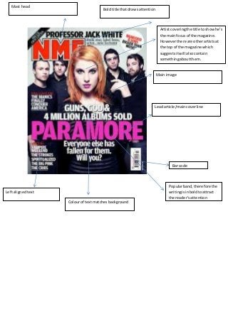
Mast head
Left aligned text
Artist covering the title to show he’s
the main focus of the magazine.
However there are other artists at
the top of the magazine which
suggests it will also contain
something about them.
Main image
Lead article/main cover line
Bar code
Bold title that draws attention
Popular band, therefore the
writing is in bold to attract
the reader’s attention
2. Limited fonts on the cover; as
overload of fonts makes the
magazine look unprofessional.
Mast head
Artist is in front of the title as the
magazine is popular.
Artist covering the title to show he’s the main focus of the magazine. However
there are other artists at the top of the magazine which suggests it will also
contain something about them.
Text surrounding the picture to
make the artist the main feature of
the cover.
Main image
Yellow font to make it stand out
in front of a white background.
Lead article/ main cover line