
Recommended
More Related Content
What's hot
What's hot (20)
Viewers also liked
Viewers also liked (14)
Similar to Evaluation Question 2: How effective is the combination of your main task and your ancillary tasks?
Similar to Evaluation Question 2: How effective is the combination of your main task and your ancillary tasks? (20)
More from L-Monk
Recently uploaded
Recently uploaded (20)
Evaluation Question 2: How effective is the combination of your main task and your ancillary tasks?
- 1. Evaluation Question 2: “How effective is the combination of your main product and ancillary tasks?”
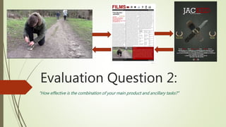
- 2. What were my three tasks for the project? For my project this year, I had three different products I had to produce. These included: A short social realist film (Main product) A promotional poster for that film (Ancillary task) A professional ‘Sight & Sound’ style review for the film (Ancillary task)
- 3. Main Task: Short Film “JACKED” The main task this year, was my short film ‘JACKED’ and the two other ancillary tasks were based upon this. My short film was a social realist text, that focussed on karma and the problems with violent and argumentative youths. In the film, the main character James has an argument with his girlfriend. After no time at all, she takes off a ring that he gave her and throws it onto the floor. After this, he is then followed by two hooded men with a knife and he is eventually mugged for a fake mobile phone and then later on his actual one. The film was shot on one afternoon in a small park in a suburban area of Surrey England. The audio taken, used the Cannon Ligeria’s on board microphone and all other sounds were added in using sound effects, music and mixing in Logic Pro X.
- 4. Promotional Poster The next ancillary task this year was the promotional poster for my film. This poster was purposed to be a promotional media entity that followed a professional standard, that was highlighted in my research into other professional film posters. This poster went through two completely different drafts and I speculated several different ideas for color and theme. However through audience research, I decided on a final design which was created using Adobe Photoshop CS6. The task set stipulated that I needed to have at least one piece of original photography, so to comply to this, the photos of the knife, phone and ring were all taken by me and cut out using tools in Photoshop.
- 5. Sight & Sound – Style Magazine Review The next and final ancillary task was my professional magazine review of the film. For this, I had to write and design the page for a review of my film. The review featured; A critical breakdown of the story and camerawork/editing an overall rating a summarized version of the film’s synopsis general information of the film the cast and credits For the task, the review had to look and sound like a professional review, and abide by the standards and conventions from other professional film reviews, such as those analyzed previously. These reviews included those taken from an previous release of Sight-&-Sound magazine.
- 6. Why is it important to have synergetic products? For many popular and successful film titles, whether they are Hollywood blockbusters, or award winning – independent film projects; it is essential that other media products are produced and synergized with these. This is so that consumers of media texts are well aware of the upcoming title and have a broad understanding of it. As well as this these extra products act as great promotion tools for the company, as well as allowing a broader spectrum of audiences to be attracted to the production. For example, the Batman ‘Dark Knight’ films cater to not only an older and more mature audience, but because of the video games and toy figures, they also attract a younger audience , whilst increasing their profit margins from the purchase of these products.
- 7. Why is it important to have synergetic products? Cont. A set of products are synergized when they use the same themes, images, characters and all focus around one specific idea or thing i.e. a film, a superhero, a celebrity or figure (documentary) etc. To evaluate the success of the combination of all three of my media products, I will be discussing how they have synergized with one another and explain what impact this has on them as a whole. For each product, the do not have to relate to each other in the exact same ways, but must all have features that relate them back to my original short film. Poster Review Short Film
- 8. How do my three products synergize with each other? - Poster Firstly, we shall look at the combination of my short film and promotional film poster. To synergize this with my original film, I decided to firstly keep and utilize the theme of violence and danger. To do so, I used a dark grey and gloomy background that covers the entire page. As well as this, I used only white and dark, blood-red for the text in the title, date, cast and credits. The dark blacks are conative of fear and the red is indicative of danger or pain. This relates to the James’ fear in the film, and the danger he was put into when confronted by the attackers. The contrasting white was to represent the happy and calm state that left James as he breaks up with his girlfriend and is then attacked and robbed.
- 9. Next, I made the tagline “what goes around…” to suggest the theme of Karma in the film, which may help educate the audience with the intended meaning of the short. My task stated that I must use at least one original piece of photography for the poster, so I decided to use this as an opportunity to help with its synergy. So, I took three separate photos of the actual props used in my short film. This included Kerry’s ring, James’ phone and the attacker’s knife. This will excite the audience when they finally see the items in the film, and it will make them feel as though they now understand the poster more. Each prop is representative of a main character and it is perfect for establishing a connection between the violent and dramatic theme, and the images within the film itself. How do my three products synergize with each other? - Poster
- 10. How do my three products synergize with each other? - Poster Finally, to create synergy between the poster and my main product (the short film), I used the exact same font and color choices for the title, as the title text in the actual film. This is used very commonly for professional film titles, and therefore it allows my product to seem, as though it to, was a high budget Hollywood production. To also make it seem like a professional and successful short film, I added the two golden leaf images, with an award title underneath it. The audience will see these and will assume it is worthy of watching if it has gained awards.
- 11. How do my three products synergize with each other? – Film Review My second ancillary task for the project was my ’Sight and Sound’ – style film review. It is hard to create synergy between this and my main product because in the media industry, reviews are never made by the same person as who made the film itself. However I have used several ways to subliminally relate this product with not only the short film, but also the promotional poster.
- 12. How do my three products synergize with each other? – Film Review Firstly, I used the design, color and structure of the page to relate this to my other tasks. After development of a pre-set website template, I changed the color theme, from a bright red, to white, black and dark, blood- red used in both my poster and the title text in the short film. The hard black and dark red used in the page title and surrounding boarders, again, links the product to the film’s connotations of danger and pain. As well as this, the white background used is the exact shade used in the first half of ‘JACKED’ in the title and the credits, therefore linking the review to my poster well.
- 13. How do my three products synergize with each other? – Film Review To create a connection between the review and the film, I also included a screenshot of the second scene in ‘JACKED’. Not only this, but a shorter, more concise version of my synopsis was placed in the bottom right corner, to show that the reviewer had a large understanding of the short’s narrative and was directly addressing the story given. Finally, my film was shot in Nork Park – Banstead, a small suburban area in surrey. To show that my film is supposed to be a well known production from this area, I titled the magazine ‘Banstead Reviewers Magazine’. This is shown in the black bars along the top and bottom of the page.
- 14. How effective is the combination of my two ancillary tasks and my short film?
- 15. Firstly, to measure how successful of a product my promotional poster is, I need to see how well it combines with my main task – the short film. Through the placement of the three items on the poster, the audience can quite clearly understand what my film is supposed to be about. The image of the knife will show to the audience that there will be themes of violence within the film, and help promote it as a social realist text – i.e. gritty, harsh, realistic etc. Unfortunately, this also means that when the knife is revealed in the short, If the viewer has already seen the poster, it will be less of a surprise and therefore have a less significant impact on them. The Short Film and the Poster
- 16. The Short Film and the Poster My film poster is used to reveal the genre, themes, issues and meaning of the film to the audience. However it is quite unrevealing in other aspects such as the fact that there is no background photo of any characters or a scene from the film. This will make the audience wonder exactly what the characters will look like, and where the film could be set. For example we see the photo of the ring amongst the phone and the knife. Firstly, the audience will be wondering what significance the ring actually has in the film, and will therefore make the audience curious when they watch it for the first time. Also, this unrevealing method, allows the audience to create their own preconceptions of what these items will be about and will therefore be more interested and focused when watching the short. This means that the poster with have successfully acted as a product to advocate and endorse the quality and ’watchability’ of my film.
- 17. The Short Film and the Review My Sight and Sound-style magazine review can be said to have an effective combination for several reasons. However there are still aspects that may suggest an improper connection between the two. Firstly, the review utilizes the colors of the promotional poster and the film title, therefore establishing a clear unidentifiable connection between the two. My review also addresses the film as a professional product and criticizes it accordingly. This is to create the illusion that the film is a higher-budget production that could be seen in television breaks or film festivals. Finally, beside the title of the magazine section ‘films’, there are logos of several professional film production companies. Because of this, it is placing my product (the short film) in the same category as productions by all of these major organizations. This is useful because the intended audience will therefore perceive my film as a more professional product that deserve recognition.
- 18. The Short Film and the Review – The Downfalls Although the review was in many was successful in creating a link between itself and my main task, and establishing a professional standard to the film, there are still some downfalls that could be improved upon to increase its credibility as a successfully combined media product. Firstly, it is fair to say that the review has an ‘online’ style to it, and could be recognized as a template for a review from independent critics’ website. This would therefore make the audience less confident about the credibility of the review, because online sources are seen as less prestigious as those with their own magazines. As well as this, the overall star rating given to the film by the review, could have been placed onto the film poster, to synergize the two products further with the film.
- 19. Overall Evaluation It is fair to say that my three media products combine well together as a whole media entity. This means that they link together well, and allow the audience to recognize my main task (the short film) as a professional media product that is synergized between other products. The poster worked well to promote the short film, as well as providing a good amount of information to the audience, to establish genre, themes and issues, meaning and connotations. However it is at part, lackluster in providing an idea of what the film entails. Next, the review of the short film was great for establishing a professional recognition for the film, as well as producing a usable rating and critical evaluation of the narrative and cinematography. But unfortunately, the review could have been related and connected to the other products better, by possibly adding images, logos, or quotes directly related to the film and/or its ’production company’.
- 20. Thank you for watching my presentation
- 21. Evaluation Question 2: “How effective is the combination of your main product and ancillary tasks?”