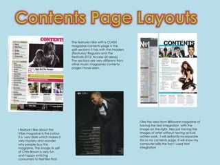
1. The features I like with is CLASH
magazine contents page is the
split sections it has with the headers
(Features/ Regulars and the
Festivals 2012: Access all areas)
The sections are very different from
other music magazines contents
pages I have seen.
I like the idea from Billboard magazine of
having the text integration with the
I feature I like about the image on the right. Also just having the
Vibe magazine is the colour images of artist without having actual
it is very dark which makes it written work. I will defiantly incorporate
very mystery and wonder this in my contents page. It will show my
why people buy this computer skills the fact I used text
magazine. The image its self integration.
of Chris Brown is very fun
and happy enticing
consumers to feel like that.
2. More Content Pages
I like the position that Taylor Swift
is standing in using the prop of a
guitar. Also her standing in front
of the Billboard sign.
I like the happiness of Rita Ora’s face it very
calm and relaxed and the picture is very clear
too not that much going on.
3. The thing I like abut
this magazine
double page
spread is the layout
of the picture on
the right hand side
and the text on the
left. But I think I will
have the text on
the right and the
image on the left.
A very nice feature of the magazine is the
red highlighted ‘L’ used. The ‘L’
represented is for Lady Gaga. I would like
to incorporate this into my own magazine
The thing I like about this for my artist.
magazine double page spread
layout is the triangle shapes used
to separate certain things. The
image is very dominate, a bad
thing about the magazine is the
image does take up most of the
page. Which isn't showing your
writing skills. But for my double
page spread I will have my artist
sitting down.