
Recommended
More Related Content
What's hot
What's hot (17)
Viewers also liked
Viewers also liked (20)
Similar to Question one evaluation
Similar to Question one evaluation (20)
Recently uploaded
Recently uploaded (20)
Question one evaluation
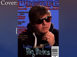
- 1. { Cover:
- 2. Cover The masthead is the second largest piece of text on the cover it takes up about an 8th of the whole cover page. The effects used are drop shadow, inner shadow, outer glow, inner glow, bevel and emboss and color overlay. Each of these effects are meant to make the title look like a ‘wreck’, its also dented on the middle to make it look like a car hit it. That’s also where the idea of the name comes from. The font is meant to look like a arcade game from the 90s, as the main focus of the magazine is a 90s look. I also paired the 90s font with a 90s colour scheme, blue/purple with red accents. As inspiration I used many different rap magazines like Rap Pages, XXL and the source. I took some aspects from each magazine and I put them together. The colour scheme was based of the matt 3 to 4 colours on old Rap Pages magazines. On the music magazines I listed all the artists make eye contact with the camera, this is the first convention I broke. I followed most of the conventions of magazines. When I was planning my magazine I still wasn’t too sure what type of music my magazine would focus on. This was a good thing because I had a better idea of conventions that many different magazines used. I used generic conventions like the left side of the magazine being used for cover lines, having the bar code on the right hand side (not really a convention its more what fits best on the magazine and doesn’t interfere with the photo too much ) and that there is a issue number and date on the magazine.
- 3. Cover photos On every rap magazine there seems to be a convention of showing the artist as seriously as possible. In pop magazines every front cover photo is taken with the artist smiling from ear to ear. I tried remaking the serious vibe in my photo-shoot as I decided that we needed a bit of gold and a pair of dark sunglasses to add a rap magazine atmosphere. Also to modernize the front cover I added a bit of Japanese writing to the hoodie ‘Big bates’ was wearing. There was originally a tiger on the hoodie but it really didn’t look the part, so I got rid of it in Photoshop. I was also thinking of using a snapback but that would ruin the 90s house style of the magazine that I did my best to keep.
- 4. Contents:
- 5. This is the contents page of The Source magazine I based my layout on The layout of my contents page was similar to what The Source magazine usually uses. The Source is one of the oldest if not the oldest rap magazine around. What's interesting about the magazine is that it also covers politics and culture for example Barack Obama was featured on Its cover. The target market for The Source magazine is between 17-30 this is exactly the same target age I was going for. As The Source has a house style that is specific for a rap magazine. The challenge I faced during the making of the cover page was to make it clear and easy to read and still follow my magazines house style. I decided to use a 90s font with a clear modern font. The contents page still used the colour scheme that was evident on the cover page. The subheadings where chosen as they summarize what happened in each article. Then the ‘sub’- sub headings explained a bit more about what the articles were about. The contents photo was taken during the cover photo-shoot. It didn’t suit the cover but it looked great on the contents. It also helped that big bates leaned a bit to the side.
- 6. Article:
- 7. This is the article I based my design off. The design does not look especially eye catching but I had a lot of space to work with. I remodeled the article side and added another picture for effect. I decided to keep the 3 row article as it didn’t look too cluttered and it was relatively easy to read. I also took some parts from this edition of The Shortlist magazine about the interview they had with Jay Z. I combined them both, I chose a couple of ideas then I made a test version (which had way to much happening on the page and it didn’t stay in the house style of the magazine) :
- 8. Article Conventions: Here is exactly when I spiced the magazine up completely. For the featured article I Wanted something a little more modern as Big Bates is a new and upcoming artist. The Colours used in this article are mainly black, white with green and red accents. The box around the title on the right page really filled the space and used the magazines main colour. The green accent on the left side on the bottom of the photo linked well with the photo as there was nothing really there. I used 2 images. One main one with a fisheye lens that completely transformed the photo and with a slight change of white balance and exposure for the really dark parts of the photo. This effect really reminded me of 90s skate videos. I tried to keep the house effect of 90s in the photo. The other photo was implemented into the article. It was also taken with a fisheye lens, but this time I changed the settings back to suit a darker scene so the camera let in more light. The readers will probably first look at the image on the left side. This is why an interesting image will instantly grab attention. This is a convention in mostly rap magazines as rappers often pose with fast and equally as expensive cars to grad attention.
- 9. Challenging conventions: I went for quite a safe publication in all honesty. I only purposely broke one convention because the photo looked so engaging and mysterious. The convention for most magazines is that the artist looks into the camera. I believe that “successful publications are risky publications” is partially correct. I also purposely broke my own house style in the article about Liam Bates because he is a new and upcoming artist, and the modern style really fits it. I also wouldn't say that it completely brakes the house style it just modifies it. There are a couple of really risky publications like ID. ID literally keeps with no conventions of music magazines or any magazine for that matter. They always have the photo of the artist with one eye covered or closed. They also never have subheadings and they often have the main title of the magazine rotated. In the last 5 years they have had a real change of design and their magazines focuses on a lot on really good photography as that their selling point now.