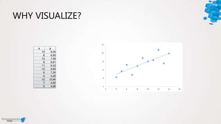
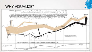
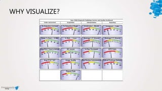
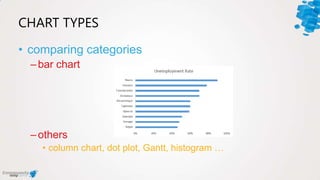
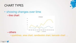
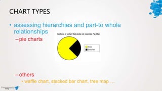
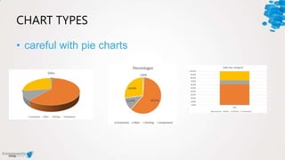
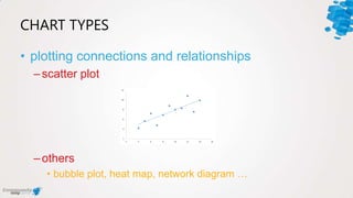
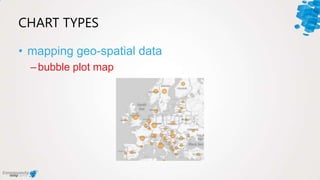
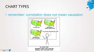
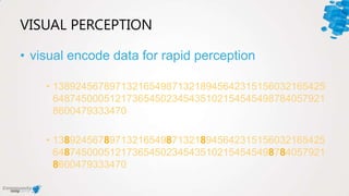
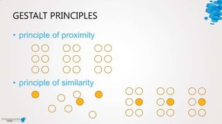
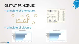
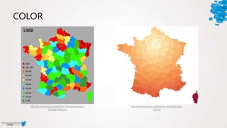
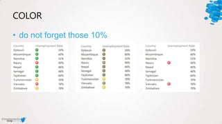
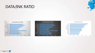
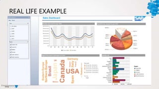
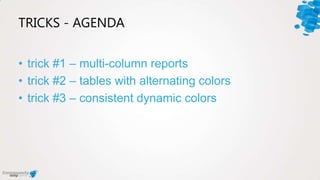
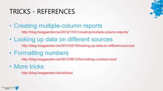
#comdaybe
DATA VISUALIZATION
TIPS & TRICKS
SQLUG.be – Koen Verbeeck & Valentino Vranken
WHO ARE WE?
BI Consultant
Board Member
Most Valuable
Expert
blog.hoegaerden.b
e
@ValentinoV42
WHO ARE WE?
BI Consultant
MCSE SQL 2012
MCC
blogs.lessthandot.c
om
@Ko_Ver
tips
DATA VISUALIZATION TIPS & TRICKS
TIPS - AGENDA
• tip #1 – establish intent
• tip #2 – use the correct chart type
• tip #3 – tap into visual perception
• tip #4 – reduce data/ink ratio
WHY VISUALIZE?
x y
10 8,04
8 6,95
13 7,58
9 8,81
11 8,33
14 9,96
6 7,24
4 4,26
12 10,84
7 4,82
5 5,68
WHY VISUALIZE?
WHY VISUALIZE?
RESOURCES
establish intent
TIP #1
ESTABLISH INTENT
• explanatory
–strategic
–operational
• analytical
• exhibition
STRATEGIC
• “executive” dashboard
• high-level
• limited/no interaction
• not real-time
Information Dashboard Design p. 177 – Stephen
Few
OPERATIONAL
• immediate & dynamic
• deeper level of detail
• limited/no interaction
• real-time
Information Dashboard Design p. 199 – Stephen
Few
ANALYTICAL
• deeper level of detail
• interactions with data
• not real-time
• more complex
Information Dashboard Design p. 201 – Stephen
Few
EXHIBITION
• “data art”
• self-expression through
raw data
• more emotive
http://www.biodiaspora.com
use the correct chart type
TIP #2
CHART TYPES
• comparing categories
–bar chart
–others
• column chart, dot plot, Gantt, histogram …
CHART TYPES
• showing changes over time
–line chart
–others
• sparklines, area chart, candlestick chart, barcode chart …
CHART TYPES
• assessing hierarchies and part-to whole
relationships
–pie charts
–others
• waffle chart, stacked bar chart, tree map …
CHART TYPES
• careful with pie charts
CHART TYPES
• plotting connections and relationships
–scatter plot
–others
• bubble plot, heat map, network diagram …
CHART TYPES
• mapping geo-spatial data
–bubble plot map
CHART TYPES
• remember: correlation does not mean causation
tap into visual perception
TIP #3
VISUAL PERCEPTION
• visual encode data for rapid perception
• 138924567897132165498713218945642315156032165425
648745000512173654502345435102154545498784057921
8600479333470
• 138924567897132165498713218945642315156032165425
648745000512173654502345435102154545498784057921
8600479333470
GESTALT PRINCIPLES
• principle of proximity
• principle of similarity
GESTALT PRINCIPLES
• principle of enclosure
• principle of closure
COLOR
• not quantative
• rather use intensity
COLOR
http://en.wikipedia.org/wiki/File:FrancePopulation
Density1968.png
http://www.theusrus.de/blog/the-good-the-bad-
22012/
COLOR
• do not forget those 10%
reduce data/ink ratio
TIP #4
DATA/INK RATIO
• reduce the non-data pixels
–don’t use 3D effects
–no backgrounds or gradients
–remove grid lines, decoration, borders, fill colors, …
• reduce unnecessary data pixels
–display only what is really needed for the visualization
• highlight most important pixels
DATA/INK RATIO
REAL LIFE EXAMPLE
Q&A
tips
DATA VISUALIZATION
tricks
DATA VISUALIZATION TIPS & TRICKS
TRICKS - AGENDA
• trick #1 – multi-column reports
• trick #2 – tables with alternating colors
• trick #3 – consistent dynamic colors
multi-column reports
TRICK #1
tables with alternating colors
TRICK #2
consistent dynamic colors
TRICK #3
Q&A
tricks
DATA VISUALIZATION
TRICKS - REFERENCES
• Creating multiple-column reports
http://blog.hoegaerden.be/2012/11/01/creating-multiple-column-reports/
• Looking up data on different sources
http://blog.hoegaerden.be/2010/05/16/looking-up-data-on-different-sources/
• Formatting numbers
http://blog.hoegaerden.be/2013/06/12/formatting-numbers-ssrs/
• More tricks
http://blog.hoegaerden.be/articles/
CONTACT INFORMATION
• blogs.lessthandot.com/index.php/Al
l/?disp=authdir&author=940
• @Ko_Ver
• Koen.Verbeeck@ordina.be
• blog.hoegaerden.be
• @ValentinoV42
• valentino@hoegaerden.be
Thanks!
tips & tricks
DATA VISUALIZATION

Data Visualization Tips & Tricks