c Starting with 5000/- for Savita Escorts Service 👩🏽❤️💋👨🏿 8923113531 ♢ Boo...
Photoshoot images 2
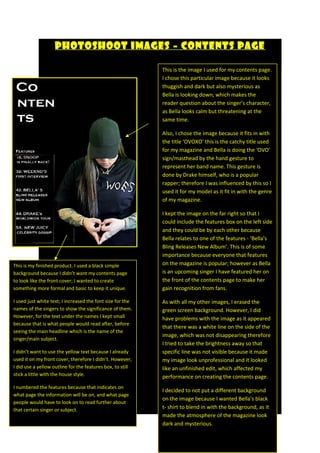
1. Photoshoot Images – Contents Page
This is the image I used for my contents page.
I chose this particular image because it looks
thuggish and dark but also mysterious as
Bella is looking down, which makes the
reader question about the singer’s character,
as Bella looks calm but threatening at the
same time.
Also, I chose the image because it fits in with
the title ‘OVOXO’ this is the catchy title used
for my magazine and Bella is doing the ‘OVO’
sign/masthead by the hand gesture to
represent her band name. This gesture is
done by Drake himself, who is a popular
rapper; therefore I was influenced by this so I
used it for my model as it fit in with the genre
of my magazine.
I kept the image on the far right so that I
could include the features box on the left side
and they could be by each other because
Bella relates to one of the features - ‘Bella’s
Bling Releases New Album’. This is of some
importance because everyone that features
on the magazine is popular; however as Bella
is an upcoming singer I have featured her on
the front of the contents page to make her
gain recognition from fans.
As with all my other images, I erased the
green screen background. However, I did
have problems with the image as it appeared
that there was a white line on the side of the
image, which was not disappearing therefore
I tried to take the brightness away so that
specific line was not visible because it made
my image look unprofessional and it looked
like an unfinished edit, which affected my
performance on creating the contents page.
I decided to not put a different background
on the image because I wanted Bella’s black
t- shirt to blend in with the background, as it
made the atmosphere of the magazine look
dark and mysterious.
This is my finished product. I used a black simple
background because I didn’t want my contents page
to look like the front cover; I wanted to create
something more formal and basic to keep it unique.
I used just white text; I increased the font size for the
names of the singers to show the significance of them.
However, for the text under the names I kept small
because that is what people would read after, before
seeing the main headline which is the name of the
singer/main subject.
I didn’t want to use the yellow text because I already
used it on my front cover, therefore I didn’t. However,
I did use a yellow outline for the features box, to still
stick a little with the house style.
I numbered the features because that indicates on
what page the information will be on, and what page
people would have to look on to read further about
that certain singer or subject.