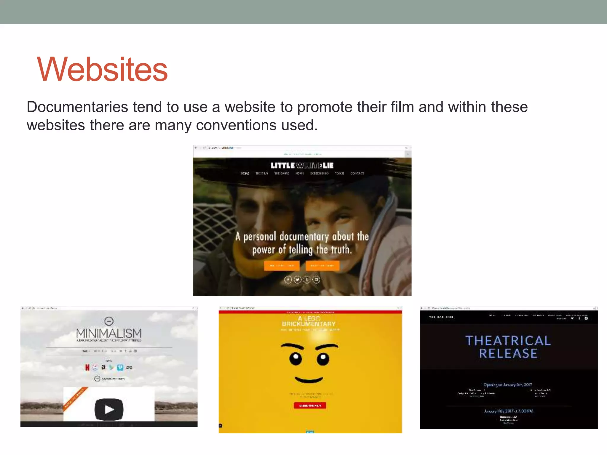
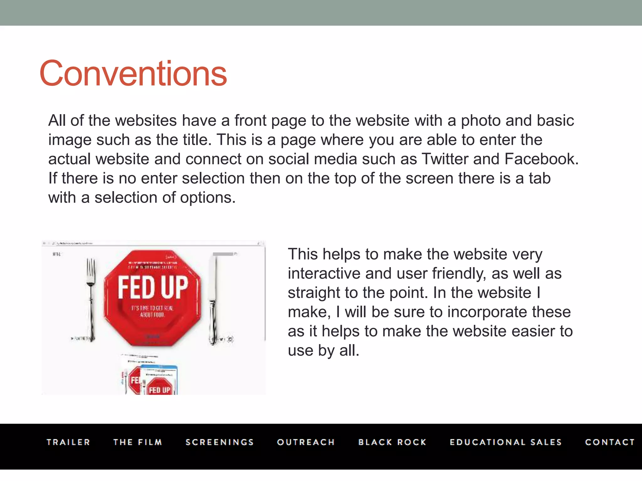
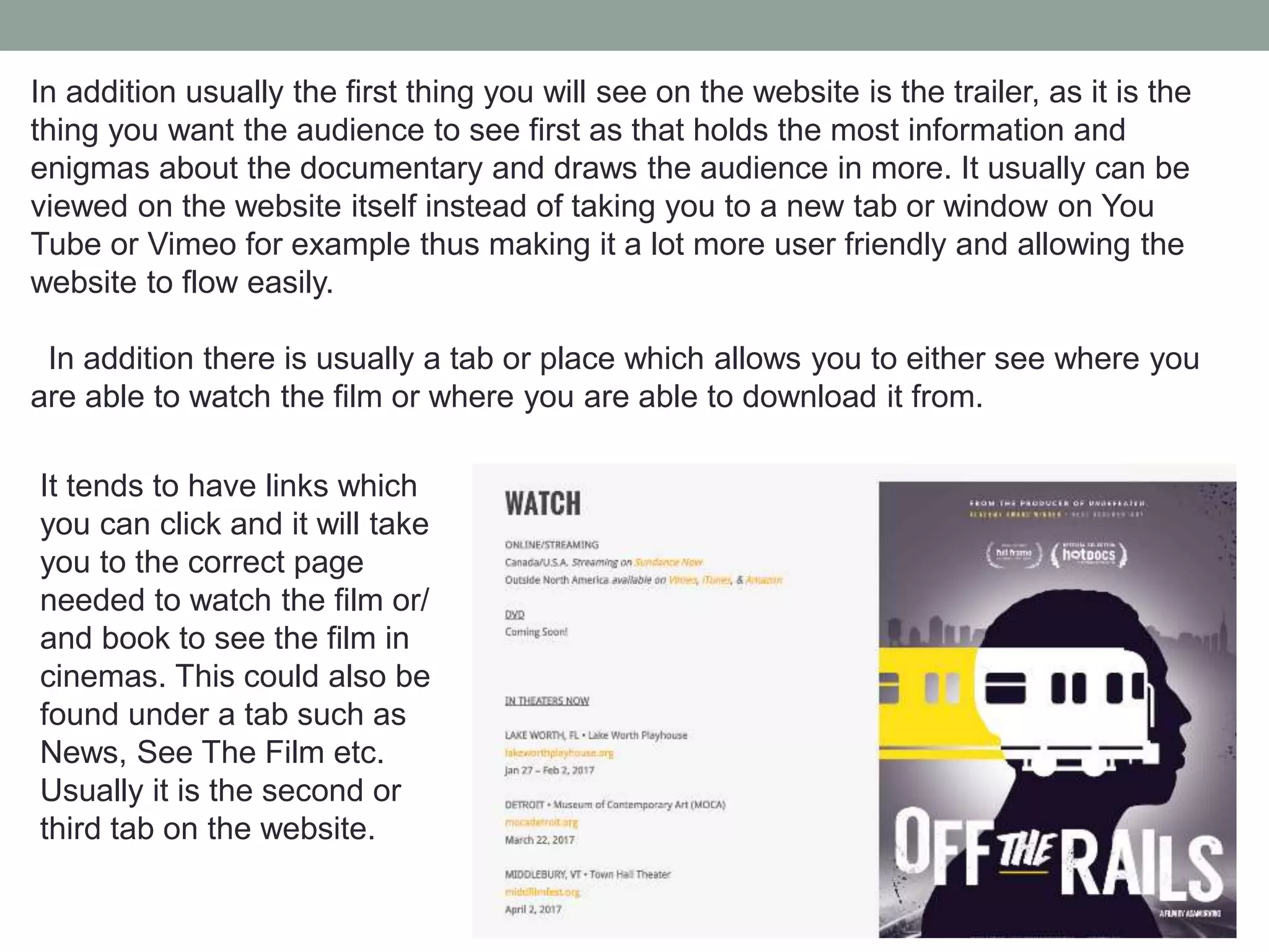
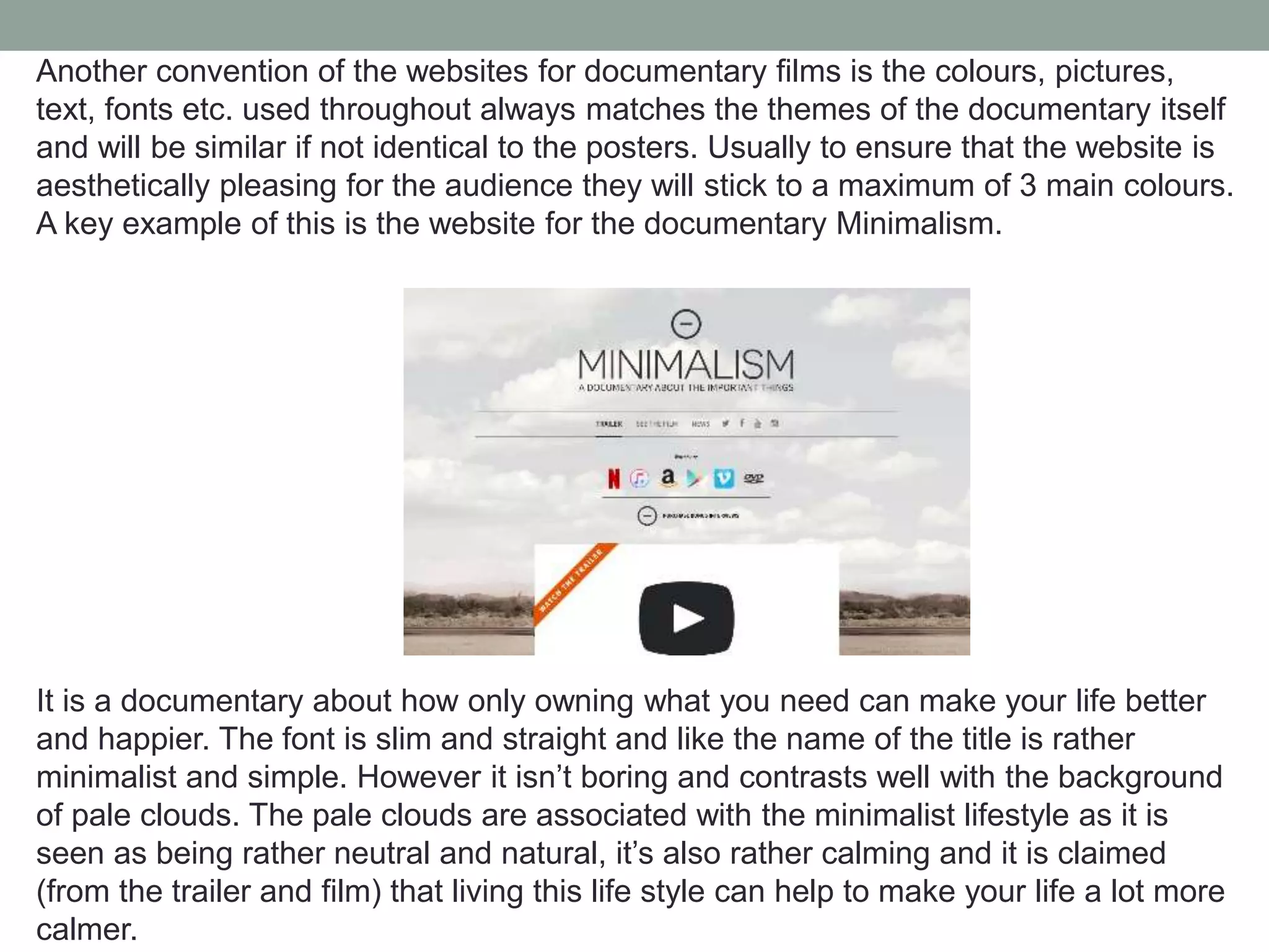
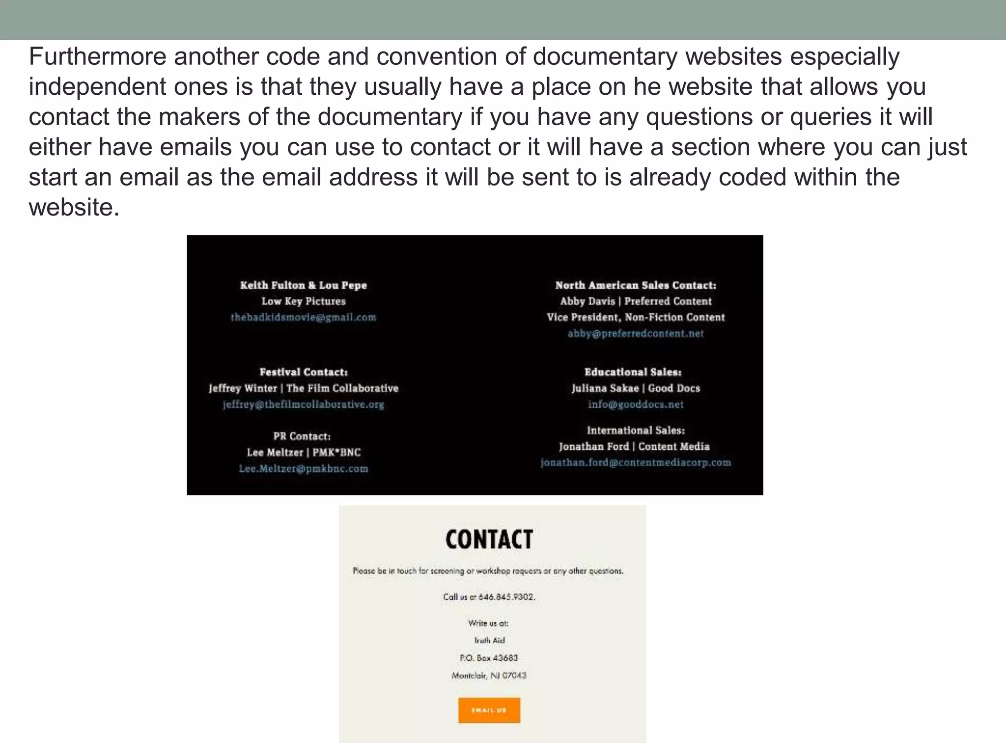
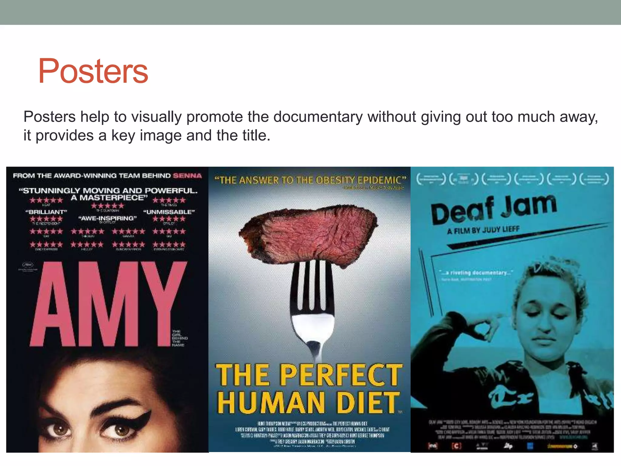
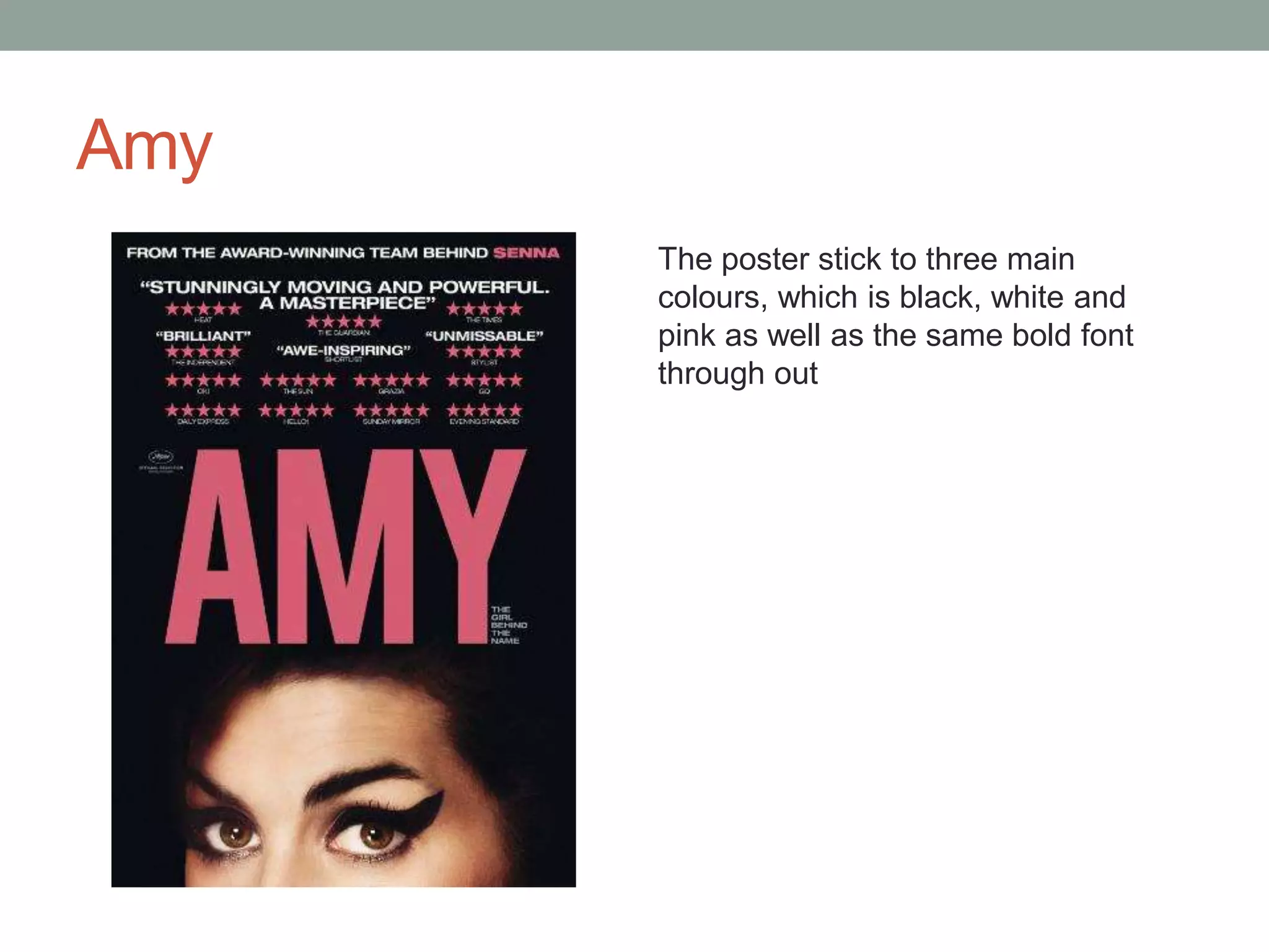
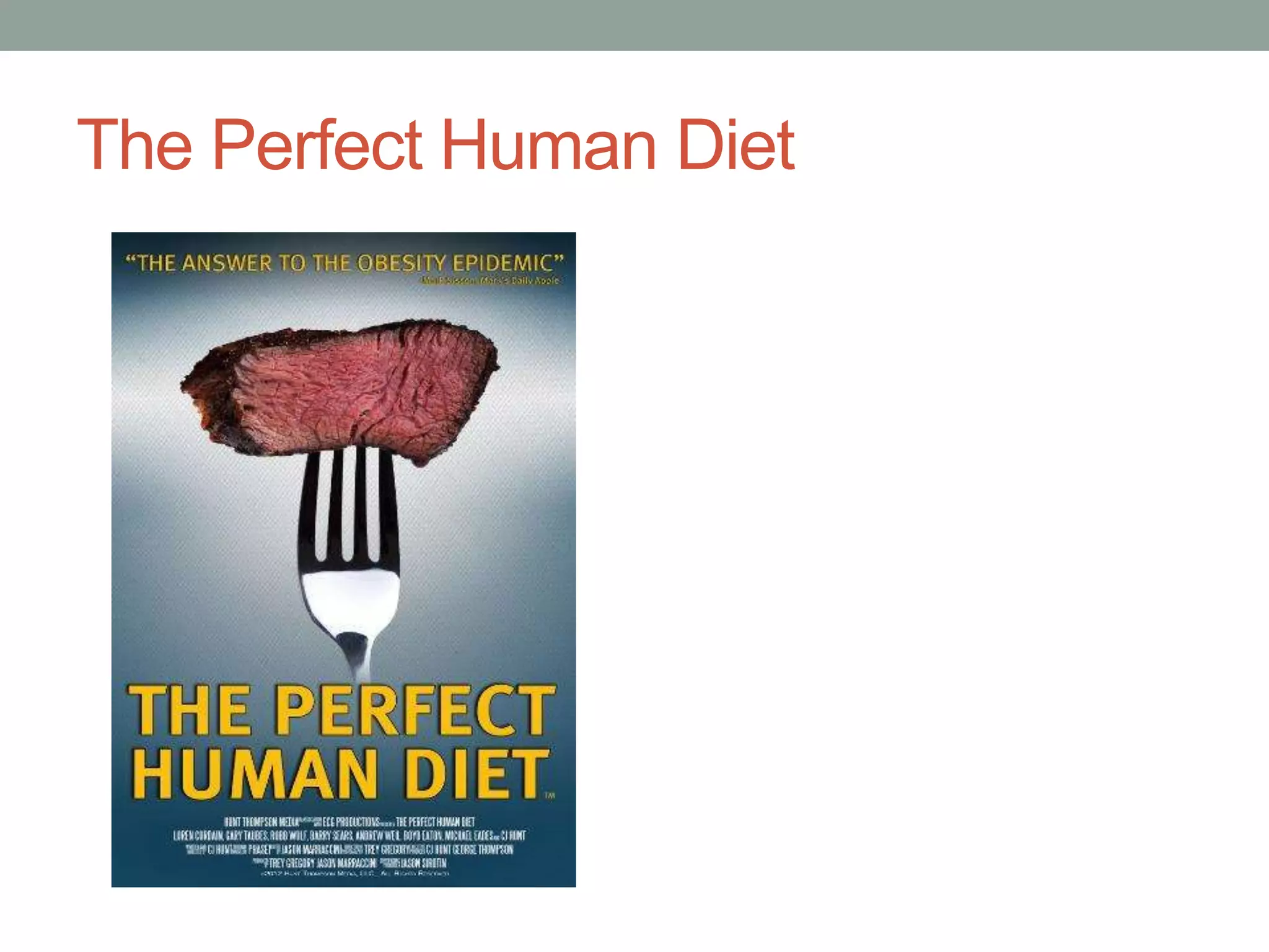
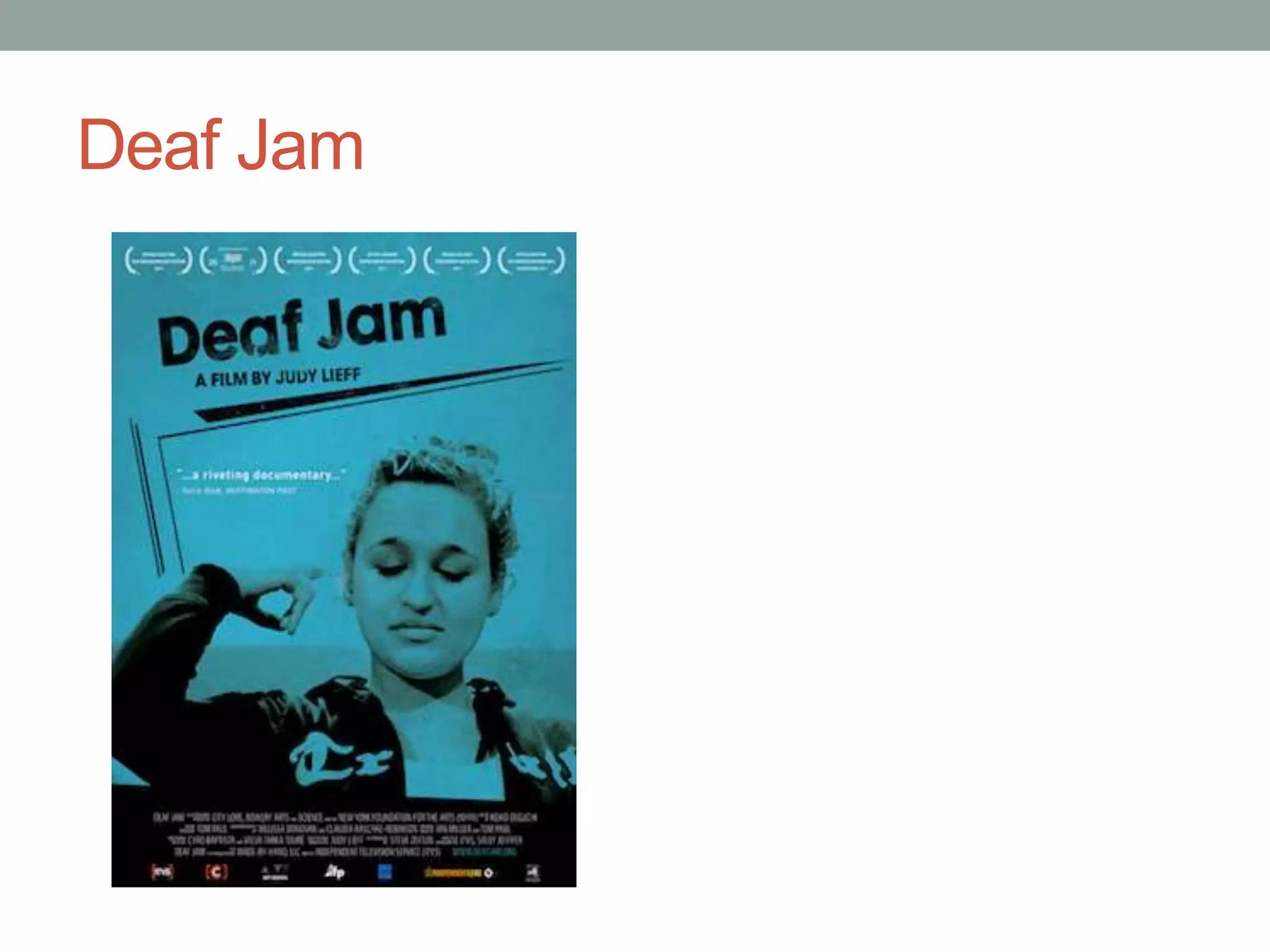
The document discusses the codes and conventions of documentary websites and trailers. It outlines that documentary websites typically include links to the film trailer, information on how to watch or purchase the film, photos and colors that match the documentary's themes. The document also notes that documentary trailers usually begin with a voiceover, use archive footage to set the scene, include reviews and awards, end with the title to leave audiences wanting more, and use consistent music to match the emotional tone. Both websites and trailers aim to promote the documentary and draw in audiences through their visuals and limited revealing of information.
2. Codes & Conventions
Codes are a signs within media that help to create meaning, you have technical
codes which is how technology is used such as camera equipment and editing
software as well as symbolic codes which is the hidden connotation or deeper
meaning of the media text.
Conventions are the common themes, technology and stereotypes found within
a media text for example: Documentaries about Gangs usually will be self filmed
by the gang members and footage would be secondary occasionally.
These two components are very important to analyse in media texts especially
when creating your own as they help to expand your own creativity and
understanding.
3. Documentaries tend to use a website to promote their film and within these
websites there are many conventions used.
Websites
4. Conventions
All of the websites have a front page to the website with a photo and basic
image such as the title. This is a page where you are able to enter the
actual website and connect on social media such as Twitter and Facebook.
If there is no enter selection then on the top of the screen there is a tab
with a selection of options.
This helps to make the website very
interactive and user friendly, as well as
straight to the point. In the website I
make, I will be sure to incorporate these
as it helps to make the website easier to
use by all.
5. In addition usually the first thing you will see on the website is the trailer, as it is the
thing you want the audience to see first as that holds the most information and
enigmas about the documentary and draws the audience in more. It usually can be
viewed on the website itself instead of taking you to a new tab or window on You
Tube or Vimeo for example thus making it a lot more user friendly and allowing the
website to flow easily.
In addition there is usually a tab or place which allows you to either see where you
are able to watch the film or where you are able to download it from.
It tends to have links which
you can click and it will take
you to the correct page
needed to watch the film or/
and book to see the film in
cinemas. This could also be
found under a tab such as
News, See The Film etc.
Usually it is the second or
third tab on the website.
6. Another convention of the websites for documentary films is the colours, pictures,
text, fonts etc. used throughout always matches the themes of the documentary itself
and will be similar if not identical to the posters. Usually to ensure that the website is
aesthetically pleasing for the audience they will stick to a maximum of 3 main colours.
A key example of this is the website for the documentary Minimalism.
It is a documentary about how only owning what you need can make your life better
and happier. The font is slim and straight and like the name of the title is rather
minimalist and simple. However it isn’t boring and contrasts well with the background
of pale clouds. The pale clouds are associated with the minimalist lifestyle as it is
seen as being rather neutral and natural, it’s also rather calming and it is claimed
(from the trailer and film) that living this life style can help to make your life a lot more
calmer.
7. Furthermore another code and convention of documentary websites especially
independent ones is that they usually have a place on he website that allows you
contact the makers of the documentary if you have any questions or queries it will
either have emails you can use to contact or it will have a section where you can just
start an email as the email address it will be sent to is already coded within the
website.
8. Codes and Conventions
• Images that match/ link to the documentary
• Links to the trailer and where to stream or buy it from
• Reviews and comments
• A range of social links to sites such as Twitter, Instagram, Facebook etc.
• A place where you can contact the makers or any other people involved
with the film
• Usually extremely user friendly where it allows you for example to click
on links or tabs to take you to the next relatable page
• Colours and fonts that will connote the themes easily and are also
aesthetically pleasing
• With regards to colours usually only a maximum of 3 main colours are
used through out the website and the images used on it
• Not too much writing but enough to give information about not only about
what will be documentary in general but also about the whole production
process to make the final product.
• Occasionally a title page or home page with just the poster and a button
to proceed to the rest of the information found on the website
9. Trailers for any film are extremely important to promote a text along side the
website, in fact the trailer can be far more important than the website and it hold
the most potential in ensuring people will watch the (documentary).
Trailers
Trailer for the film Minimalism : https://www.youtube.com/watch?v=0Co1Iptd4p4
10. Minimalism
When the trailer begins it jumps straight in with a voice over this a key convention
of many documentary film trailers as It open up straight away, jumping into what
the film will about but also leaving some enigmas, allowing the audience to be kept
guessing hence ensuring that they carry on watching. Then almost archive like
footage is cut in of people on black Friday sales at shops and it is very tense with
new coverage like speech over it, I feel as though having footage that looks or
could possibly be second hand and archived is a key convention in trailers for
documentaries to really tell the story of the films themes and what it will about it, it
also connotes that it is about a real life issue that people could be familiar with
allowing the audience to engage and connect with it in many ways. I feel as though
a documentary should allow you to really feel apart of the text which is a key
function of media communicated through uses and gratification theories.
Shortly after this we are introduced to awards that the documentary has received,
and the music moves from intense to a lot more indie, acoustic like music to
connote the idea of minimalism as the music is very simple and isn’t over the top in
anyway. In addition having the awards at the beginning of the trailer allows for the
audience to already set up their expectations for the film so that they go in with the
idea it will brilliant.
11. As the trailer proceeds more archive like footage of magazines, stores, celebrities
etc. Are seen and you have voice overs of professionals such as writers explain to
us shortly about how the modern day need to consume is effecting us, it will as they
finish talking cut to their face so we are able to see who is in fact discussing this
idea. It then shortly after reveals in-fact what the film will be about which is how
people live a minimalist lifestyle and how beneficial it is to them and the world
around them, it allows for a upbeat atmosphere allowing the audience to feel a
sense disengagement from the world around them and really feel entertained and at
peace with what they see in the text as it is so relaxing and joyful this hence really
does target those who want to be educated and find something new and through
doing this it allows the audience to want to understand these enigmas within the
trailers to really understand how good a lifestyle like this can be thus they want to
watch the full film. Finally the last things you see in the trailer are the title and realise
dates along side some small text of information about the creators.
Having the title at the end of the trailer is a key convention to really any film trailers
especially documentary ones, as it leaves the audience hanging wanting to find out
what the film is called so they can find out even more thus they have to wait to the
very end to find this information out and then it follows by the release date so that
the audience must sit through the whole trailer to gain a further understanding of
when they can see the movie. Furthermore the title for the movie in the trailer is the
exact same font and typography as on the posters and website so that it fits
together well and sticks to the same format.
12. Trailer for The True Cost: https://www.youtube.com/watch?v=OaGp5_Sfbss
13. The True Cost
The similarities between The True Cost and Minimalism really reveal how
documentary trailers stick to this very similar format of voice over, archive like
footage, in-fact The True Cost uses a piece of the same footage as in Minimalism
near the end of people running into a store, followed by very emotive music to match
the theme and the title at the end.
The True cost however is a more emotive, sadder documentary informing and
educating people about the effects of sweat shops, thus it the music within is very
moving throughout which is a key code of much more emotionally moving trailers for
documentaries where the music is consistent through out and doesn’t change much
as well as really fits the mood. From the archive footage there is a real contrast
between first world fashion consumerism and third world fashion manufacturing to
really demonstrate and connote how much of an issue it, having contrasting footage
is an important convection of documentary trailers as it sets out an enigma for
audience where they can already see how much of an issue there is however they
want to find out more thus they have to watch the film. Having this type of footage
near the end without any speech just the emotive music and film really leaves the
audience wanting more and doesn’t reveal too much about the film but does show
the main, key themes that is will about as well leaving it on a dramtic cliffhanger
14. Trailer for The Bad Kids: https://www.youtube.com/watch?v=-gHRZKRuuRk
15. The Bad Kids
Instead of starting with a voice over like the previous trailers, this trailer begins with
music that has a consistent beat and a mention of an award to reveal to the
audience that it is a excellent film, having reviews of awards through out like this
trailer does is extremely important to inform the audience that the film is award
winning and is interesting so that they will want to see it. In addition to this instead
of a voice over about the film seem to have more text that states things such as
“Somewhere in the dessert” to set the scene, I feel like this is a very interesting and
useful technique as it allows the audience to quickly pick up on key information that
may be missed in a voice over. This is a convention used in very fast paced trailer
that need to communicate important facts about the film. In addition in the text it
uses rhetorical questions to get the audience thinking, this is a key convention in
documentary film trailers either through text or speech to start the cogs turning in
the audiences brains so they begin from the very start to think about what they can
learn from the film. The trailer continues with introducing characters who will be
found in the film that play an important role and gives the audience a sneak peak-
insight into what their lives are like acting as a enigma code as the audience wants
to find out more about them and their journey through out the film.
16. Codes and Conventions
• Quick snappy cut aways to reveal the themes in the film sometimes they can
look very achieve footage like
• Voice overs by professionals ie) Doctors, teachers, writers etc.
• The Title always found at the end of the trailer to leave the audience waiting to
find out more about it
• Enigmas through unanswered, rhetorical questions either through speech or text
on the screen that leave the audience wanting to understand and learn more
• The same text through out that is usually also the same text on the poster and
the website
• Awards and reviews all the way through but ensuring that there is one near the
beginning to inform the audience that the documentary film is award winning and
critics enjoyed it so they will too
• The trailer tends to end on some kind of cliff hanger so the audience want to
watch the full documentary to find out what happens
• The music is consistent throughout and matches the themes in the documentary
usually focusing on the emotions the trailer is meant to promote
17. Posters
Posters help to visually promote the documentary without giving out too much away,
it provides a key image and the title.
18. Amy
The poster stick to three main
colours, which is black, white and
pink as well as the same bold font
through out