
Recommended
More Related Content
What's hot
What's hot (15)
Similar to Music magazine analysis
Similar to Music magazine analysis (20)
More from Jessemurray111
More from Jessemurray111 (15)
Recently uploaded
Recently uploaded (20)
Music magazine analysis
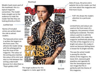
- 1. Masthead Justified text Models head covers part of the masthead- this is a typical magazine convention. The model looks straight out to the audience to make the reader feel like they are looking directly at them. Puff- this draws the readers attention to a particular story. Date of issue, the price and a website link so the reader can find out more about the magazine and find more issues. Barcode Names of included artists are written down the side to attract readers. Limited fonts and colours are used on the front cover of a magazine, this prevents it from looking too cluttered. The font colours used tie in with the models outfit, this makes the magazine aesthetically pleasing. The title of the magazine is in a bright red colour, this makes it stand out because Rolling Stone is known for its bright red title. The featured artists name is written the largest on the front cover. This attracts the reader along with the photograph to buy this issue of the magazine. The colour of the writing also matches the colour of his shirt and also is a link between the writing underneath because he is described as “Pop’s golden child”. The way the artist/ model is posing fits into the theme of the magazine. His loose shirt, excessive gold jewellery and cigarette fit into the stereotypical rock star image that fits in perfectly with the theme of this magazine.
- 2. Masthead The models head covers part of the masthead. He looks straight out to the reader to make them feel like he is only looking at them. These are both typical conventions of magazines. Puff- this is in a bright colour that doesn’t match the theme of the rest of the magazine to attract the reader. The advertisement for a free CD is a major attraction to the reader and can make them more likely to buy this issue of the magazine. Puff- this is there to attract the audience to this specific story of the magazine. The featured artist is written in the biggest font to make is stand out. The artists/ bands name along with the model is the biggest attraction for this issue of the magazine. The term “Exclusive!” is used to make the reader believe that the stories included in this magazine can only be read in this issue. A limited number of fonts and colours are used on the front cover, this stops the magazine from looking cluttered. The dark mise-en-scene fits into the theme of the magazine. The font colours are taken from the colours that the model is wearing to make the cover more aesthetically pleasing. The model is also dressed as a stereotypical rock star because that is the general theme of the magazine. The names of featured artists and bands are included on the front cover to draw the reader in. The target audience for this magazine is males aged 18-30. The model is photographed from a low angel at a medium shot. He has shadows on his face to make him look more mysterious and rock like.
- 3. Masthead Banner- This is the magazines tag line Featured artists names are included down the side to attract the audience to buy this issue of the magazine. The model is a famous rock artist, this immediately attracts the reader because if they like the artist they are more likely to buy this issue. The model is made to look rebellious because he is hitting the masthead with his guitar. This fits into the stereotypical rock star image of this magazine. The front cover of a magazine generally only uses limited fonts and colours. The colours used on this magazine are dark and fit into the theme of this magazine. The models outfit matches the colour scheme of the magazine. The featured artists name is written in large, bold letters to attract the audience to buy this issue of the magazine. Justified text A picture of a famous band is included to draw the reader in. Anyone who is interested in that band is more likely to buy this issue of the magazine.Barcode The artist is photographed at a long shot, this is so that you can see his full outfit. The mise-en- scene is dark to make the model look more rebellious .