1. Brand Identity and Target Audience Analysis
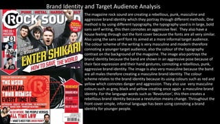
The magazine rock sound are creating a rebellious, punk, masculine and
aggressive brand identity which they portray through different methods. One
method is by using different typography, the typography used is in large, bold
sans serif writing, this then connotes an aggressive feel. They also have a
house feeling through out the font cover because the fonts are all very similar.
Also using the sans serif font its aimed at a more informal target audience.
The colour scheme of the writing is very masculine and modern therefore
connoting a younger target audience, also the colour of the typography
contrast on the background of the magazine. The image also portrays the
brand identity because the band are shown in an aggressive pose because of
their face expression and their hand gestures, connoting a rebellious, punk,
aggressive brand identity. The image is also very masculine because the band
are all males therefore creating a masculine brand identity. The colour
scheme relates to the brand identity because its using colours such as red and
yellow which connotes danger and aggression. They also use very masculine
colours such as grey, black and yellow creating once again a masculine brand
identity. For the language words such as ‘Revolution’, this then creates a
rebellious brand identity because a revolution means change. Throughout the
front cover simple, informal language has been using connoting a brand
identity for younger people.
2. The context page is creating a dark, demonic, rebellious/ playful
brand identity. They do this through the different types of
typography they use. For example the typography is very large and
makes a statement making it stand out and seem very aggressive. It
is also in sans serif making a younger brand identity. The
typography colour scheme is also important because the colours
white and red are creating a demonic brand identity because red is
associated with the devil. The Image also creates a playful brand
identity because the male is shown to be making a stupid face
making him look childish and playful. He is shown to be wearing a
shirt and tie which is given him a punk persona or even a childish
high school look. The colour scheme creates the brand identity
because its very dark and twisted especially the background
because its in block black colour and black connotes death and
darkness. The colours on the context page also create a house
feeling with the front page. The language on the content page
creates the aggressive demonic brand identity because it says things
like ‘they kill you’ and ‘I’m actually quite terrified’. This is very
straight forward at what its trying to say and it uses words such as
‘kill’ and ‘terrible’ which are strong, dark words. The language is also
simple creating a younger brand identity because the language is
more informal portraying a younger audience.
3. The double page spread creates a disturbing, Sinster brand identity,
the magazine first does this through the typography. This is done by
having the mast head looking like its written in blood, this then gives
the typography a satanic look, also the red writing backs up the
satanic look because red connotes blood and death therefore it can be
related to Sinster/ satanic life. The image also creates an even more
disturbing brand identity because the male is shown to be wearing
dark, smudged make up, making him look aggressive and that he is
like a ‘follow of the devil’. His facial expression is also aggressive, even
though he has his tongue out it is not taken in fun silly way, but in a
dark/ death like way. The man is also shown to be eating a persons
brains which automatically gives him a zombie persona, this then
portrays the brand identity to be very dark and twisted. The
background creates a dark brand identity because its of a brick wall
which is shown as dirty and reminds you of a prison wall which then
connotes misery and crime, relating to the brand identity. The colour
scheme is very important on creating the disturbing brand identity
because the page is made to look like it’s slightly dirty and the red writing connotes on this making it seem more masculine. The
red writing and the dirty walls all connote a deathlike feel creating the right brand identity for this magazine. The language also
creates a perfect brand identity for the magazine because the fist words you're drawn to is ‘darkly’ and ‘devious’. These words are
clearly dark and aggressive words, suiting the brand identity because these word s are connoting death and despair. The other
words are very simple on the page making it more informal creating a younger target audience.