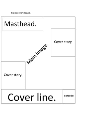
2. Masthead san serif font big
bold text written in red font
in order to create the theme
of aggression.
Interesting
cover line
making you
want to read
the magazine.
Main image of
artist
Eye catching.
Interesting
cover line
making you
want to read
the magazine.
Cover line also enticing the audience to read the
magazine.
Barcode with
price.
4. i
Contents page-title of the contents page san
serif font, font colour red black linking to
aggression.
In this box you would find
picture of the artists included
in this magazine.
Thisbox is where all the informationwill be
locatedinorderto be readby the audience in
orderto find out where certainthingsare in
whichpart of the magazine.
5. Image filling the whole page.
Big headline filling both pages.
Interview or article.
picture
6. Picture used to fill the whole of the left page usually
implementedin order to grab the reader’s attention and
entice the audience into reading the article on the
following page may include a smaller picture over the
bigger picture in the bottom corner of the page.
Smaller picture to
add effect.
Headline whichwouldnaturallygoontobothpagescreatingthe theme of importance shown by
its size. Written in bold red letters causing it to stand out from a plain or dark background.
Interview orarticle usuallyrelatingto the
image onthe opposite page,mayinclude
and start with a drop cap in order to not
onlymake the start easily identifiable to
the readerbut alsograbs the attentionof
the user and encourages them to read
on.
Background
information on
band/artist on
the previous
pages.
Smaller pictures used after the article which could
relate to the outcome of the interview/article.