
Recommended
More Related Content
What's hot
What's hot (20)
More from Jake Lawton
Recently uploaded
Recently uploaded (20)
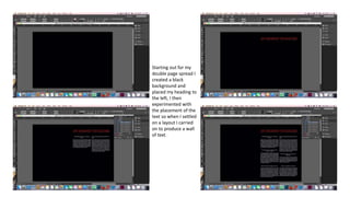
Double Page Spread Construction
- 1. Starting out for my double page spread I created a black background and placed my heading to the left, I then experimented with the placement of the text so when I settled on a layout I carried on to produce a wall of text.
- 2. I then found a good spot for my photograph so I added a smokey effect behind it to carry on the theme that I have through out the magazine. I then added the textures background and the opaque flowers around the edge of the page. This ties up all of the double spread together.