SlideShare a Scribd company logo
1 of 1
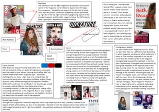
Masthead
                                                                                                                                      On my front cover I used a simple
                                                The masthead from the B&S magazine is positioned in the top left
                                                corner of the magazine and is rotated so it goes down the page.                       sans serif font however, uses a more
                                                In my magazine I decided to use aspects of this but tried to break                    stylised font for more important
                                                away from this typical convention by keeping the text positioned                      words or phrases. This is quite a
                                                up right but in the top right corner of my page using aspects of the                  common convention and works well
                                                younger magazine and the older magazine below. But still trying to                    with the rest of the front cover and
                                                keep it young so it appeals to my target audience                                     helps it to flow as well as making it
                                                                                                                                      more mainstream. However, I used a
                                                                                                                                      slightly older looking font which
                                                                                                                                      probably wouldn’t be associated with
                                                                                                                                      a young audience however does fit
                                                                                                           Stylised Sans Serif Font   with the genre. I also used language
                                                                                                                                      such as, questioning and pull quotes
                                                                                                                                      from current artists which will draw
Web Address
                                                                                                                                      my audience in.


                                                                                     Genre                                                           Photography/ Models
Price                                                            Running head                                                                        It is noticeable in many magazines such as, ‘Blues
                                                                                     I feel, of all magazine convention, I have challenged genre
                                                                                     the most looking at both older magazines from B&S a             and Soul’ that they use a different artist depending
                                                                                     younger magazines for a younger audience. The older             on which magazine you buy and which audience it is
                                                            Splash                                                                                   aimed at. The headline is typically in the top left
                                                                                     magazines represent music as an art that needs to be
                                                            Headline                 listened to carefully whereas, the magazines of a younger       corner with the model in a few of the magazine
                                                                                     audience represent it completely the opposite. I wanted         leaning/stilting towards the masthead. In my final
                                                                                     to convey aspects of both these without making it sound         piece I deliberately challenged these conventions by
Colour Scheme                                                                        like too much as an art as I felt this wouldn’t interest a      placing the masthead on the opposite side on the
B&S/ Blues and Soul particularly stick with a colour scheme of                       young audience of 16-19 year-olds. But by highlighting a        right, running across the top. However, I kept the
just red and white, these are quite striking colours particularly                    young audience on my front over by using current artists        idea of the model being positioned so some of the
with the model in quite vibrant clothing which define ‘B&S’ as a                     and concerts it enabled me too slightly move away from          lettering of the masthead overlaps/goes over the
relaxed maybe even chilled magazine type. I wanted to                                this aspect and on my double page spread move towards           models head slightly. I also used a female model on
challenge this and chose a light blue tone, red and black for                        conveying music as maybe an art, by talking about a             my front cover; this is due to targeting a female
contrast and also a calmer tone whilst still being striking. I kept                  musician who has succeeded, talking about ambition              audience even though it’s not very common to find
with this colour scheme throughout my magazine. However,                             aiming for a young musical audience                             a female posing on a Blues magazine. However, I
deliberately used more red and black on my double page spread                                                                                        tried to balance this out by using and challenging
to convey a slightly different tone, being an article on                                                                                             conventions such as, keeping the low lights and
succeeding I wanted it to be quite daring without making it too                                                                                      smoky background and relaxed clothing associated
contrasting with the rest of the magazine. But, by only using the                                                                                    with Blues.
red for pull out quotes and headlines and sub-headlines it didn’t
pull away from the relaxed tone of the magazine.

Double Page spread
Through many magazines I looked at, they were either very simple layouts or very crowded, I wanted to use
aspects of both without being too busy or too simplistic. I decided to keep the background to simply white and
used images to break up text if it got too crowded. I also used pull quotes and maintained that aspect in my
own work.

More Related Content

What's hot

Nadine's As Media Evaluation
Nadine's As Media EvaluationNadine's As Media Evaluation
Nadine's As Media EvaluationNadineasmediablog
 
Deconstruction of two music magazines
Deconstruction of two music magazinesDeconstruction of two music magazines
Deconstruction of two music magazinesozgealtinok
 
Deconstruction of 3 magazines covers
Deconstruction of 3 magazines coversDeconstruction of 3 magazines covers
Deconstruction of 3 magazines coversRebecca Black
 
Question 1 evaluation
Question 1   evaluationQuestion 1   evaluation
Question 1 evaluationasmedia
 
Nme analysis of magazine
Nme analysis of magazineNme analysis of magazine
Nme analysis of magazineasmediaf12
 
Vinyl Evaluation
Vinyl EvaluationVinyl Evaluation
Vinyl Evaluationlilyjones
 
Task 2 – analysing magazine 2
Task 2 – analysing magazine 2Task 2 – analysing magazine 2
Task 2 – analysing magazine 2asmediaf12
 
Evalution For Vinyl
Evalution For VinylEvalution For Vinyl
Evalution For Vinyllilyjones
 
Front cover analysis contents
Front cover analysis contentsFront cover analysis contents
Front cover analysis contentssharonbachra
 
Analysing mgazine pages
Analysing mgazine pagesAnalysing mgazine pages
Analysing mgazine pagesasmediae12
 
Analyse music magazine
Analyse music magazineAnalyse music magazine
Analyse music magazinejillmuri
 
Analysis of nme magazine
Analysis of nme magazineAnalysis of nme magazine
Analysis of nme magazineasmediaf12
 
the making of my front cover
the making of my front coverthe making of my front cover
the making of my front coverErosV
 
Lady gaga rollingstone analysis
Lady gaga rollingstone analysisLady gaga rollingstone analysis
Lady gaga rollingstone analysisSianLynes
 

What's hot (16)

Nadine's As Media Evaluation
Nadine's As Media EvaluationNadine's As Media Evaluation
Nadine's As Media Evaluation
 
Deconstruction of two music magazines
Deconstruction of two music magazinesDeconstruction of two music magazines
Deconstruction of two music magazines
 
Deconstruction of 3 magazines covers
Deconstruction of 3 magazines coversDeconstruction of 3 magazines covers
Deconstruction of 3 magazines covers
 
Number 3
Number 3Number 3
Number 3
 
Question 1 evaluation
Question 1   evaluationQuestion 1   evaluation
Question 1 evaluation
 
Nme analysis of magazine
Nme analysis of magazineNme analysis of magazine
Nme analysis of magazine
 
Vinyl Evaluation
Vinyl EvaluationVinyl Evaluation
Vinyl Evaluation
 
Task 2 – analysing magazine 2
Task 2 – analysing magazine 2Task 2 – analysing magazine 2
Task 2 – analysing magazine 2
 
Evalution For Vinyl
Evalution For VinylEvalution For Vinyl
Evalution For Vinyl
 
Front cover analysis contents
Front cover analysis contentsFront cover analysis contents
Front cover analysis contents
 
Analysing mgazine pages
Analysing mgazine pagesAnalysing mgazine pages
Analysing mgazine pages
 
Analyse music magazine
Analyse music magazineAnalyse music magazine
Analyse music magazine
 
Blender
BlenderBlender
Blender
 
Analysis of nme magazine
Analysis of nme magazineAnalysis of nme magazine
Analysis of nme magazine
 
the making of my front cover
the making of my front coverthe making of my front cover
the making of my front cover
 
Lady gaga rollingstone analysis
Lady gaga rollingstone analysisLady gaga rollingstone analysis
Lady gaga rollingstone analysis
 

Viewers also liked

009-Jornal Cesesul 25-05-14
009-Jornal Cesesul 25-05-14009-Jornal Cesesul 25-05-14
009-Jornal Cesesul 25-05-14CESESUL
 
不動産に投資する右の場所を選択してください
不動産に投資する右の場所を選択してください不動産に投資する右の場所を選択してください
不動産に投資する右の場所を選択してくださいzongli935
 
Ficha generacion blog2andresvaldes
Ficha generacion blog2andresvaldesFicha generacion blog2andresvaldes
Ficha generacion blog2andresvaldesAndrés Val Antilef
 
Certificate of Completion-Real Estate Principles
Certificate of Completion-Real Estate PrinciplesCertificate of Completion-Real Estate Principles
Certificate of Completion-Real Estate PrinciplesRyan Donner
 
Comportamiento Electoral y Comportamiento Politico
Comportamiento Electoral y Comportamiento PoliticoComportamiento Electoral y Comportamiento Politico
Comportamiento Electoral y Comportamiento PoliticoGustavo Amato
 
Carte préfecture périmètres epci
Carte préfecture périmètres epciCarte préfecture périmètres epci
Carte préfecture périmètres epciJean Jacques Gourhan
 
Natalia botero trabajo sistemas
Natalia botero trabajo sistemasNatalia botero trabajo sistemas
Natalia botero trabajo sistemasNati Botero
 
Cata informatica case study CLAAS italia spa
Cata informatica case study CLAAS italia spaCata informatica case study CLAAS italia spa
Cata informatica case study CLAAS italia spaC.A.T.A. INFORMATICA
 
Mapa conceptual sistema de informacion ruben
Mapa conceptual sistema de informacion rubenMapa conceptual sistema de informacion ruben
Mapa conceptual sistema de informacion rubenRuben Varon
 
Dipl. Electronica LPM
Dipl. Electronica LPMDipl. Electronica LPM
Dipl. Electronica LPMLuis Ponce
 
Analisis estructural bur al arab dubai
Analisis estructural  bur al arab dubaiAnalisis estructural  bur al arab dubai
Analisis estructural bur al arab dubaiEduardo Lara Rojas
 

Viewers also liked (14)

009-Jornal Cesesul 25-05-14
009-Jornal Cesesul 25-05-14009-Jornal Cesesul 25-05-14
009-Jornal Cesesul 25-05-14
 
不動産に投資する右の場所を選択してください
不動産に投資する右の場所を選択してください不動産に投資する右の場所を選択してください
不動産に投資する右の場所を選択してください
 
Ficha generacion blog2andresvaldes
Ficha generacion blog2andresvaldesFicha generacion blog2andresvaldes
Ficha generacion blog2andresvaldes
 
Certificate of Completion-Real Estate Principles
Certificate of Completion-Real Estate PrinciplesCertificate of Completion-Real Estate Principles
Certificate of Completion-Real Estate Principles
 
Comportamiento Electoral y Comportamiento Politico
Comportamiento Electoral y Comportamiento PoliticoComportamiento Electoral y Comportamiento Politico
Comportamiento Electoral y Comportamiento Politico
 
Carte préfecture périmètres epci
Carte préfecture périmètres epciCarte préfecture périmètres epci
Carte préfecture périmètres epci
 
Pniv by niko
Pniv by nikoPniv by niko
Pniv by niko
 
Natalia botero trabajo sistemas
Natalia botero trabajo sistemasNatalia botero trabajo sistemas
Natalia botero trabajo sistemas
 
Cata informatica case study CLAAS italia spa
Cata informatica case study CLAAS italia spaCata informatica case study CLAAS italia spa
Cata informatica case study CLAAS italia spa
 
Mapa conceptual sistema de informacion ruben
Mapa conceptual sistema de informacion rubenMapa conceptual sistema de informacion ruben
Mapa conceptual sistema de informacion ruben
 
Kate tania
Kate  taniaKate  tania
Kate tania
 
Dipl. Electronica LPM
Dipl. Electronica LPMDipl. Electronica LPM
Dipl. Electronica LPM
 
C.V AZMI
C.V AZMIC.V AZMI
C.V AZMI
 
Analisis estructural bur al arab dubai
Analisis estructural  bur al arab dubaiAnalisis estructural  bur al arab dubai
Analisis estructural bur al arab dubai
 

Similar to Question 1

Statement of intent front page
Statement of intent  front pageStatement of intent  front page
Statement of intent front pageoliviaolives
 
Statement of intent front page
Statement of intent  front pageStatement of intent  front page
Statement of intent front pageoliviaolives
 
Statement of intent front page
Statement of intent  front pageStatement of intent  front page
Statement of intent front pageoliviaolives
 
Magazine analysis3 totp
Magazine analysis3 totpMagazine analysis3 totp
Magazine analysis3 totpramondeholmes
 
Front page statement of intent
Front page statement of intentFront page statement of intent
Front page statement of intentoliviaolives
 
Question one evaluation
Question one evaluationQuestion one evaluation
Question one evaluationRhiannon Jones
 
Macabees nme dps analysis
Macabees nme dps analysisMacabees nme dps analysis
Macabees nme dps analysisjessiekeegan
 
Macabees nme dps analysis
Macabees nme dps analysisMacabees nme dps analysis
Macabees nme dps analysisjessiekeegan
 
Evaluation question 1
Evaluation question 1 Evaluation question 1
Evaluation question 1 rdowell1
 
Evaluation question 1
Evaluation question 1Evaluation question 1
Evaluation question 1asmediaf12
 

Similar to Question 1 (20)

Statement of intent front page
Statement of intent  front pageStatement of intent  front page
Statement of intent front page
 
Statement of intent front page
Statement of intent  front pageStatement of intent  front page
Statement of intent front page
 
Statement of intent front page
Statement of intent  front pageStatement of intent  front page
Statement of intent front page
 
Magazine analysis3 totp
Magazine analysis3 totpMagazine analysis3 totp
Magazine analysis3 totp
 
Front page statement of intent
Front page statement of intentFront page statement of intent
Front page statement of intent
 
Mock ups
Mock upsMock ups
Mock ups
 
Final evaluation
Final evaluationFinal evaluation
Final evaluation
 
Question one evaluation
Question one evaluationQuestion one evaluation
Question one evaluation
 
How did you attract
How did you attractHow did you attract
How did you attract
 
Evaluation
EvaluationEvaluation
Evaluation
 
Macabees nme dps analysis
Macabees nme dps analysisMacabees nme dps analysis
Macabees nme dps analysis
 
Conventions
ConventionsConventions
Conventions
 
Q1 eval
Q1 evalQ1 eval
Q1 eval
 
Evaluation Q2
Evaluation Q2Evaluation Q2
Evaluation Q2
 
Question 4and5
Question 4and5Question 4and5
Question 4and5
 
Macabees nme dps analysis
Macabees nme dps analysisMacabees nme dps analysis
Macabees nme dps analysis
 
Presentation 1
Presentation 1Presentation 1
Presentation 1
 
Final evaluation1
Final evaluation1Final evaluation1
Final evaluation1
 
Evaluation question 1
Evaluation question 1 Evaluation question 1
Evaluation question 1
 
Evaluation question 1
Evaluation question 1Evaluation question 1
Evaluation question 1
 

More from IndiaCaleb

Question 3 - Feedback
Question 3 - FeedbackQuestion 3 - Feedback
Question 3 - FeedbackIndiaCaleb
 
Digipak Research
Digipak ResearchDigipak Research
Digipak ResearchIndiaCaleb
 
Potential dangers
Potential dangersPotential dangers
Potential dangersIndiaCaleb
 
Risk Assessment
Risk AssessmentRisk Assessment
Risk AssessmentIndiaCaleb
 
Music Video Analysis
Music Video AnalysisMusic Video Analysis
Music Video AnalysisIndiaCaleb
 
Technical and Visual Codes
Technical and Visual CodesTechnical and Visual Codes
Technical and Visual CodesIndiaCaleb
 
Remi nicole – Another Day
Remi nicole – Another DayRemi nicole – Another Day
Remi nicole – Another DayIndiaCaleb
 
Magazine Analysis
Magazine AnalysisMagazine Analysis
Magazine AnalysisIndiaCaleb
 

More from IndiaCaleb (11)

Question 3 - Feedback
Question 3 - FeedbackQuestion 3 - Feedback
Question 3 - Feedback
 
Digipak Research
Digipak ResearchDigipak Research
Digipak Research
 
Potential dangers
Potential dangersPotential dangers
Potential dangers
 
Risk Assessment
Risk AssessmentRisk Assessment
Risk Assessment
 
Music Video Analysis
Music Video AnalysisMusic Video Analysis
Music Video Analysis
 
Technical and Visual Codes
Technical and Visual CodesTechnical and Visual Codes
Technical and Visual Codes
 
Remi nicole – Another Day
Remi nicole – Another DayRemi nicole – Another Day
Remi nicole – Another Day
 
Question 3.
Question 3.Question 3.
Question 3.
 
Question 6
Question 6Question 6
Question 6
 
Question 2
Question 2Question 2
Question 2
 
Magazine Analysis
Magazine AnalysisMagazine Analysis
Magazine Analysis
 

Question 1

  • 1. Masthead On my front cover I used a simple The masthead from the B&S magazine is positioned in the top left corner of the magazine and is rotated so it goes down the page. sans serif font however, uses a more In my magazine I decided to use aspects of this but tried to break stylised font for more important away from this typical convention by keeping the text positioned words or phrases. This is quite a up right but in the top right corner of my page using aspects of the common convention and works well younger magazine and the older magazine below. But still trying to with the rest of the front cover and keep it young so it appeals to my target audience helps it to flow as well as making it more mainstream. However, I used a slightly older looking font which probably wouldn’t be associated with a young audience however does fit Stylised Sans Serif Font with the genre. I also used language such as, questioning and pull quotes from current artists which will draw Web Address my audience in. Genre Photography/ Models Price Running head It is noticeable in many magazines such as, ‘Blues I feel, of all magazine convention, I have challenged genre the most looking at both older magazines from B&S a and Soul’ that they use a different artist depending younger magazines for a younger audience. The older on which magazine you buy and which audience it is Splash aimed at. The headline is typically in the top left magazines represent music as an art that needs to be Headline listened to carefully whereas, the magazines of a younger corner with the model in a few of the magazine audience represent it completely the opposite. I wanted leaning/stilting towards the masthead. In my final to convey aspects of both these without making it sound piece I deliberately challenged these conventions by Colour Scheme like too much as an art as I felt this wouldn’t interest a placing the masthead on the opposite side on the B&S/ Blues and Soul particularly stick with a colour scheme of young audience of 16-19 year-olds. But by highlighting a right, running across the top. However, I kept the just red and white, these are quite striking colours particularly young audience on my front over by using current artists idea of the model being positioned so some of the with the model in quite vibrant clothing which define ‘B&S’ as a and concerts it enabled me too slightly move away from lettering of the masthead overlaps/goes over the relaxed maybe even chilled magazine type. I wanted to this aspect and on my double page spread move towards models head slightly. I also used a female model on challenge this and chose a light blue tone, red and black for conveying music as maybe an art, by talking about a my front cover; this is due to targeting a female contrast and also a calmer tone whilst still being striking. I kept musician who has succeeded, talking about ambition audience even though it’s not very common to find with this colour scheme throughout my magazine. However, aiming for a young musical audience a female posing on a Blues magazine. However, I deliberately used more red and black on my double page spread tried to balance this out by using and challenging to convey a slightly different tone, being an article on conventions such as, keeping the low lights and succeeding I wanted it to be quite daring without making it too smoky background and relaxed clothing associated contrasting with the rest of the magazine. But, by only using the with Blues. red for pull out quotes and headlines and sub-headlines it didn’t pull away from the relaxed tone of the magazine. Double Page spread Through many magazines I looked at, they were either very simple layouts or very crowded, I wanted to use aspects of both without being too busy or too simplistic. I decided to keep the background to simply white and used images to break up text if it got too crowded. I also used pull quotes and maintained that aspect in my own work.