Introduction to ArtificiaI Intelligence in Higher Education
Magazine Cover Research
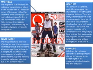
1. MASTHEAD The magazines title differs to the codes and conventions of others in that it is featured in the top left corner of the cover, rather than the entire width of the page. The main, obvious reason for this is that it is only one letter. This helps to make the magazine unique and the white writing on the red background is instantly recognisable. GRAPHICS The constant use of bold, capital letters suggest the importance of everything the magazine features. There are many different sizes yet all of them manage to stand out. Q chooses to stick with fairly simple colouring of red, black and white. These work well together to capture it’s audience because they simply have to draw their eyes across the page and are able to read what’s happening without having to put effort into it. COVER IMAGE The image they have chosen is effective because it helps connote the Prodigy's loud, explosive style with the megaphone and cracks in the ground. Also Keith Flints’ pose suggests he is yelling. It dominates the page and instantly draws the audiences attention due to it’s explosive nature. BARCODE Q follows the codes and conventions of magazines by placing it’s barcode in the bottom right of the magazine, clearly displaying the date and price.
2. MASTHEAD Kerrang’s masthead follows the codes and conventions of magazines by placing it’s title across the top of the page, taking the entire width. It brings attention to it’s audience by being the largest, most dramatic font that is recognisable by it’s unique style of having lines across the lettering. GRAPHICS The magazine focuses on using bold lettering, with exclamation marks. This-combined with the cover image-works to capture the audiences attention and add drama. The chosen quotes of ‘unfold the puzzle of life’ and ‘Hayley starts a riot’ are cleverly thought of as they relate to the song names from the band themselves. COVER IMAGE The image of Biffy Clyro dominates the page, with each of them posing in a dramatic manner, suggesting power and confidence. They are printed over the Kerrang! title, as the brand is already recognisable. BARCODEKerrang! Follows the codes and conventions of magazines by having it’s barcode in the bottom right hand corner, clearly displaying the issue number and price.