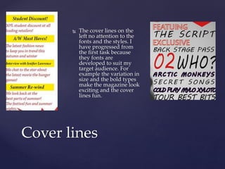
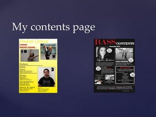
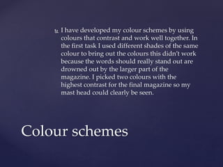
{
Question 7
Looking back at your preliminary task what do you
feel you have you learnt in the progression from it to
the full product?
My Front Covers
I have progressed from the
first task because of my
attention to detail that made
me think about my choices of
fonts, colour, etc. that
influenced my decision for my
genre and target audience. The
overall house style of the first
magazine shows a simple
minimalistic style however I
feel for a student magazine
this is too boring. I have
progressed by making the
house style more fun and
exciting thinking about my
target audience and what they
would like too see.
Mast heads
The yellow is drowned out by the white in this magazine, mast
heads are supposed to create a house style witch this one isn’t
memorable. By using red it stand out to the reader and is bold.
I have developed my skills because I have found the colours
that work well and are effective.
 The cover lines on the
left no attention to the
fonts and the styles. I
have progressed from
the first task because
they fonts are
developed to suit my
target audience. For
example the variation in
size and the bold types
make the magazine look
exciting and the cover
lines fun.
Cover lines
My contents page
 For the first task the layout isn’t in a suitable
order. There is no structure to my contents
page witch can come across as quite confusing
to my readers. For the final contents page I
added lines to break up the page making it
easier to read and quicker to find certain parts
of the magazine.
Layout
 I have developed my colour schemes by using
colours that contrast and work well together. In
the first task I used different shades of the same
colour to bring out the colours this didn’t work
because the words should really stand out are
drowned out by the larger part of the
magazine. I picked two colours with the
highest contrast for the final magazine so my
mast head could clearly be seen.
Colour schemes

Question 7

  • 1.
    { Question 7 Looking backat your preliminary task what do you feel you have you learnt in the progression from it to the full product?
  • 2.
    My Front Covers Ihave progressed from the first task because of my attention to detail that made me think about my choices of fonts, colour, etc. that influenced my decision for my genre and target audience. The overall house style of the first magazine shows a simple minimalistic style however I feel for a student magazine this is too boring. I have progressed by making the house style more fun and exciting thinking about my target audience and what they would like too see.
  • 3.
    Mast heads The yellowis drowned out by the white in this magazine, mast heads are supposed to create a house style witch this one isn’t memorable. By using red it stand out to the reader and is bold. I have developed my skills because I have found the colours that work well and are effective.
  • 4.
     The coverlines on the left no attention to the fonts and the styles. I have progressed from the first task because they fonts are developed to suit my target audience. For example the variation in size and the bold types make the magazine look exciting and the cover lines fun. Cover lines
  • 5.
  • 6.
     For thefirst task the layout isn’t in a suitable order. There is no structure to my contents page witch can come across as quite confusing to my readers. For the final contents page I added lines to break up the page making it easier to read and quicker to find certain parts of the magazine. Layout
  • 7.
     I havedeveloped my colour schemes by using colours that contrast and work well together. In the first task I used different shades of the same colour to bring out the colours this didn’t work because the words should really stand out are drowned out by the larger part of the magazine. I picked two colours with the highest contrast for the final magazine so my mast head could clearly be seen. Colour schemes