
Recommended
More Related Content
What's hot
What's hot (14)
Viewers also liked
Similar to Sketches
Similar to Sketches (20)
More from EugeneBongo
More from EugeneBongo (20)
Recently uploaded
Recently uploaded (20)
Sketches
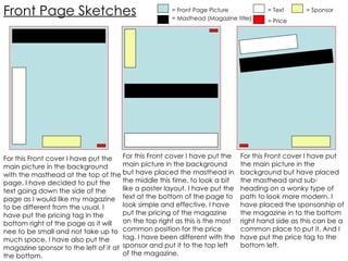
- 1. Front Page Sketches = Front Page Picture = Masthead (Magazine title) = Text For this Front cover I have put the main picture in the background with the masthead at the top of the page. I have decided to put the text going down the side of the page as I would like my magazine to be different from the usual. I have put the pricing tag in the bottom right of the page as it will nee to be small and not take up to much space. I have also put the magazine sponsor to the left of it at the bottom. For this Front cover I have put the main picture in the background but have placed the masthead in the middle this time, to look a bit like a poster layout. I have put the text at the bottom of the page to look simple and effective. I have put the pricing of the magazine on the top right as this is the most common position for the price tag. I have been different with the sponsor and put it to the top left of the magazine. For this Front cover I have put the main picture in the background but have placed the masthead and sub-heading on a wonky type of path to look more modern. I have placed the sponsorship of the magazine in to the bottom right hand side as this can be a common place to put it. And I have put the price tag to the bottom left. = Price = Sponsor
- 2. Double-Page spread Sketches = Artists Picture = Story (Text) = Sub-Heading, title Or For this Double page spread I decided to make the picture start from the left hand side of the page and come in across to the right side. I did this because this gives the effect that it’s a double page spread not to separate things. The sub-heading or titles will always go at the top of the page to show What it’s about and also over a story or piece of writing. I have decided to Put a mini story about the artist in the bottom left corner just to make the magazine a lot more juicier and full of content and the main story goes and takes up the whole right side of the page. Lastly I think I little picture of the artist looking slightly cool or charming is a good touch up. For this Double page spread I decided to make the Masthead Title, stretch across the page equally for a big broad effect. I also put the pictures in opposite diagonal frame to each other as this is how many artists I may look to try and cover or publish a story about on the page. I have decided to go for the more storeys approach by placing a bit of story by each picture, this gives more gossip and a more filled out look. I have also put questions or sub-headings in, in case I feel the interview look within a double page spread. The Question will be placed just above the writing or story at hand. Questions
- 3. Content Page Sketches = Artists Picture = page Reference & Story = Normal Storeys = Heading Or Title For this content page design I have gone for the photo album look. Putting the photos in symmetry with each other. These Four photos are in big because they will be the main storeys within that issue. The page reference and slight entail in to the story is written in underneath the photo to obviously show who it’s about and what. The Headline for that story is written at the top of the picture on it to show it’s importance. At the bottom the normal everyday Stories are place along with there references. For this content page design instead of putting numerous photos I have placed only 1 big photo along with its title quite big above it to show that this is the main story within the magazine. The page reference and snippet of the story will go underneath the big photo. The normal stories within the magazine issue will be placed at the bottom along with the references. For this content page design I have gone with a newspaper column look. Everything looking quite neat, in line and rectangular. The page reference and snippet of the storey sit underneath the photos with there titles. The normal page stories are placed at the bottom along with the references.