
Recommended
More Related Content
What's hot
What's hot (16)
Viewers also liked
Viewers also liked (17)
Similar to Versions of Front Cover
Similar to Versions of Front Cover (20)
Recently uploaded
Recently uploaded (8)
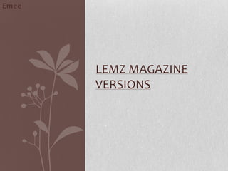
Versions of Front Cover
- 1. Photoshop Picture Modification for my Front Cover Emee
- 2. Creating the Logo: I have got the letter “E” with patterns from the internet and modified it by erasing of the background and using a magnetic tool to get out the outline of the letter “E” and also I have made it big to make it stand out from the rest of my letters. I started creating the first draft of my logo on Photoshop. I decided to call my RnB magazine “Lemz” because RnB tends to have a short snappy names like music magazine “Vibe”. I have decided to add this extra design on the letter “L” to give the wild side of my magazine as RnB can be quite wild so it’s compatible with my genre.
- 3. Photo shopped: Before After Using the magnetic tool on Photoshop, I traced out the outline of the design and made many layers out of it and then added all of them on top of each layer to give me multiples floral pattern rather just a simple design which shows it vibrancy. Multiple pictures of the same pattern.
- 4. Modifying Letter “E” Before After I erased of the solid background to make it transparent so then the background wouldn’t block the magazine background that I am going to use.
- 5. Modified and final version of my Logo: I modified my logo because it was to simple and didn’t give that RnB look or the vibe when you look at it. So I got a floral pattern of the internet and using Photoshop I erased of the white background. I used the colour hot pink because I wanted it look more vibrant and visible from the white background. The floral pattern gives the look of wilderness which my genre of magazine has. Using the painting tool on Photoshop, I filled up the black patterns with red colour to give the symbolism of danger and love.
- 6. My Cover picture Before After Using the picture that I took for my front cover, I photo shopped the picture and modified it. I cut out the background and the outline of the picture and put it on transparent background. I also changed the saturations and the brightness of the picture so that it looks natural.
- 7. The barcode Using the Photoshop I cropped the barcode picture and then using the eraser I erased of white background to make it transparent on my magazine.
- 8. Evaluation: The reason why I have made my logo with the floral patterns and used the name which I have came up with for the magazine is that I wanted to bring a new whole theme or an concept to the media music magazines. The concept of using such colour or a pattern which symbolises and represents my front cover will give my targeted audience the message of what they are about to unleash inside.