1. I’ve went with a play on words
with my masthead. ‘ABS’ KOOL’, The strap line is used in my
‘KOOL’ as in the word cool which magazine in order to highlight the
gives the impression that the fact this is my debut addition, this
magazine is ‘fresh’ like the youth will entice my target audience,
culture of ABS. the colour red that of school students aged 12-
expresses a bright, vibrant 16, as this highlights the fact it’s a
school, it also shows a first issue and will therefore,
determination to improve as a influence them to read it in
school and become the best curiosity of what it will be like.
school in the country. The
capital letters I used were to
grab the readers attention and
to highlight the fact of the
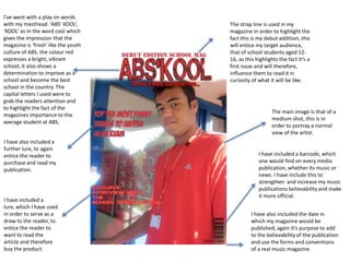
The main image is that of a
magazines importance to the
medium shot, this is in
average student at ABS.
order to portray a normal
view of the artist.
I have also included a
further lure, to again
entice the reader to I have included a barcode, which
purchase and read my one would find on every media
publication. publication, whether its music or
news. I have include this to
strengthen and increase my music
publications believability and make
it more official.
I have included a
lure, which I have used
in order to serve as a I have also included the date in
draw to the reader, to which my magazine would be
entice the reader to published, again it’s purpose to add
want to read the to the believability of the publication
article and therefore and use the forms and conventions
buy the product. of a real music magazine.
2. I have taken this photo to attempt to the reader that
this is a photo during an interview , to show the
reader the atmosphere of the interview. I have also
included pictures that are based on the subject
matters involved in the magazine, this I also included
to lure my reader to make them want to read the
I have decided to make the
magazine and purchase my publication.
title ‘contents’ a large font ,
this was in order to tell the
reader what this page is
about .
I have also decided
to keep a red and
blue colour scheme
throughout my
publication, with a
red and blue colour
scheme on my
magazine cover and
on my contents page,
this I to give an
smooth feel and a
relaxed read about
the publication.
I have included a rather important and key feature to a contents page, and that is
the features box, this features box simply communicates to the reader where to
find the specific article and what the article is going to be about, this again is
very simple, yet adds to the sophistication of the publication