1. Positives:
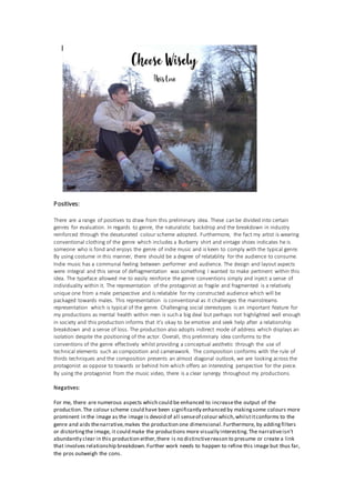
There are a range of positives to draw from this preliminary idea. These can be divided into certain
genres for evaluation. In regards to genre, the naturalistic backdrop and the breakdown in industry
reinforced through the desaturated colour scheme adopted. Furthermore, the fact my artist is wearing
conventional clothing of the genre which includes a Burberry shirt and vintage shoes indicates he is
someone who is fond and enjoys the genre of indie music and is keen to comply with the typical genre.
By using costume in this manner, there should be a degree of relatablity for the audience to consume.
Indie music has a communal feeling between performer and audience. The design and layout aspects
were integral and this sense of defragmentation was something I wanted to make pertinent within this
idea. The typeface allowed me to easily reinforce the genre conventions simply and inject a sense of
individuality within it. The representation of the protagonist as fragile and fragmented is a relatively
unique one from a male perspective and is relatable for my constructed audience which will be
packaged towards males. This representation is conventional as it challenges the mainstreams
representation which is typical of the genre. Challenging social stereotypes is an important feature for
my productions as mental health within men is such a big deal but perhaps not highlighted well enough
in society and this production informs that it’s okay to be emotive and seek help after a relationship
breakdown and a sense of loss. The production also adopts indirect mode of address which displays an
isolation despite the positioning of the actor. Overall, this preliminary idea conforms to the
conventions of the genre effectively whilst providing a conceptual aesthetic through the use of
technical elements such as composition and camerawork. The composition conforms with the rule of
thirds techniques and the composition presents an almost diagonal outlook, we are looking across the
protagonist as oppose to towards or behind him which offers an interesting perspective for the piece.
By using the protagonist from the music video, there is a clear synergy throughout my productions.
Negatives:
For me, there are numerous aspects which could be enhanced to increasethe output of the
production.The colour scheme could have been significantly enhanced by makingsome colours more
prominent in the image as the image is devoid of all senseof colour which,whilstitconforms to the
genre and aids thenarrative,makes the production one dimensional.Furthermore, by addingfilters
or distortingthe image, it could make the productions more visually interesting.The narrativeisn’t
abundantly clear in this production either,there is no distinctivereason to presume or create a link
that involves relationship breakdown.Further work needs to happen to refine this image but thus far,
the pros outweigh the cons.
2. Positives:
This idea contrasts the firstone as it more a more stylised and commercial productwhich lends itself
more to the brand identity of the artistwho features as opposeto a protagonistfrom the narrative.
There are elements of this design which conform to the genre likethe indirectmode of address
adopted by the artistdenotes this concept he is concentrated on his music and keen to produce
engaging music as opposeto being in the spotlight.The colour scheme is also moreengaging the
alternate design with the colour wheel being used to constructthe image so two colours which create
a pleasantvisual aesthetic.The yellow used for the background connotes a sense of freshness and
energy will my artistwill bringto the industry.The brightness is then contrasted with an edited image
of my artistwhereby gradientfills havebeen used to create the polished and refined finish visible.
The design and layoutelements are strong and spacinghas been meticulously planned.The motif of
the puzzle will run throughout my panels to highlightand reinforcethis idea that relationships are
made up of multiple,complex pieces. This motif also provides a niceaesthetic but I want the piece to
be meaningful in regards to characteristicsand notsimply due to the aesthetic which is created. The
missingpiecejustreinforces the aforementioned point I feel. Overall,this design is onewhich is a
better will forma better commercial product for my artistand help himestablish an audiencein the
embryonic stages of his career and that is vitally importantto establish for the success of his career.
Negatives:
This is very much orientated on the artistand the brand identity of the artistas opposeto the
narrativeor focusingon a specific representation.This approach isn’tconventional of the genre and
puts a commerciality on the production which isn’tevident in the indiegenre due to the relationship
shared between the audienceand performer. The motif differs from the music video and so any
chanceof creating synergy has been lostand the opportunity to create a distinctivelink with the
narrativehas been missed.This cover is one which is succinctand aesthetically pleasingbutis reliant
upon visualsas opposeto connotations and rejects a lotof the traditions of indie music.Itsacrifices
the audience’s interaction in exchange to establish a brand and the balanceof that isn’tquite right.
The font is questionableand the title could conform to the visiual aspects better, perhaps ‘Missing
Pieces’, would be a better title.