
Recommended
More Related Content
What's hot
What's hot (20)
Similar to A2 Media Studies Evaluation Question 2
Similar to A2 Media Studies Evaluation Question 2 (20)
Recently uploaded
Recently uploaded (20)
A2 Media Studies Evaluation Question 2
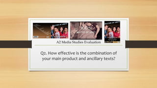
- 1. Q2. How effective is the combination of your main product and ancillary texts? A2 Media Studies Evaluation
- 2. Intentions For Promotional Pack • As I have represented a boy band within the genre of pop rock, I wanted to communicate a theme of timeless youthful spirit and to unleash the 'inner child' within the performers in spite of their adolescent age. • Signifiers of the pop rock genre within the pack include a wide sense of chemistry between the performers which is a fundamental necessity for a successful boy band. For example, 'Somebody To You' by The Vamps features the members collectively throughout interacting with 'piggybacks', football and performing. Equally, I have featured my band 'Matter Of Unity' as team players on the CD cover and advert to represent them as a working unit together.
- 3. On-Screen Titles For the opening on-screen titles, I have used the same 'Adventure' font as the advertisement for the name of the band. This creates a recognisable branding logo which the audience will relate to on future releases. This font is warped in Photoshop to effectively suggest that the band are not ruled by convention and will adopt their own style.
- 4. Crumpled Paper Effect A subtle reflection of Will's dismal career is shown in the textural design of the digipak. In the office, we see him staring at an abundance of paperwork. On the promo package, a crumpled paper effect is visible behind the halftone newsprint. This creates an edgy rock based feel and suggests that the band have abandoned their work duties, enhancing the sense of rebellion. McFly's 'Memory Lane' features a sketch based CD cover with a stained background, which influenced my design choice.
- 5. Gestures The band members are seen interacting with informal and popular gestures among teenagers e.g. 'fistbump'. This is used to represent how the band functional as a unit. On the advertisement, the members are seen clenching their fist and staring confidently at the camera, suggesting a youthful rock theme.
- 6. Grid To best communicate how the band reunite, I decided to create a 4 x 2 grid composite shot of all the members. This creates a cross- cutting effect as each member receives the same text at the same point in time. This idea was reused as an old album cover of the band shown by Will on his phone inspired by The Beatles 'Let It Be' cover. The digipak gatefold replicates this look with a 4 x 1 retro effect reflecting each member's personality. The inspiration to use this idea was taken from Gary Numan's 'Cars', featuring 80's electropop unnatural effects, and from Little Mix's 'Hair', which also features the group communicating through cross-cutting.
- 7. Colour Design The use of colour within the drama theatre could be altered to best suit the feel of the performance. I decided to use a scheme of red and yellow to provide an edgy and dynamic setting for the band to relive their memories. The Script and Imagine Dragons feature a similar arrangement. 'Superheroes' by The Script features lead vocalist Danny O'Donoghue performing in a crowded space with red low-key lighting. 'Demons' by Imagine Dragons is also set in a crowded arena with a purple and blue scheme providing a cold feel. The red and yellow counteraction is evident with the bronze background on the advertisement, while keeping the same clothing provides synergy through the bright t-shirts. One Direction's 'Live While We're Young also features the band wearing the same casual clothing as the video.
- 8. Post-Production Effects A number of unnatural effects was added to the performance to uplift the energy and to resemble 80s electropop such as Duran Duran and Eurythmics. These effects include a halftone newsprint, stretching performers out of the frame, adding a glow and increasing the saturation. These enhance the vividity of the colour scheme boosting the pop genre appeal. The colour design and halftone effect were reproduced on the advertisement while featuring the band in the same clothing as the performance.
- 9. Genre I have used a number of signifiers that tell the audience that the video is related to the pop rock genre, with electropop influence. A key element I wanted to achieve was the chemistry between the members of the band. This is reflected by the gestures and eye contact with each other. Casual clothing is another signifier used by boy bands.The performing space with a red and yellow lighting set- up provided an edgy and dynamic feel for the genre. The album name is featured in a larger font than the band name, to emphasise the release of new material.
- 10. Iconography The iconography I have illustrated with my band is the 'boy band look'. Every member of the band is represented as an individual with personal traits: Will is ambitious; Joe is shy; Manuel is excitable and Alex is the gentleman. The casual clothing is a common look for a boy band as seen by The Script. One Direction's album cover for 'Live While We're Young' sees the performers interacting informally and with youthful spirit. My album cover features my performers making eye contact and featuring a more determined look while maintaining the spirit.
- 11. Conclusion Having followed the conventions of my chosen genre and linking elements of the performance and personalities of my band on the promotional pack, I believe the synergy and marketing potential would be effective for my target audience with a clear narrative intention.