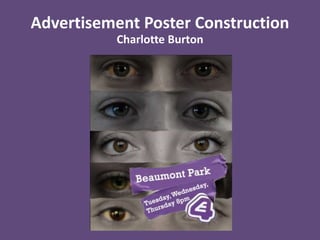
2. Once I had added all my cropped images into my poster I aligned them in order of
how I felt would look best in the final image and considered where I would include
the E4 branding tape.
3. Then to add an emphasis on the eyes of the different people I added an adjustment
layer where I reduced the saturation of the image then painted on the colour of the
eyes so they are the only area in colour and are very defined on the poster.
4. Next I used a E4 purple tape image that I found on the internet as an overlay over the
top of my background image. When I found the image it already had a title on so I
erased the previous text ready to add my own text.
5. I then added text to the purple tape so the title matches alike to the E4 branding that
is regularly used on their posters so my poster looks like a regular feature of the
channel.