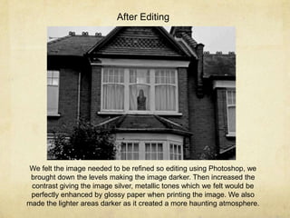
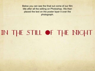
Creating the poster
By Izabella Tulip-Parkin
Before
Editing

This picture was taken while we where filming the window shot used
before I title sequence in our trailer. We felt the image was perfect for
our poster as the looming figure in the window is quite haunting for
the viewer to look at and felt the simplicity of the image was perfect
for our style of trailer.
After Editing

We felt the image needed to be refined so editing using Photoshop, we
brought down the levels making the image darker. Then increased the
contrast giving the image silver, metallic tones which we felt would be
perfectly enhanced by glossy paper when printing the image. We also
made the lighter areas darker as it created a more haunting atmosphere.
We then further edited the image by cropping it down even smaller as we
wanted our poster to be portrait instead of landscape and wanted to focus in
on the subject in the window.
We then began cutting out our film title logo and coloured it in a dark
maroon red , as the poster will be in black and white following our style of
trailer we felt that it needed a pop of colour. Also the red is symbolic for
blood and love which follows the plot of our piece as the mother loves her
family, but spills their blood as it seemed like the right thing to do.
After cutting our the title we felt that the lines were not smooth enough so placed
a blur filter on the text softening the lines and colours with is a perfect contrast to
the sharp and metallic tones of the image.
Below you can see the final out come of our film
title after all the editing on Photoshop. We then
placed the text on the poster layer it over the
photograph.
Then after placing in our title we added a tagline ‘With Pardon in her
Pitying Eyes’, which is a reference to the poem ‘The Angel in the House’ by
Coventry Patmore. This where part of the concept for our trailer was
developed from which is elaborated on in my blog. We placed the text at
the bottom of the image so as not to obstruct the view we have of the
subject and make you work your way up the poster seeing the text at the
The poster was lacking in information so placed a critics rating at the top of the
page , which is a common feature of a poster and felt would raise the standard
of our poster.
Then moved the section further up the page so we could fit in a second piece of
critics review.
Then second critics review we put in was from the Sundance
film festival as we felt that it was perfect for our independent
genre of work.
We felt to give the viewer a better understanding of what the film is
like before having previewed the trailer we need to put a more film
reference quote in giving them an idea of what style of film it will be.
We then placed the date in at the bottom of the
page.

Creating poster

  • 1.
    Creating the poster ByIzabella Tulip-Parkin
  • 2.
    Before Editing This picture wastaken while we where filming the window shot used before I title sequence in our trailer. We felt the image was perfect for our poster as the looming figure in the window is quite haunting for the viewer to look at and felt the simplicity of the image was perfect for our style of trailer.
  • 3.
    After Editing We feltthe image needed to be refined so editing using Photoshop, we brought down the levels making the image darker. Then increased the contrast giving the image silver, metallic tones which we felt would be perfectly enhanced by glossy paper when printing the image. We also made the lighter areas darker as it created a more haunting atmosphere.
  • 4.
    We then furtheredited the image by cropping it down even smaller as we wanted our poster to be portrait instead of landscape and wanted to focus in on the subject in the window.
  • 5.
    We then begancutting out our film title logo and coloured it in a dark maroon red , as the poster will be in black and white following our style of trailer we felt that it needed a pop of colour. Also the red is symbolic for blood and love which follows the plot of our piece as the mother loves her family, but spills their blood as it seemed like the right thing to do.
  • 6.
    After cutting ourthe title we felt that the lines were not smooth enough so placed a blur filter on the text softening the lines and colours with is a perfect contrast to the sharp and metallic tones of the image.
  • 7.
    Below you cansee the final out come of our film title after all the editing on Photoshop. We then placed the text on the poster layer it over the photograph.
  • 8.
    Then after placingin our title we added a tagline ‘With Pardon in her Pitying Eyes’, which is a reference to the poem ‘The Angel in the House’ by Coventry Patmore. This where part of the concept for our trailer was developed from which is elaborated on in my blog. We placed the text at the bottom of the image so as not to obstruct the view we have of the subject and make you work your way up the poster seeing the text at the
  • 9.
    The poster waslacking in information so placed a critics rating at the top of the page , which is a common feature of a poster and felt would raise the standard of our poster.
  • 10.
    Then moved thesection further up the page so we could fit in a second piece of critics review.
  • 11.
    Then second criticsreview we put in was from the Sundance film festival as we felt that it was perfect for our independent genre of work.
  • 12.
    We felt togive the viewer a better understanding of what the film is like before having previewed the trailer we need to put a more film reference quote in giving them an idea of what style of film it will be.
  • 13.
    We then placedthe date in at the bottom of the page.